
Color is more than a visual element in architecture; it is a powerful tool that can evoke emotions, shape perceptions and define a building’s identity.
From the vibrant hues of ancient temples to the minimalist palettes of modern buildings, color has played a pivotal role in shaping our built environment. Understanding the principles of color theory and its impact on the human experience is essential for architects seeking to create spaces that are not only visually appealing, but also emotionally resonant and culturally relevant.
Defining Color Theory: Purpose and Psychological Impact
Color theory is the study of how colors affect and interact with human perception. It explores the psychological and emotional responses associated with different colors, as well as the principles of color harmony, contrast and balance.
- Color Psychology: Colors evoke certain emotions and associations. For example, blue is often associated with calmness and tranquility, while red is associated with energy and excitement.
- Color Harmony: Harmonious color combinations create a sense of balance and visual appeal. Complementary colors like blue and orange create high contrast, while similar colors like blue and green create a sense of unity.
- Color Contrast: Contrast is essential for creating visual interest and defining different areas within a space. High contrast can be used to emphasize focal points, while low contrast can create a sense of calm and serenity.
Historical Evolution of Color in Architecture
Throughout history, color has been used in architecture to express cultural values, religious beliefs and social status. From the vibrant frescoes of ancient Rome to the intricate mosaics of Byzantine churches, color has played a vital role in shaping architectural styles and traditions.
- Ancient Civilizations: Ancient civilizations used color to symbolize power, spirituality and social hierarchy. The Egyptians, for example, used bright colors in their temples and tombs to represent the gods and the afterlife.
- Medieval Period: During the medieval period, color was used in religious buildings to create a sense of awe and respect. Stained glass windows, often depicting biblical scenes, gave churches a mystical and spiritual quality.
- Renaissance and Baroque: During the Renaissance and Baroque periods, interest in classical architecture increased and a more naturalistic approach to color was adopted. Buildings were often painted in warm, earthy tones reflecting the beauty of the natural world.
- Modernism and Postmodernism: Modernist architecture took a minimalist approach to color, often using neutral tones to create a sense of simplicity and functionality. Postmodernism adopted a more playful and eclectic use of color, often combining bright hues and bold patterns.
Key Features of Effective Color Application in Design
Effective color application in architecture requires a deep understanding of color theory, the intended function of the space and the overall design aesthetic.
- Functionality: Color can be used to define different areas within a space, create a sense of flow and enhance the functionality of the building. For example, warm colors can be used in dining areas to stimulate appetite, while cool colors can be used in bedrooms to encourage relaxation.
- Aesthetics: Color can be used to create a certain mood or atmosphere. Bold colors can create a sense of energy and excitement, while muted tones can create a sense of calm and serenity.
- Context: Color should be chosen to complement the environment, taking into account the building’s location, surrounding landscape and local culture.
- Sustainability: Architects are increasingly considering the environmental impact of their color choices, preferring environmentally sustainable paints and pigments that are low in VOC and environmentally friendly.
The Role of Color in Shaping Architectural Identity and Context
Color plays a crucial role in shaping the identity and context of a building, reflecting its cultural significance, historical context and architectural style.
- Cultural Identity: Color can be used to express the cultural values and traditions of a society. For example, the use of vibrant colors in traditional Indian architecture reflects the country’s rich cultural heritage.
- Historical Context: Color can be used to evoke a sense of history and place. For example, using muted tones in historic buildings can create a sense of timelessness and tradition.
- Architectural Style: Color is often used to define different architectural styles. For example, the use of bold colors in Art Deco buildings reflects the movement’s emphasis on geometric patterns and ornamentation.
Overview of Global Trends in Color in Architecture
Global trends in color in architecture are influenced by a variety of factors, including cultural influences, technological advances and environmental concerns.
- Minimalism and Neutrals: Minimalist design continues to be popular and architects often use neutral tones to create a sense of calm and simplicity.
- Biophilic Design: Incorporating elements of nature into architecture, biophilic design influences color choices, with architects using natural tones and textures to create a sense of connection to the outdoors.
- Sustainable Color: Architects are increasingly using sustainable paints and pigments that are low in VOCs and environmentally friendly.
- Cultural Influences: Global trends in color are also influenced by cultural influences, with architects incorporating traditional colors and patterns into their designs.
By understanding the principles of color theory and its impact on the human experience, architects can create culturally relevant and sustainable spaces that are not only visually appealing, but also emotionally resonant. Color is a powerful tool that can be used to shape our built environment, creating spaces that inspire, connect and enhance our lives.
Psychological Effects of Color in Architecture
Beyond its aesthetic appeal, color in architecture has a powerful impact on our emotions, perceptions and behavior. Understanding the psychological effects of color allows architects to create spaces that not only look good, but also feel good, promote a sense of well-being, increase productivity, and shape the overall experience of a building.
Understanding the Psychology of Color: Emotional Reactions and Associations
Color psychology explores the deep connections between colors and human emotions. Each color carries a unique set of associations and evokes specific emotions, affecting our mood, behavior and even our physiological responses.
- Warm Colors: Warm colors such as red, orange and yellow are associated with energy, excitement and arousal. They can increase heart rate, speed up metabolism and create a feeling of warmth and comfort.
- Cool Colors: Cool colors such as blue, green and purple are associated with calmness, peace and relaxation. They can lower the heart rate, promote a sense of peace and create a soothing atmosphere.
- Neutral Colors: Neutral colors such as white, gray and black are often used to create a sense of balance and neutrality. They can serve as a backdrop for other colors, creating a feeling of spaciousness and promoting a sense of calm.
Perception of Color and Space: Manipulating Dimensions and Atmosphere
Color can be used to manipulate our perception of space, making rooms appear larger or smaller, higher or lower, and more or less inviting.
- Warm Colors: Warm colors can make spaces feel smaller and more intimate. They can also create a feeling of warmth and comfort.
- Cool Colors: Cool colors can make spaces feel larger and more spacious. They can also create a feeling of coolness and serenity.
- Light Colors: Light colors reflect more light, making spaces feel brighter and airy.
- Dark Colors: Dark colors absorb more light, making spaces feel more intimate and dramatic.
Color as a Wayfinding and Navigation Tool
Color can be used to guide people through spaces by highlighting important pathways, identifying different areas and creating a sense of orientation.
- Directional Signage: Color can be used to create clear and easily recognizable signage that directs people to specific destinations.
- Color Coding: Different areas within a building can be color coded to help people get their bearings.
- Focal Points: Bold colors can be used to highlight important features such as entrances, exits or emergency exits.
Creating Ambiance The Impact of Color on Human Behavior
Color can be used to create a certain ambience or mood, influence human behavior and encourage certain activities.
- Restaurants: Warm colors like red and orange can stimulate appetite and create a lively atmosphere.
- Hospitals: Cool colors like blue and green can promote relaxation and healing.
- Offices: Neutral colors like white and gray can create a sense of focus and productivity.
- Retail Spaces: Bright colors can attract attention and encourage impulse purchases.
Case Studies: Successful Applications of Color Psychology in Architecture
Numerous examples demonstrate the successful application of color psychology in architecture, creating spaces that are both visually appealing and emotionally resonant.
- The Guggenheim Museum in New York: Frank Lloyd Wright’s iconic museum creates a sense of movement and excitement by using a spiral ramp painted in a warm, inviting red to guide visitors through the building.
- Mies van der Rohe’s Barcelona Pavilion: This minimalist masterpiece uses a limited palette of white, black and gold to create a sense of elegance and sophistication.
- Pompidou Center in Paris: This postmodern masterpiece uses a vibrant primary color palette to create a playful and dynamic atmosphere.
By understanding the psychological effects of color, architects can create spaces that are not only visually appealing but also resonate emotionally, promoting well-being, increasing productivity and shaping the overall experience of a building. Color is a powerful tool that can be used to create spaces that inspire, connect and enhance our lives.
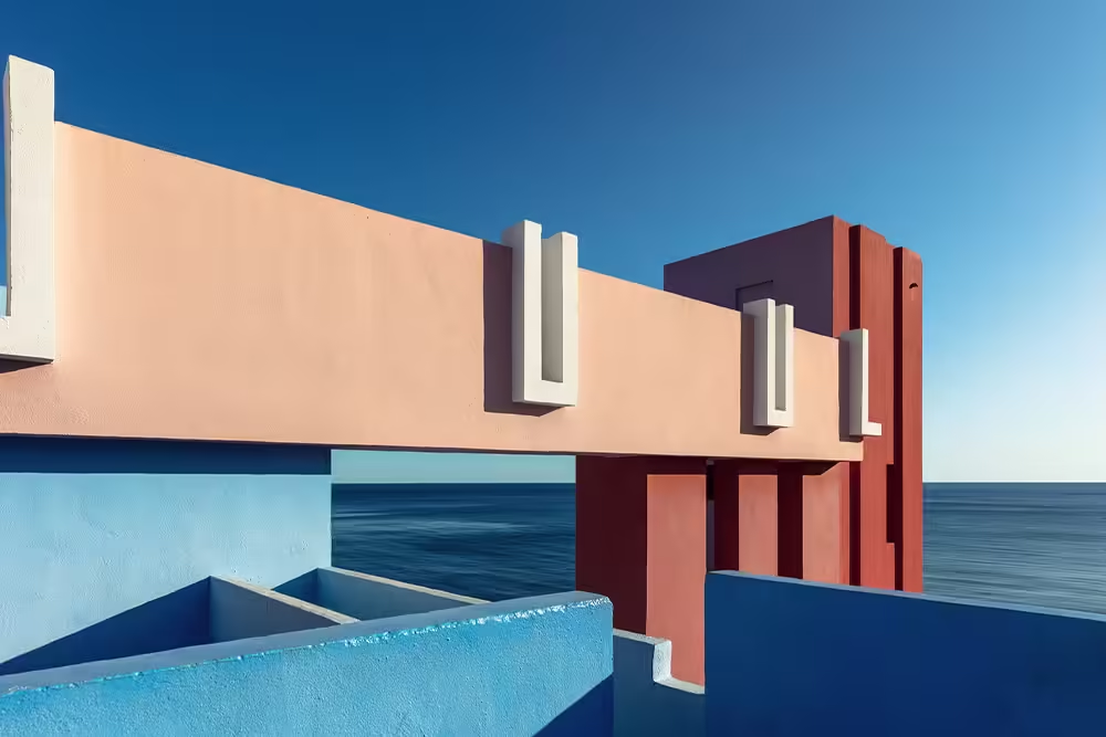
Architectural Styles and Color Schemes
The interplay between architectural style and color schemes is a fascinating dance where form and hue intertwine to create a unique visual language. Each architectural style has its own distinctive color palette, often reflecting cultural influences, historical context and even the materials used in construction. Understanding these connections allows us to appreciate the subtle nuances of color choices and how they contribute to the overall character of a building.
Traditional Architecture: Heritage Colors and Cultural Significance
Based on centuries of building practices, traditional architecture often has color schemes deeply embedded in local culture and history. These colors often symbolize religious beliefs, social status and even the natural environment.
- Mediterranean Architecture: Whitewashed walls, terracotta roofs and vibrant blue accents are characteristic of Mediterranean architecture, reflecting the region’s sunny climate and proximity to the sea. White reflects heat, terracotta blends with earth and blue evokes sky and water.
- Victorian Architecture: Victorian homes often have a rich palette of colors such as deep reds, greens, blues and yellows, reflecting the era’s love of ornamentation and detail. These colors were often used to create a sense of grandeur and opulence.
- Colonial Architecture: Influenced by European styles, colonial architecture often features muted tones such as white, cream and gray, reflecting the simplicity and practicality of the era. These colors also blend seamlessly with the surrounding landscape.
Modern Architecture: Minimalism and Bold Color Choices
With an emphasis on functionality and simplicity, modern architecture often adopts a minimalist color palette, using neutral tones to create a sense of clean lines and open spaces. However, modernism also allows for bold and unexpected color choices, often used as accents to highlight certain features or to create a sense of dynamism.
- International Style: Characterized by its sleek lines and geometric forms, International Style creates a sense of purity and objectivity, often using a limited palette of white, black and grey.
- Brutalism: Known for its raw concrete surfaces, Brutalism usually uses a limited palette of gray, brown and beige, reflecting the natural color of the material. However, some Brutalist buildings incorporate pops of color such as bright red or yellow to create visual contrast.
- Postmodernism: Postmodernism, with its playful and eclectic approach, often uses a wider range of colors, including bright hues and bold patterns, to challenge traditional notions of architectural form.
Eclectic Architecture: Combining Colors from Different Influences
Eclectic architecture draws inspiration from a variety of styles, blending elements from different eras and cultures. This eclectic approach is reflected in the use of color, where different influences are combined to create a unique and often unexpected visual experience.
- Art Deco: With its geometric patterns and luxurious materials, Art Deco architecture creates a sense of grandeur and sophistication, often using a rich palette of colors such as gold, silver, black and white.
- Mid-Century Modern: Known for its organic forms and use of natural materials, mid-century modern architecture often incorporates warm, earthy tones such as brown, green and yellow, reflecting the era’s connection to nature.
- Contemporary Architecture: Contemporary architecture reflects the diversity of contemporary design trends by embracing a wide range of color palettes, from minimalist neutrals to bold and vibrant hues.
Regional Variations: Climate and Local Materials Affecting Color Use
Climate and local materials play an important role in shaping color choices in architecture. In warmer climates, light colors are often used to reflect heat, while in colder climates dark colors can absorb heat and create a sense of warmth. The availability of local materials also influences color palettes, with regions using colors derived from natural pigments found in the region.
- Tropical Architecture: Tropical architecture often features bright, vibrant colors that reflect the lush vegetation and colorful flora of the region. These colors also help to create a sense of energy and vitality.
- Scandinavian Architecture: Influenced by the region’s long winters and limited daylight, Scandinavian architecture often uses a muted palette of white, gray and black, reflecting the natural colors of the landscape.
- Earth Architecture: Using local materials such as clay and mud, earth architecture often uses earth tones that reflect the natural colors of the soil, such as brown, yellow and red.
Case Studies: Iconic Buildings and Color Schemes
Iconic buildings around the world showcase the power of color to enhance architectural style and create a lasting impression.
- Taj Mahal: This iconic mausoleum in India is a masterpiece of Mughal architecture and features a white marble facade that reflects sunlight and creates a sense of ethereal beauty.
- Guggenheim Museum in Bilbao: This modern masterpiece by Frank Gehry features a titanium-clad exterior that shimmers and changes color depending on the light, creating a dynamic and captivating visual experience.
- Burj Khalifa: This Dubai skyscraper is clad in glass panels that reflect the surrounding desert landscape, creating a shimmering and iridescent effect.
By understanding the relationship between architectural styles and color schemes, we can appreciate the subtle nuances of color choices and how they contribute to the overall character of a building. Color is not just a decorative element; it is a powerful tool that can enhance architectural form, express cultural values and create a lasting impression.
Color in Urban Environments
Color is more than just a visual element in urban environments; it is a powerful tool that can shape our perceptions, foster community and even address urban challenges. From vibrant murals to carefully curated building facades, color plays a crucial role in creating a sense of place, enhancing livability and fostering a more vibrant and engaging urban experience.
Enhancing Urban Identity through Colorful Architecture
Color can be used to create a distinct visual identity that reflects a city’s history, culture and aspirations. Careful use of color can help define neighborhoods, highlight landmarks, and create a sense of pride and belonging.
- Historic Districts: Preserving the historic color palettes of older neighborhoods can help maintain a sense of continuity and cultural heritage.
- Modern Developments: New developments can use bold and innovative color choices to create a sense of dynamism and progress.
- Landmarks: Using distinctive colors to highlight important buildings can create a sense of visual interest and draw attention to important landmarks.
Color and Community Engagement: Promoting Social Interaction
Color can be used to create inviting and engaging public spaces that encourage social interaction and strengthen a sense of community.
- Public Art: Murals, sculptures and other forms of public art can add color and vibrancy to urban spaces, creating opportunities for community engagement and artistic expression.
- Street Furniture: Colorful benches, trash cans and other street furniture can add personality to public spaces and encourage people to linger and interact.
- Playgrounds: Bright and playful colors can create a sense of fun and excitement in playgrounds, encouraging children to play and socialize.
Addressing Urban Challenges: Color as a Tool for Revitalization
Color can be used to revitalize neglected urban areas, attract investment, promote tourism and foster a sense of pride and hope.
- Urban Renewal: Using color to brighten rundown buildings and streets can attract residents and businesses by creating a more inviting and warm atmosphere.
- Community Gardens: Colorful gardens and green spaces can transform neglected areas into vibrant and productive spaces, encouraging community engagement and environmental awareness.
- Traffic Calming: Using color to create visual cues such as crosswalks or traffic islands can help slow traffic and make streets safer for pedestrians.
Public Art and Color: Integrating Artistic Expression in Urban Design
Public art, often in vibrant colors, can transform urban spaces into canvases for artistic expression, encouraging creativity, promoting cultural exchange and enhancing the overall aesthetic of the city.
- Murals: Murals can add color and vibrancy to walls, transforming bland surfaces into works of art.
- Street Art: Often characterized by bold colours and unusual styles, street art can add a sense of energy and creativity to urban spaces.
- Sculptures: Colorful sculptures can add a touch of whimsy and interest to public spaces, creating opportunities for interaction and contemplation.
Case Studies: Successful Urban Color Initiatives
Many cities around the world have implemented successful urban color initiatives that demonstrate the power of color to transform urban environments.
- Guadalajara, Mexico: Guadalajara’s vibrant murals and colorful architecture have helped create a unique and engaging urban experience, attracting tourists and fostering a sense of community pride.
- Valparaiso, Chile: Valparaiso’s colorful hillside houses, known as “ascensores”, have become a symbol of the city’s artistic heritage and a popular tourist destination.
- Copenhagen, Denmark: Kop enhag’s use of color in public spaces, from colorful bike lanes to vibrant murals, has helped create a city that is both functional and aesthetically pleasing.
By embracing the power of color, cities can create more vibrant, engaging and livable urban environments. Color can be used to enhance urban identity, encourage community, address urban challenges and create a more beautiful and inspiring city for all.
Challenges in the Application of Color in Architecture
While color is a powerful tool in architecture, its application presents a unique set of challenges that architects must overcome to ensure both aesthetic appeal and functionality. From balancing artistic vision with practical considerations to addressing cultural sensitivities, color choices require careful planning and a deep understanding of the complexities involved.
Balancing Aesthetic Appeal with Functional Considerations
The ideal color scheme should strike a balance between visual appeal and functional considerations. While a bold color may be visually striking, it may not be appropriate for a space that requires a sense of calm or focus.
- Functionality: Color can affect mood, behavior and even productivity. Warm colors can increase appetite in dining areas, while cool colors can encourage relaxation in bedrooms.
- Accessibility: Color choices should consider accessibility for people with visual impairments, ensure adequate contrast and avoid color combinations that can be difficult to distinguish.
- Lighting: Natural and artificial lighting can significantly affect how colors appear. Architects should consider how colors will interact with different lighting conditions throughout the day.
Addressing Environmental Factors: Color Durability and Maintenance
Color choices should consider environmental factors that can affect their durability and longevity. Factors such as sunlight, moisture and pollution can cause colors to fade, crack or peel over time.
- Material Selection: Choosing paints and coatings that are resistant to fading, cracking and peeling is essential for the longevity of colors.
- Maintenance: Regular maintenance, such as cleaning and repainting, is essential to maintain the vibrancy and integrity of color over time.
- Sustainability: Architects are increasingly considering the environmental impact of their color choices, preferring environmentally sustainable paints and pigments that are low in VOCs and environmentally friendly.
Stakeholder Participation in Color Decision Making
Color choices can significantly affect the perception and experience of a building. Involving stakeholders, including clients, users and community members, in the decision-making process can ensure that the final color scheme is well received and reflects the needs and preferences of all parties involved.
- Client Consultation: Architects should work closely with clients to understand their vision and preferences for the building’s color scheme.
- User Feedback: Gathering feedback from potential users can provide valuable insight into the functional and aesthetic aspects of color choices.
- Community Involvement: Involving the community in decision-making can help ensure that the color scheme is culturally sensitive and reflects the values and aspirations of the community.
Mitigating Cultural Sensitivities and Local Contexts
Color is culturally significant and can evoke strong emotions. Architects should be sensitive to local contexts and cultural norms when making color choices and avoid colors that may be considered offensive or inappropriate.
- Historic Context: Preserving the historic color palettes of older buildings can help maintain a sense of continuity and cultural heritage.
- Religious Beliefs: Color choices should be respectful of religious beliefs and practices, avoiding colors that may be considered sacred or taboo.
- Local Traditions: Understanding local customs and traditions can help ensure that color choices are appropriate and well received by the community.
Future-proofing Color Choices Against Design Trends
Design trends are constantly evolving and what is considered fashionable today may be outdated tomorrow. Architects should strive to create timeless and adaptable color schemes, avoiding overly trendy choices that can quickly become outdated.
- Neutral Base: Using a neutral base palette such as white, gray or beige can provide a timeless foundation for the color scheme.
- Accent Colors: Adding pops of color with accents such as furniture, artwork or textiles can provide a touch of personality without overwhelming the space.
The Future of Color in Architectural Design
As a fundamental element of architectural design, color is constantly evolving, driven by technological advances, changing cultural values and a growing awareness of sustainability. The future of color in architecture promises a vibrant landscape of innovative practices, technological tools and global perspectives, shaping the way we experience and interact with built environments.
Emerging Trends in Sustainable Color Applications
Sustainability is becoming increasingly important in architectural design and color choices are no exception. By exploring eco-friendly paints and pigments, architects are minimizing environmental impact and promoting healthier indoor environments.
- Bio-Based Paints: Paints derived from natural sources such as plants and minerals offer a sustainable alternative to traditional petroleum-based paints.
- Low VOC Paints: Low VOC paints emit fewer volatile organic compounds, reducing indoor air pollution and promoting healthier living spaces.
- Recycled Pigments: Using recycled pigments from industrial waste or natural resources reduces the need for virgin materials and supports a circular economy.
The Role of Technology in Color Visualization and Selection
Technology is revolutionizing the way architects visualize and select colors. Virtual reality, augmented reality and digital color tools enable architects to explore color palettes, experiment with different combinations and create immersive experiences for clients.
- Virtual Reality (VR): VR technology allows architects to create immersive simulations of buildings, allowing clients to experience the impact of color choices in a realistic and interactive environment.
- Augmented Reality(AR): AR technology overlays digital information on top of the real world, allowing architects to visualize color schemes in real time on existing structures or during the design process.
- Digital Color Tools: Digital color tools simplify the color selection process by providing architects with a wide range of color palettes, color matching tools and visualization software.
Global Perspectives on the Innovative Use of Color in Architecture
Architects around the world are pushing the boundaries of color in architecture, inspired by different cultures, local contexts and new trends.
- Biomimicry: Architects are inspired by nature, incorporating colors and patterns found in the natural world into their designs.
- Cultural Influences: Architects incorporate traditional color palettes and cultural symbolism into their designs, creating a sense of place and identity.
- Urban Regeneration: Architects use color to revitalize urban areas, creating vibrant and engaging public spaces that nurture community and encourage social interaction.
Case Studies: Visionary Projects Redefining Color in Architecture
Visionary projects around the world demonstrate the transformative power of color in architecture.
- Kunsthaus Graz in Austria: Known as the “Friendly Alien”, this museum features a colorful, undulating facade that reflects the surrounding cityscape.
- Qatar National Museum: Designed by Jean Nouvel, this museum features a facade inspired by desert roses, with a complex interplay of light and color.
- Serpentine Pavilion in London: Designed by different architects each year, this annual temporary pavilion often features bold and innovative color choices that push the boundaries of architectural design.
Conclusion: The Lasting Importance of Color in Shaping Architectural Experiences
Color is not just a decorative element; it is a powerful tool that can shape our perceptions, influence our emotions and enhance our experience of the built environment. As technology advances and our understanding of color deepens, the future of color in architecture promises a vibrant and transformative landscape where color plays an important role in creating more beautiful, sustainable and engaging spaces for all.
Discover more from Dök Architecture
Subscribe to get the latest posts sent to your email.