


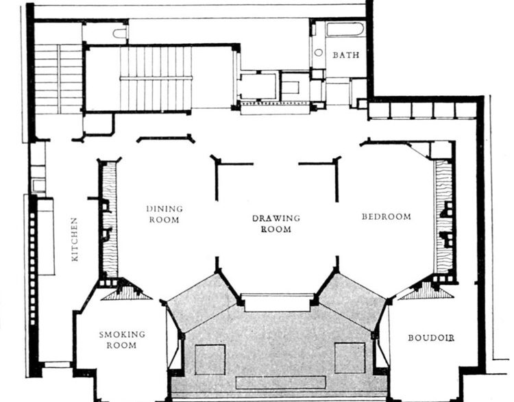
When you look at a plan, you don’t just see lines and rooms; you see choices about how people will move, meet, and feel. A plan is a prediction about behavior. It shows where we will stop, where we will hurry, where we will turn back, and where we will linger. Architects have sensed this for a long time, but in recent years, psychology and neuroscience have given this intuition language and evidence: order shapes experience.
A plan is also a kind of story. It encodes values such as privacy or display, order or play, control or freedom, and then invites users to bring them to life. Therefore, reading a plan can feel like reading the mind. We are not just deciphering measurements; we are deciphering the meanings and expectations embedded in walls, thresholds, and paths.
The Conceptual Origin of the Floor Plan
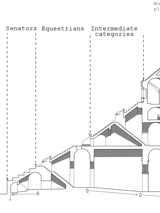
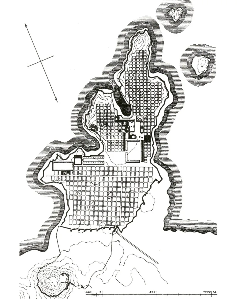
Long before CAD and tracing paper came into existence, builders drew buildings in diagram form. In ancient Mesopotamia, architects carved plans into clay; temples and houses were mapped with simple lines that can still be read as settlement plans today. A temple plan found on a Neo-Babylonian tablet from Sippar and floor plans of courtyard and room-based houses on tablets from the Ur III period are examples of this. These were not merely pictures, but operational instructions detailing where walls would be built, how rooms would connect to each other, and where ceremonial processions would pass. In other words, the “plan” emerged as a tool for coordinating collective action.
Renaissance theory transformed this practical drawing into an intellectual object. Alberti’s study systematized “line elements” by relating geometry and proportion to desired plans; centuries later, Durand’s atlases compared plans on a common scale, turning the settlement plan into a kind of catalog. When modern schools began training architects, the floor plan had become both a design tool and a way of thinking—an abstract map of relationships that could be approached logically, compared, and developed.
Architecture and Human Behavior: A Historical Perspective
In the mid-20th century, psychologists began studying behavior in real-world settings. Roger Barker’s work on “behavioral environments” redefined environments as patterns that direct action: gyms, classrooms, main streets… Each had arrangements that triggered specific behaviors. This moved design discussions beyond “style” to observable connections between spatial arrangements and what people actually do.
Urban planners and environmental psychologists added the mental dimension to this. Kevin Lynch showed how people create “visually perceivable” maps of cities, preferring clear paths, edges, and nodes; Kaplan explained why environments are perceived as understandable or confusing due to consistency and legibility. The conclusion for plans is clear: Layouts that clarify sequences and destinations reduce cognitive load; layouts that complicate routes increase cognitive load.
From Schematics to Semiotics: Why Is This Question Important?
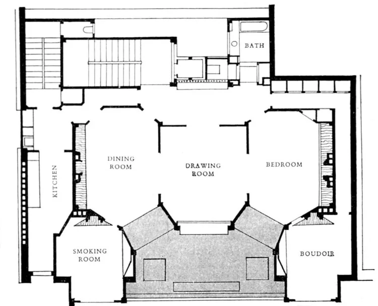
A plan not only organizes movement, but also communicates. Umberto Eco argued that architecture functions as a sign system. A plan “says” something before a final choice is made: a series of interconnected rooms (enfilade) expresses hierarchy, circular corridors express privacy, and an open central hall expresses collectivity. Users read these messages and act accordingly.
Semiotics helps explain why two layouts with the same square footage feel ethically different. One plan emphasizes backstage work and front-of-house presentation, while the other distributes ownership equally. These interpretations are not subjective whims; they are becoming standardized and increasingly measurable. For example, spatial syntax analysis allows designers to test what a plan “means” behaviorally before it is built, by relating the configuration characteristics of plans to encounter and usage patterns.
Growing Interest in Spatial Psychology
Two factors accelerated interest in this field: organized research and practical benefits. The Academy of Neuroscience and Architecture formalized the bridge between brain science and design in the early 2000s, creating a forum where laboratory findings meet design decisions. Hospitals, schools, offices, and residential buildings now benefit from this work, not because it is fashionable, but because it reduces errors, stress, and costs.
The evidence continues to mount. Hospital wayfinding studies show that clearer spatial arrangements and navigation cues improve navigation and reduce anxiety. Open-plan office studies reveal that acoustic and spatial zoning significantly affect cognition and well-being. Even ceiling height can trigger different thinking styles, directing people toward abstract or detail-oriented thinking. Each of these results is reflected in the plan first: The shapes and connections you draw on day one can make people more bold, calm, fast, or collaborative by day one hundred.
Memory and Movement: How Do We Find Our Way in Space?
Cognitive Mapping and Spatial Memory
Your brain constantly draws a silent map wherever you are. By connecting routes, edges, and destinations, it creates a mental image often referred to as a cognitive map. Deep within the medial temporal lobe, specialized cells assist in this mapping process: “place” cells fire at specific locations like pins on a map, while “grid” cells create a repeating grid that reliably provides distance and direction. Together, they support the fundamental actions that let you know where you are, where you came from, and how to get somewhere else.
Design choices can make this internal map clear or ambiguous. Clear landmarks and consistent sequences reduce the effort of remembering, while ambiguous corridors and similar-looking intersections increase cognitive load. The terms used by urban planner Kevin Lynch (paths, edges, districts, nodes, and landmarks) can easily be applied to interior spaces: a well-placed staircase is perceived as a node, a change in floor covering as an edge, and a gallery sequence as a district. When these elements are harmonious, people form stronger mental images and get lost less often.
Orientation in Buildings and Orientation in Cities
Finding your way in a city depends on long sightlines and outdoor cues: the horizon line, a river bend, a cathedral tower. Inside buildings, the horizon collapses. Sightlines shorten, decisions are made more quickly, and you must update your map at every door and every turn. Therefore, indoor navigation relies more on architecture (how paths connect, how thresholds frame views) and purposeful communication through graphic and tactile information. Arthur and Passini’s classic work addresses this as a common problem of form, signs, and verbal assistance: the building and information system must be designed as a whole.


Since indoor cues are limited, configuration is important. Spatial syntax studies show that people move more safely in layouts that reflect the overall structure of local connections. This is referred to as “understandability” in this field. When corridors, courtyards, and staircases reveal how the whole comes together, users can predict what lies around the next corner; otherwise, the experience becomes a maze of unrelated sections.
The Role of Corridors, Thresholds, and Circulation Paths
Corridors are not merely tunnels; they form the backbone of a building’s mental map. Aligned with key points and offering intermittent views of adjacent areas, corridors function like powerful “pathways” that organize memory. Those that suddenly curve, multiply at odd angles, or conceal junctions, however, become memory traps. Space-syntax theory explains this through configuration: routes that are both locally well-connected and globally well-integrated encourage natural movement and support quick, accurate choices.
Thresholds perform a delicate function. An expanded opening, a “pull” that lets in daylight, or a framed view indicates that you have entered a different space without losing your bearings. On the other hand, doors that change your direction and obstruct your field of vision interrupt the flow of the journey. Studies linking connectivity (places you can reach in one step) with integration (a space’s place within the entire network) show why these small design decisions matter: Each threshold determines whether it clarifies or erases the mental model people create as they move.
Design Patterns That Make Navigation Easier (or Harder)
Readability begins before the signs. A consistent backbone, consistent room numbering that corresponds to the actual geometry, and repeated wayfinding markers at decision points ensure that the plan is readable at a glance. Only then do graphic systems function optimally. Healthcare guidelines are very clear on this: typography, color, pictograms, and tactile cues must be consistent, minimal, and precisely placed where decisions are made; never before or after. When architecture and information design are incompatible, people hesitate, turn back, and seek help even in familiar buildings.
In complex indoor environments such as hospitals, better wayfinding systems have been proven to be linked to reduced stress and smoother operations. Research points to the combined effect of architectural cues, colors, and graphics with digital aids; when these are harmonized, visitors move faster and feel calmer. Even passively collected navigation data, such as anonymous requests made to the campus app, can reveal where the building confuses people and where the plan works. Evaluate these problematic points not as user error, but as design feedback.
Case Studies: Airports, Museums, and Hospitals
Airports are high-risk laboratories for navigation. The Amsterdam Schiphol system, developed and refined by Mijksenaar, is renowned for greeting passengers with simple, high-contrast signs from the curb to the gate, precisely when they need them. Recently, airports have been using eye-tracking studies to see what passengers actually notice and what they overlook, adjusting the placement and information density of signs accordingly. This principle can be applied to any public building: test the route from the visitor’s perspective and improve the plan based on measured behavior.
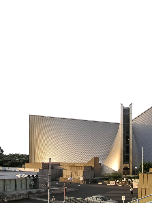
Museums demonstrate how the form itself can serve as a map. At the Guggenheim Museum in New York, the spiral rotunda and the descent through the skylight transform the visit into a seamless, comprehensible journey; because the whole can be perceived as a single spatial concept, you always know where you are within the whole. Contemporary research on museum layout also confirms this: when main paths are clear and options are limited to meaningful choices, people explore more and ask for fewer directions.
Hospitals are revealing the cost of confusion. National health guidelines address wayfinding as clinical infrastructure rather than decoration, because poor wayfinding increases anxiety, wastes staff time, and delays treatment. Research confirms that interior design features and wayfinding strategies can improve performance and reduce stress; the building plan is the first prescription. Clear entrances, clear interior views, consistent signage, and information at decision points are not branding initiatives but health measures.
Emotional Templates: How Do Spaces Shape Emotions?
The Psychology of Room Ratios
Proportion is not neutral. A small change in height or width can alter a room toward tranquility, focus, or sociability, because our brain perceives size and shape as clues about what kind of thoughts will occupy that space. Research shows that high ceilings tend to evoke a sense of freedom and encourage more relational, big-picture thinking, while low ceilings tend to direct people toward detail-oriented tasks. In other words, the same square footage can encourage different mindsets depending on the vertical dimension you choose.
Perceived enclosure also depends on simple ratios. As the height-to-width ratio increases, people report a stronger sense of enclosure, and once certain thresholds are exceeded, the sense of pleasantness decreases; meanwhile, visual permeability and light can counterbalance this feeling of confinement. Contemporary studies using VR and behavioral measurements continue to reveal that ceiling height and enclosure alter both aesthetic judgments and approach-avoidance tendencies. This proves that the ratio changes not only style but also emotions.
Culture and context add nuance. In experiments comparing German and South Korean participants, the same rectangular room was “read” differently depending on its aspect ratio and viewing angle. This does not invalidate universal tendencies; it reminds us that the ratio is not a formula you apply to people, but a dial you adjust according to them.
Light, Color, and Shadow in Floor Plan Design
Daylight is an element that determines mood and regulates the body clock. Beyond brightness and color rendering, light carries a circadian signal that helps synchronize sleep and wakefulness. Current international guidelines express this biological effect in terms of melanopic values, allowing you to plan exposure time not only based on the lux value at the desk but also according to the time of day. A plan that places rooms where morning light easily enters into open areas and protects bedrooms from bright light late at night works in harmony with biology, not against it.
Quality is just as important as quantity. The European standard EN 17037 and IES LM-83 formalize two concepts that every plan grapples with: providing sufficient daylight throughout the year (spatial daylight autonomy) and keeping excess under control (annual solar exposure). Meanwhile, glare science offers a way to test whether that striking window is actually uncomfortable when viewed; Daylight Glare Probability remains a useful indicator for predicting discomfort caused by bright skies and sunlight. These tools relate the lines on the plan to human comfort before concrete is poured.
Color and shadow complete the emotional scenario. A broad body of evidence shows that color can subtly yet reliably influence emotions and cognition. Therefore, decisions regarding long corridors, entrance halls, and focal corners should align color tones with their functions. Finally, shadow is not the enemy of light; it is what gives light readability. Plans that create shadow areas (deep recesses, side-lit niches, layered thresholds) allow the eyes to rest and reduce fatigue caused by glare. Use colors to indicate intent and shadows to humanize brightness.
Closed Plan or Open Plan: Security or Freedom?
Open plans promise flexibility and connectivity, but the human nervous system has its limits. Extensive research conducted in offices shows that switching from cubicles to open workstations reduces face-to-face collaboration and lowers satisfaction, largely due to noise and loss of privacy. The result is a paradox: when everything is visible, people retreat to their headphones and messages. Freedom without a place to retreat becomes stress.
Closed spaces are not inherently bad; when used purposefully, they serve as a security measure. Classic security-focused design frameworks like defensible space and CPTED also yield good results inside buildings: create pathways for natural surveillance, clarify area boundaries, and control access so that people feel a sense of ownership over their space. In homes, this means you can open up the kitchen to the living room for socializing, but still preserve quiet corners with short turns, partial walls, and fully closing doors. The key is not choosing “open” or “closed,” but using both together to allow people to choose whether to be out in the open or retreat.
Levels of Sincerity: Private Spaces and Public Spaces
Most homes function best with a slight gradient from public to private space. Christopher Alexander called this the “intimacy gradient”: being greeted at the entrance, spending time in living areas, retreating to bedrooms. When this sequence is disrupted (bedrooms become exposed to door-knocking views, kitchens become isolated beyond the family area), daily life becomes a series of awkward compromises. A clear gradient allows hospitality and privacy to coexist without friction.
Psychology also supports this model. Irwin Altman’s privacy regulation theory defines privacy as a dynamic need—sometimes we want to communicate, sometimes we don’t—and good environments give people the opportunity to control this balance through doors, turns, thresholds, and sightlines. Add the old but resilient “view-shelter” pairing (being able to see outside without being seen) and you get a plan logic: orient common rooms toward the view, nest corners and bedrooms toward the shelter, and connect them with transitions that allow people to instantly adjust their contact levels.
Quiet Homes, Stressed-Out Offices
Health design provides concrete data on soft feelings. Roger Ulrich’s groundbreaking research showed that surgery patients with a view of trees recovered faster and needed less potent painkillers than patients facing a blank wall. This is an early and definitive sign that small environmental differences can alter physiological outcomes. Subsequent evidence has shown that better organization, views, and single rooms are associated with reduced stress and safer care. When applied to your home, the lesson is simple: Place rooms with natural light and views where they are accessible, and give each person a door they can control. Calm has a plan.
In contrast, offices often inadvertently increase stress. Surveys and behavioral studies all point to the same conclusion: Open-plan environments compromise acoustic privacy and reduce face-to-face communication, while background noise increases discomfort and tension. If you must use an open-plan layout, you should create actual quiet rooms, separate noisy areas with storage and glass, and organize teams according to task intensity, so no one has to struggle with the floor plan to think. Freedom works best when a place to retreat is always just a step away.
Behavior Scenarios Embedded in Architecture
Design for Expected Behaviors
Architecture is full of expectations. A school lobby expects visitors to slow down, organize themselves, and set the tone for the day; a clinic reception area expects people to line up, find their way, and calm down. Environmental psychologists define these patterned moments as “behavioral settings” — stable combinations of space, time, and activity that reliably guide people’s actions. Thinking this way transforms design from background decoration to scriptwriting: entrances that regulate the pace of arrivals, corridors that measure flow, rooms that frame participation.
The scenario is partially written through possibilities that show what is possible at a glance. It implies climbing a staircase, resting on a bench, sitting on a low wall. James J. Gibson’s classic idea is useful here: possibilities exist in the relationship between the body and its environment, so a plan that includes wide steps, warm light, and a clear destination not only makes the stairs “possible” but also makes them an easy and likely choice.
Social distance is also predetermined. The spacing between seats and the size of tables speak a silent language that determines how close we stand, how loudly we speak, and how much we linger. Edward T. Hall’s proxemics theory names these zones and reminds us that they vary according to culture. Therefore, unless we carefully adjust the dimensions, furniture, and viewing angles, arrangements that are suitable for one group may be uncomfortable for another.
How Do Social Structures Encourage or Discourage Social Interaction?
Layouts can make chance encounters inevitable or rare. Spatial syntax research shows that the way spaces connect to each other—that is, how “integrated” a plan is—predicts where people naturally pass through and gather. Corridors and rooms that reflect the structure of the whole tend to be easier to read and become places where movement intensifies; where movement intensifies, gathering and conversation follow. Designers can use these configuration cues to place encounters where they will be useful: near shared resources, in open spaces, along clear spines.
Vertical connections are powerful social intensifiers. When staircases are central, visible, and attractive, they not only increase physical activity but also add quick, informal encounters to daily life. Public health studies show that simple, well-placed signage and attractive staircases increase stair use, while active design guidelines encourage wider and more inviting staircases for daily traffic. A communicative “monumental” staircase in an atrium often serves as a social stage between floors.
Furniture completes the picture. Circular or semi-circular seating arrangements balance conversation, while rows and narrow gaps hinder it. Studies conducted in classroom and group settings repeatedly show that layout and distance affect participation. This proves that small design choices can either enliven or stifle the social life of a room.
Stopping, Transition, and Ritual Areas
Good buildings breathe; they don’t sway from outside to inside. Threshold areas—porches, foyers, entry halls, extended landings—create a gentle slope where our steps, our voices, and our attention can shift. Contemporary studies emphasize how these intermediate spaces regulate movement and support brief social contact. Classical design language recommendations, however, treat the entrance transition as the beginning of the home’s “intimacy gradient.”
Inside, small breaks are important. A window ledge at the end of the corridor, a bench next to the elevator, a niche in front of the meeting room… Each of these helps people rest, meet, or wait without obstructing the flow of traffic. When the plan arranges these micro-stops along clear sightlines, the building gives a regular and courteous impression; when it skips them, people create awkward waiting areas at doorways and in corridors. The simplest test is experiential: walk the corridor from end to end and note where your body wants to slow down.
Museums clearly demonstrate these lessons. The entrance sequences that create a calm threshold in front of the galleries—framing the first view, softening the light, clarifying the options—reduce confusion and focus attention. Even when looking at case studies, redesigning lobbies and wayfinding systems in areas with such transitions improves flow and reduces the cognitive load of the visit.
Architectural Tips and Unwritten Rules
We read buildings without realizing it. Handrails, step heights, counter edges, and sightlines whisper instructions about where to stand, how fast to move, and whether we should participate or observe. In Gibson’s terms, these are “affordances” — action opportunities that people perceive directly — so the plan’s “messages” are not metaphors, but practical clues embedded in the form.
Certain cues shape security and civility. Defensible space theory and CPTED guidelines demonstrate how regional delineation, natural surveillance, and the irregularity of clear access routes prevent crime while also fostering a sense of responsibility among daily users toward their surroundings. What matters is not reinforcement, but clarity; edges and landscapes that make social rules understandable without a single sign.
Other cues also encourage healthy choices. Observations at transportation stations, offices, and campuses show that warnings at decision points and small improvements near staircases lead to measurable increases in stair usage. When stairs are easily visible and enjoyable to use, these reminders become even more effective. This proves that architecture and information are complementary elements.
Japanese Genkan, European Living Rooms, American Kitchens
In Japan, the genkan is a designated pause area designed with ritual in mind. A low, durable floor (tataki) and a raised step (agari-kamachi) mark the boundary between the street and the home. Shoes are removed, slippers are worn, and brief conversations can take place before stepping inside. This is an architectural element designed for cleanliness, respect, and gradual hospitality. The detail is very small, but its effect on behavior is very large.
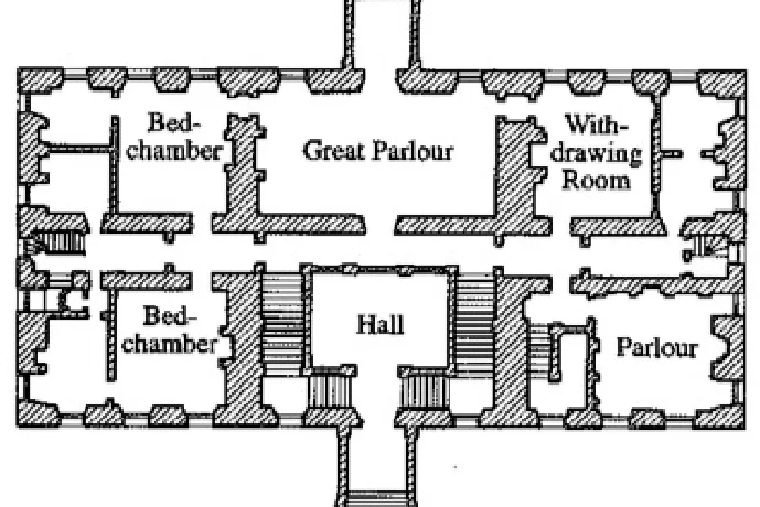
The parlor was like a stage at the front of the house. In the 18th and 19th centuries, it was used to receive and display guests, separating them from the more private rooms at the back. Etymology reveals the function of this room: derived from the French word parler (to talk), parlor, while social history explains how this room lost its importance as families preferred less formal “living rooms” where the transition from public to private space was smoother. The arrangement here determined status and protocol before anyone spoke.
In the United States, the story of the kitchen has moved from the background to the forefront. While the 1920s Frankfurt Kitchen viewed cooking as an efficient workflow, post-war American life brought kitchens to the forefront, merging them with dining rooms and family rooms, and later focusing life around the kitchen island. From MoMA to the Smithsonian, museums have chronicled this evolution, while current debates about open kitchens reveal how a design can celebrate sociability while also exposing clutter and noise. The narrative continues to evolve alongside culture.
The Cultural Mind Behind the Floor Plan
How Does Culture Determine Spatial Priorities?
Every culture teaches people how close to stand to each other, how loudly to speak, and where to place the door. Anthropologist Edward T. Hall called these unspoken rules “proxemics,” and they explain why the same room can feel warm and welcoming to one group but uncomfortable to another. Space is not neutral; it is a social agreement shaped by upbringing and habits.
These arrangements are also evident in the plans. In environments where Muslims are in the majority, the interior layout of homes generally balances hospitality with modesty. A series of stages are organized, from welcoming guests to family life, and the view is preserved without disturbing guests by using courtyards, screens, or sloped entrances. Studies examining Muslim homes repeatedly reveal that privacy and hospitality are at the center of spatial priorities. Therefore, inward-facing homes and layered thresholds are commonly seen, regardless of climate and income level.
Other traditions assign different priorities to the plan. Historically, Japanese houses use an engawa, a veranda that is neither entirely inside nor outside, to slow down the entrance, filter the view, and choreograph encounters with nature. In northern China, siheyuan arrange family life around a protected courtyard, with orientation and hierarchy encoded along a north-south axis. In both cases, culture translates geometry into behavior.
Regional Settlement Archetypes: From Courtyards to Farms
The Moroccan riad is an example of interiority. Thick outer walls keep the street outside, while life flows around a courtyard, usually divided into four sections, adorned with plants and featuring a central water feature. This layout responds to the climate through shade and evaporative cooling, while also addressing social values through gradual privacy; the exterior of the house appears simple, allowing beauty and family life to flourish within.
A century later, on the other side of the world, American farmhouses offered a different promise: build low and long houses, open up the living room, dining room, and kitchen to each other, and install large windows overlooking the garden. Post-war prosperity, car culture, and the ideal of a comfortable family life enabled farmhouses to dominate the suburbs from the 1940s to the 1970s. The single-story layout still symbolizes comfort, mobility, and connection to the outdoors today.
Between these two extremes lie the Chinese siheyuan courtyards, which calm the dust and noise, arrange rooms according to status and season, and face the sun. Contemporary research documents how this type adapts to modern needs while preserving its fundamental logic of enclosed space, orientation, and shared open air.
Gender, Power, and Domestic Politics
Houses have long symbolized power. In Ottoman and South Asian cultures, houses were divided into selamlık or mardana (front, open to guests) and harem or zenana (family, women’s quarters) areas. These were not merely decorative names, but architectural divisions that regulated who could enter, who could see, and who could be seen. The palace harem is the most famous example of this, but the same logic was reflected in ordinary homes through doors, screens, and separate courtyards.
Victorian Britain implemented a different map based on the ideology of “separate spheres,” assigning men to public affairs and women to private domestic tasks. This worldview was also embodied in house plans: front rooms for display, back rooms for service, circulation areas separating classes and genders. Historians of the period note how these beliefs were literally reflected in homes and transformed respectability into a spatial system.
Today, gender-conscious designers are examining this legacy, questioning how to support the security and autonomy of these arrangements without reproducing the division. Reading the politics of past plans helps us determine doorways, sightlines, and neighborhood relationships that enhance freedom of movement while preserving privacy.
Religious and Symbolic Spatial Geographies
Religious orientation generally determines the compass of a plan. In mosques, the qibla axis directs prayer towards Mecca and organizes movement and hierarchy throughout the plan; this orientation can also determine where families place their prayer corner in their homes. Here, orientation is not a stylistic choice, but a spatial theology.
Chinese feng shui creates another type of orientation by aligning rooms, doors, and thresholds with qi flows and local landscape conditions. While interpretations vary, authoritative sources define it as a system for the placement and arrangement of buildings in harmony with the environment and cosmology. This logic has influenced both historical structures and some contemporary homes.
In the Indian tradition of Vastu Shastra, classical texts link the layout and openness of rooms to directions and the balance of elements, connecting daily life to the movement of the sun and the winds. If we consider these systems as beliefs, heritage, or intuitive methods, they demonstrate that meaning and rituals can be fixed as firmly as a building plan.
Translating Cultural Logic into Modern Architecture
What matters is not copying the forms, but carrying the intentions. Courtyard houses are being redesigned worldwide to provide shade, cross ventilation, and a social focal point without compromising privacy. Recent studies on adaptable siheyuan renovations show how we can update the layouts for contemporary living while preserving the courtyard’s climatic and social benefits.
Climate-responsive applications are clearly inspired by cultural precedents. Reports on tropical and subtropical regions highlight architects who are reviving local logic (deep eaves, porous coatings, shaded courtyards) to passively cool homes and maintain community resilience in response to rising temperatures. These choices are both cultural and environmental in nature: they shape daily life around shade, breezes, and shared open spaces.
When cultural promises still hold their significance, even familiar types evolve. Conservation experts and housing agencies note that interest in farmhouses is reviving due to their accessibility and the ease of flow between indoor and outdoor spaces. This is a mid-century ideal that has taken on new meaning for aging and single-story family living. In public projects, designers are borrowing the spirit of engawa, creating soft thresholds that invite public life without eliminating boundaries. Culture continues to be the silent author behind the plan.