
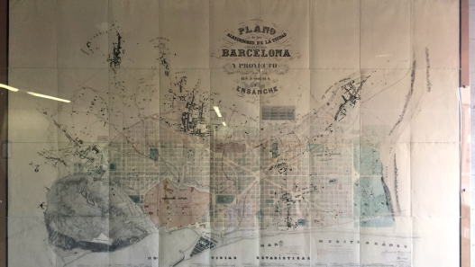
Traditional urban layouts (grids, boulevards, combined block patterns) create a strong visual and spatial grammar. Cerdà’s plan for Barcelona, for example, divided the city into equal blocks of 113 m×113 m with a depth of 20 m and a height of 16 m, built up on only 2-3 sides and with corners cut at 45° to let in light and turn trams. Such regularity makes the city imaginable: residents easily recognise roads, edges, landmarks and districts.
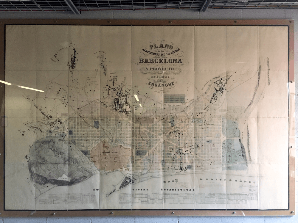
Figure: The 19th-century Eixample plan of Barcelona, designed by Ildefons Cerdà, showing uniform octagonal blocks (“manzanas”) with chamfered corners for sunlight and traffic flow.
Aldo Rossi similarly argued that the repetition of historic building “types” (urban artefacts) gives a city continuity of form and memory. Zoning and design codes can enforce this unity by dictating alignments, materials and window patterns.
However, a rigid form can conflict with changing uses. Rigid Euclidean zoning (residential, commercial, industrial separation) often leads to isolated areas, reducing street life and visual interest. In contrast, more flexible or mixed-use schemes allow shops, offices and homes to coexist, increasing vitality but potentially causing visual clutter (advertisements, various façade styles, etc.). Transition zones or buffers are often used: for example, a pedestrian-orientated street lined with ground-floor retail can soften the change in use by gradually giving way to quieter low-rise housing. In practice, cities balance legibility and change by grouping like with like at one scale (e.g. a uniform row of brownstones) while allowing for variety at another (e.g. different storefronts, infill developments).
- Grid vs Organic: Orthogonal grids (Manhattan, Barcelona) enforce geometric order; winding streets (Paris historic centre) create variety but can still feel coherent if building heights and materials are consistent.
- Block size and form: Small blocks (<100 m) encourage walkability but require careful design of daylight access; large blocks facilitate traffic but can feel monolithic. Design elements such as chamfered corners, mid-block transitions or inner courtyards (e.g. Vienna’s peripheral blocks) help to avoid monotony.
- Typological repetition: Repetitive housing types (e.g. uniform row houses) create a visual rhythm. As Lynch notes, clear “paths, edges, zones” are the building blocks of a legible city image. However, too much uniformity can stifle innovation, so many cities allow variation (colour, ornamentation, contemporary forms) on a site-by-site basis within a common framework.
- Aesthetic order: Research shows that form-based design rules (focusing on building form and public space) result in streets that are perceived as more beautiful and coherent than traditional zoning or no regulation at all. In fact, applying a public “grammar” – setbacks, cornice lines, facade bays – creates unity, while laissez-faire development can lead to chaotic sign clutter and discordant volumes.
Balancing these factors means giving districts a recognisable pattern – a city “language” – while allowing sufficient flexibility for economic and cultural change. The tension between a unified cityscape and a dynamic mixed-use environment is at the centre of modern planning debates (echoing Jane Jacobs’ advocacy of diversity over sterile segregation). In sum, principles of urban morphology (grid, block, street hierarchy) create coherence, while zoning strategies (rules of use, mixed-use overlays) enable adaptability – and contemporary planners seek a middle ground between them.
Infrastructure Orientated Planning: Transit, Water and Identity
Modern urban plans often prioritise infrastructure, both in terms of functionality and configuration. In transit-oriented development (TOD) models, transit lines and stations connect dense, mixed-use neighbourhoods. Tokyo is a prime example: Over the century, it has built a “rail+pedestrian” fabric where shopping centres, offices and housing are built directly around stations. Tokyo has become the most transit-orientated city in the world and TOD has become essential to its urban fabric and identity. Similarly, Zurich and Vienna integrate tram and railway lines as visible backbones: Zurich’s Limmatquai tram corridor, for example, defines the riverside promenade, while Vienna’s Ringbahn encircles the historic core. In both cases, the infrastructure axis doubles as a public space and design motif.
Figure: The Copenhagen “Finger Plan” of 1947 is superimposed on a city map. Development is orientated along five radial corridors (fingers) of transit lines, with green wedges between them.
In Europe, national transit (S-Bahn in Germany/Austria, RER in Paris) is often reflected in urban form: linear urban growth along the tracks, generous plazas or arcades at major stations, and consistent materials (stone pavements, canopies) that create a legible cityscape. Asia’s megacities similarly use transport as an aesthetic driver (imagine Seoul’s elevated railway lines with artistic columns or Singapore’s MRT interchanges connecting shopping centres and parks).
Green infrastructure and “sponge city” design also link function to form. Cities combat flooding and heat islands with systems that are at once technical and decorative. For example, Wuhan’s sponge city initiative uses green roofs, permeable pavements and constructed wetlands to absorb rainwater. These features double as public space, such as rooftop gardens and park-like wetlands, giving neighbourhoods a lush green character. Bioswales and rain gardens (planted street-side swales) are now common in cities from Copenhagen to Portland, meeting drainage needs while enhancing the streetscape. Even sanitary and utility corridors can become formal elements: Think of Tokyo’s ornamental grilles and lampposts covering storm drains, or the Neo-Gothic decoration on Budapest’s bridges hiding pipelines.
Thus, infrastructure-first planning ensures long-term efficiency (less traffic, better flood control) and a clearer city image. Transport lines and green networks create backbones and edges that residents recognise, making different neighbourhoods into a coherent whole. In summary, when roads, tracks, waterways or power lines are treated as design elements (with special lighting, art, landscaping), they support function and become part of the urban identity.
Regional Traditions in Public Space Design
Across regions, planners balance technical performance and aesthetics in different ways. In Northern/Central Europe (e.g. Copenhagen, Zurich), order and hierarchy are emphasised. Pedestrian zones and squares often follow a clear spatial stratification: for example, a central square leads to a cathedral or government building, with secondary squares feeding into it. Material choices are durable and lightweight (granite paving, restrained lighting) and visual clutter (commercial signage, overhead cables) is tightly controlled. Swiss and German cities maintain rigorous standards of cleanliness and street furniture: bins and bicycle racks are built-in, public art is curated, and each station or square has a uniform wayfinding design. Maintenance regimes are strong – plazas are swept frequently, plants are pruned, power outages are repaired promptly – so that infrastructure (lighting, seating, drainage grids) looks as seamless as it functions.
In East Asia(especially Japan) the approach is highly integrated and layered. Large railway stations (e.g. Tokyo Station, Osaka Umeda) become vertical cities: multi-storey concourses with shopping arcades, open pedestrian flow and co-located bus and metro centres. Public space is zoned according to function (e.g. an “ekimae” plaza outside the station, quieter side streets, sales/kiosk streets) but designed with precise geometry. Clutter is minimised through regulations (signage laws) and cultural norms (private advertisements tend to be smaller). Narrow alleyways often have built-in utility tunnels, so there are no overhead cables. Street trees and benches are placed at disciplined intervals. The result is a high-tech layout: signage is generally clean (dots against billboards) and areas feel uncluttered despite the high density.
In North America, by contrast, there are different approaches. Old plazas (Philadelphia’s Centre Square, San Francisco’s Union Square) are designed around monuments and large open spaces, while new ‘pedestrianised’ streets (Times Square, Portland’s Pearl District) often combine formal paving with pop-up kiosks, public art and festival lighting. Many cities in the US have historically tolerated more signage and vehicular infrastructure in public space. However, recent placemaking trends (parklets, pedestrian plazas) prioritise flexible use and whimsy: Seattle’s Pike Place, for example, features colourful mosaics, while Mexico City’s Reform Street has replaced traffic with bike lanes and native plants. Coordination between street infrastructure (curbs, trees, bicycle parking) and aesthetics is often developed through design codes (e.g. San Francisco’s Streetscape Manual) and public involvement. In general, cultural expectations influence the outcome: where civic pride is high (Tokyo, Zurich), public spaces are celebrated and kept tidy; where budgets or traditions differ, streets may show a more informal ephemeral character.
A key factor in all areas is the invisible co-ordination of function and form: drainage, lighting, seating and signage should serve safety and access while contributing to the look and feel of the space. Research shows that the application of design rules (as in many European plazas) tends to be perceived as more attractive and organised. Where technical requirements (e.g. kerb heights, grade separation) are well integrated into the initial design, the result is excellent – for example, a curved pavement that both provides drainage and guides pedestrians without a visible ‘gutter’ interrupting the plaza surface. The most successful public spaces, such as Tokyo’s station squares or Barcelona’s superblock parks, coordinate every element (benches, bollards, lighting, signage) into a unified aesthetic, while hiding as much as possible the clutter behind the scenes (cables, pipes).
Design Codes and Free Market Cityscapes
In some cities municipal codes strictly dictate building form, while in others developers direct the skyline. Berlin’s Baulinienplan approach (dating back to the 1950s) fixes an unbroken street wall: new buildings should be aligned with the historic façade line. This ensures consistent block facades and a uniform urban skyline, even as styles evolve. Paris goes even further: The Plan Local d’Urbanisme (PLU) mandates façade harmony and height limits. For example, Haussmannian boulevards require stone facades, matching cornice lines and consistent parapet heights. Parisian rules even dictate colour palettes (e.g. “up to 12 shades” of green/grey for shutters in some districts) and require facades to be cleaned or restored every 10 years. The PLU also prohibits incompatible materials or reflective glass on historic streets. These prescriptive frameworks make Paris look unified and legible from a distance – you can recognise a 19th century block by its mansard roofs and limestone.
In Houston, by contrast, there is no formal zoning law for land use. Buildings rise to market-determined specifications, subject only to general building codes (setbacks for light, minimum parking spaces, floodplain rules). The result is eclectic: a strip of skyscrapers can share a street with a motorway petrol station and a bungalow. Similarly in Dubai, the explosion of wealth has led to the free placement of iconic towers with only basic height or setback rules. There are few requirements for a unified street frontage – each developer often commissioning a unique design. These laissez-faire environments maximise flexibility and allow for rapid change, but urban critics note that they can sacrifice human-scale continuity and walkability. For example, a street in Houston may not have a continuous pavement wall (buildings are set far back), making the pedestrian space feel undefined.
Summary of approaches:
- Berlin: Projected building line(Baulinie) and block structure; contemporary buildings are still expected to follow plot lines and street rhythm (although the style may vary).
- Paris: PLU and heritage codes create a harmonious streetscape by imposing strict façade and height rules (e.g. “facades must be compatible with neighbouring buildings”); only in certain new areas are more creative forms allowed.
- Houston: No land-use zoning; a complex zoning code regulates car parking, flood zones, etc., but architects are free to design a variety of facades. In reality, the building form is market-orientated (as one planner put it, “Houston has no zoning but lots of vacancies”).
- Dubai: Masterplans outline urban extensions, but within them developers build iconic buildings with their own logic. Visual coherence comes from city-wide image creation (skyline views) rather than block-by-block regulations.
Where rules exist, they improve legibility and walkability in the long term: predictable cornice lines and pavement rhythms make streets easy to navigate. However, overly strict rules can stifle innovation or make projects costly. Cities like Amsterdam or Vienna take a middle path: they allow creative contemporary architecture but maintain a fixed street wall and scale, often through design review boards. The debate continues: how to codify enough to maintain consistency, but allow the skyline to evolve?
Streets and Blocks: Functional Cross-Sections with Urban Aesthetics
Modern block and street section design should reconcile technical needs (deliveries, emergency access, light, air) with a pleasant public space. Different traditions provide examples in this regard: Vienna’s classic Hof (courtyard) blocks create clear edges by placing buildings flush along the street, while car parking, service rooms and stairwells extend around the central courtyard. This ‘perimeter block’ maximises light and social space within the block by providing lively street frontages (shops and apartments meet the pavement) and a private green interior. Facades are often modulated with bays or lanes so that even long block edges feel rhythmic. Regulations (often in form-based codes) mandate things like minimum window sizes, cornice height or facade articulation to ensure a human-scale, uninterrupted street wall.
In Tokyo, plots are often very narrow and deep, with multi-storey wooden or concrete houses side by side. To meet fire and daylight standards, many narrow streets have height limits based on width (2-3 storeys maximum on 6 metre streets) and even internal lighting wells are mandatory. Buildings tend to set back or change rooflines to let in air; alleyways behind the street harbour rubbish and bicycles. Yet the front façade often features transparent ground floors or canopies, allowing pedestrians to interact even on congested roads. The Japanese approach is quite progressive: many small buildings meet varying needs (shops on the first floor, apartments above) with little disruption to the façade line.
The historic apartment and brownstone grid of New York City shows another pattern: long linear blocks (80-200 m) divided by streets. A typical brownstone is a narrow row house of 5-6 storeys, with a landing (which raises the living level for light and privacy) and a backyard for fire exits. The 1916 Zoning Ordinance introduced setbacks: taller buildings had to set back above a certain height (sky exposure plane) to keep light at street level. This created the tapered “wedding cake” style of streets. Modern legislation continues to require street trees and fixed-width curb cuts to make each block section appear pedestrian-friendly. Facade modulation is achieved through proportions: even if each brownstone looks the same, small differences in colour or entrance detailing create visual interest without disturbing the rhythm of the block.
In all of these cases, technical requirements (load-bearing core, stairs, parking, daylight courtyards) are tucked behind or between publicly visible elements. For example, curb cuts for deliveries are kept narrow or placed at lane ends; blank service walls are hidden within courtyards or behind vegetation. Design strategies such as step-back (upper storeys set back) and setback (differences in façade depth) help to reduce monotony and allow light to diffuse into the pavement. Modern form-based regulations clearly codify these: for example, they allow a continuous cornice up to 12 metres, but require a 3 metre setback for subsequent storeys. This ensures a closely defined street wall and a horizon line running above.
The street sections and blocks are designed as integrated systems. The aim is a walkable, legible streetscape that accommodates services and safety. Form-based codes summarise this by focusing on physical form rather than use: they define building-ground relationships, façade patterns, and streetscapes that fit the urban vision. Properly applied, these rules ensure that even as cities densify, each street remains an organised, attractive public space rather than a chaotic jumble of functions.
Discover more from Dök Architecture
Subscribe to get the latest posts sent to your email.