

Material juxtaposition is the deliberate placement of different materials side by side, thereby making their differences clear. Stone cools the hand while wood warms it; glass melts the mass while brick brings it together; and the eye reads these edges to understand the room. The encounter is a message, because contrast transforms silent matter into a readable sentence about gravity, craft, and time. In good work, the seam is not a scar but a meaningful line that helps tell the truth about how the building stands.
Definition of the Concept of Side-by-Side Placement of Materials
This is more like a grammar for creating perception than a shopping list for a final coat of paint. By contrasting rough with smooth, heavy with light, and opaque with translucent, it choreographically arranges how project bodies move and how light falls. The aim is clarity, not showiness, so each material speaks with its own voice while also enhancing the others. This is architecture as dialogue rather than monologue, where adjacency generates understanding.
Origins and theoretical foundations
This idea stems from tectonic thinking, which is read through how the parts of a building come together and function. From Semper’s concepts of fabric, hearth, frame, and earth to modernism’s call for the authenticity of materials, the theory has been intrinsically linked to ethics. Phenomenology later centered on touch, smell, and time, making patina and wear part of the narrative. Among these threads, juxtaposition acts as the motor that transforms structure and shell into culture.
Materiality and contrast in architectural discourse
Materiality addresses what objects are made of and how they shape the atmosphere, while contrast explains why we notice them. The discussion ranges from minimal unity to collages with high expressive power, but both depend on the sensitivity of the joints and the honesty of the surfaces. Contrast balances scale and mood, so that thin steel reveals the weight of thick stone, and matte plaster tempers the brilliance of glass. In discourse, these choices are as much ethical positions as they are aesthetic ones.
Why is it important to place materials side by side in design?
Side-by-side placement teaches users how to read a space and trust its structure. It anchors orientation, making thresholds, bases, and crowns distinct, so rooms feel solid and navigable. Additionally, local stone, recycled wood, or cast metal connect to social memory, telling a story about origin and labor. Over time, the materials’ interplay records weather conditions and usage, transforming the building into a slow archive of its life.
Key terms: material palette, material contrast, tectonics
The material palette is the collection of carefully selected materials chosen for a project based on their characteristics, properties, and ability to communicate. Material contrast is the measured difference between these materials, adjusted by texture, color, density, and reflectivity to sharpen perception. Tectonics is a highly expressive logic that shows how forces move through joints, layers, and supports, and how craftsmanship becomes visible. Together, they form a conceptual toolkit that gives meaning to the material.
The Role of Material Combination in Architectural Practice
Placing materials side by side, displaying their differences, transforms the building into a readable object, allowing users to perceive weight, lightness, warmth, and time. This is as much a cultural decision as it is a technical one, because where objects come together reveals the building’s values and how it was made. In tectonic thinking, these points of union are not decoration, but proof that structure, cladding, and craftsmanship are in harmony. Read this way, contrast becomes a design ethic that links performance, expression, and memory.
Selecting the appropriate material palette
Start with climate and lifespan, then select a small group of materials that can be clearly and coherently expressed together. Evaluate durability, maintenance, and compatibility alongside environmental impact, so the palette reflects both beauty and a sense of responsibility. Feature-based tools for concrete carbon help compare options without reducing everything to a single metric. A concise palette that is low-carbon, repairable, and legible lends architecture a consistency that grows more beautiful over time.
Balancing aesthetics, function, and context
Good pairings strike a balance between what the eye desires, what the site requires, and what the community can sustain. Local presence, craftsmanship, and climate performance should guide choices, so that beauty arises not from novelty but from appropriateness. When these factors are in harmony, the building is not staged but perceived as inevitable. The result is a form with high expressive power that also supports net-zero and long-lasting, loose-fitting goals.
Examples of successful material matching
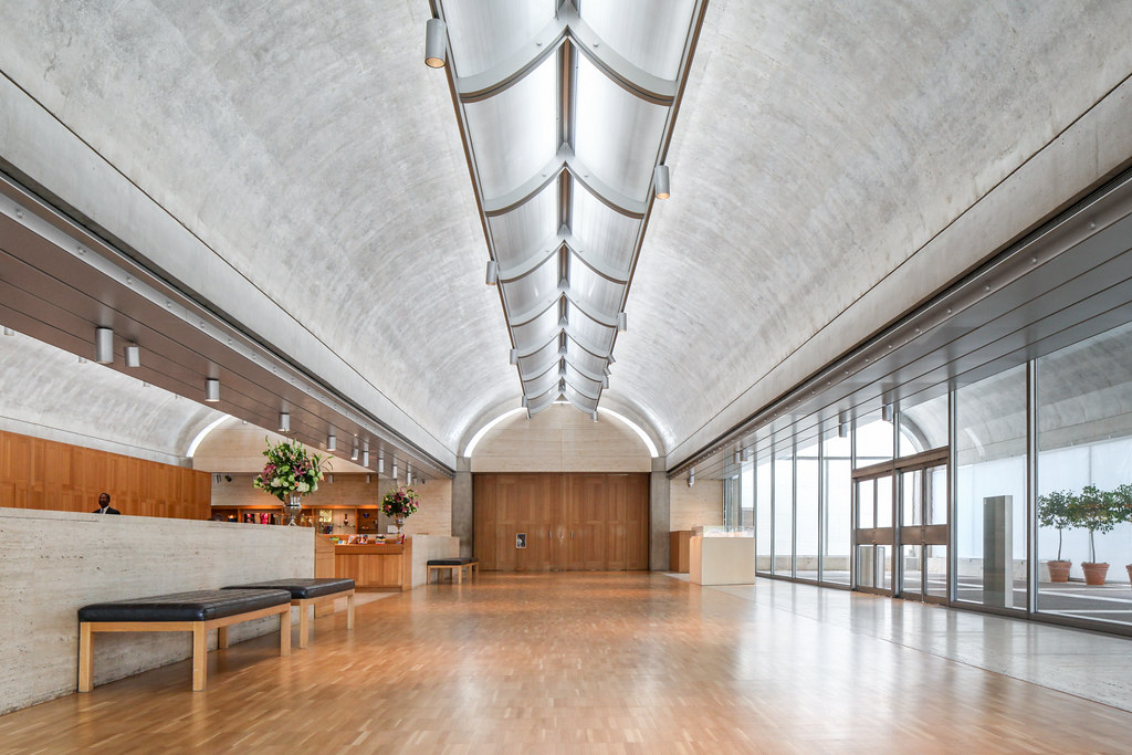
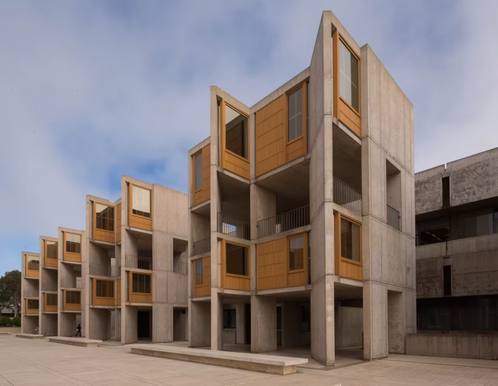
At the Salk Institute, poured concrete and oiled teak sharpen each other, while travertine creates a serene plane, transforming light and the horizon into a true third material. This contrast makes the research feel both monumental and human.
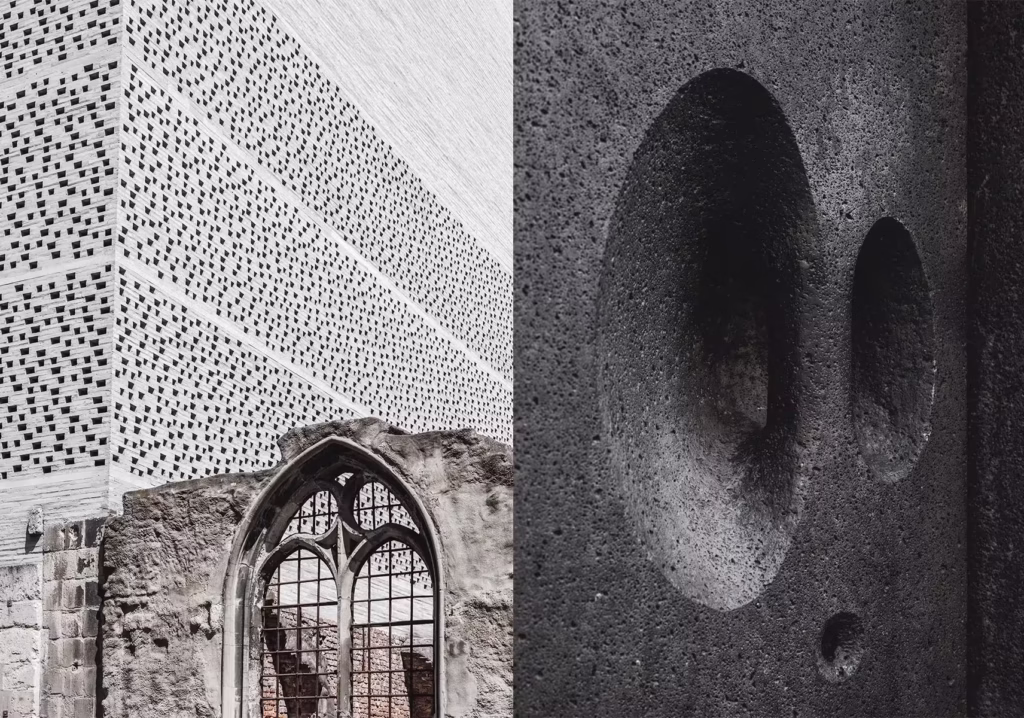
Zumthor’s Kolumba project combines medieval remains with new perforated gray bricks, allowing air and daylight to pass through the wall, thus bringing history and the present together in a single, breathing mass. This combination makes the restoration work the fundamental aesthetic of the project.
Tate Modern’s transformation proves that reuse can gain intensity when old and new are delicately combined, blending the rough brickwork of the former power station with a refined new fabric. The dialogue between the inherited mass and the cage-like addition reframes industrial memory as public culture.
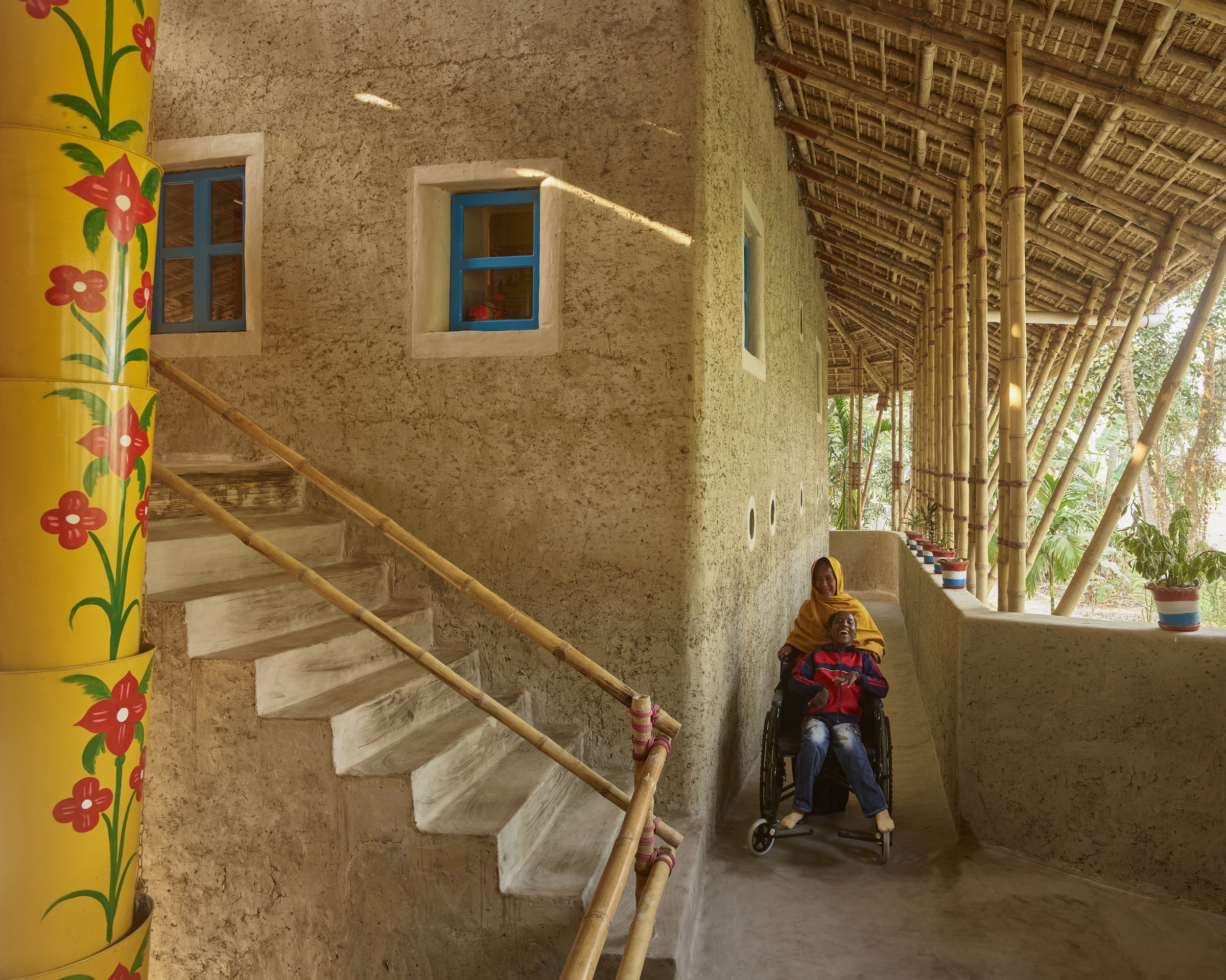
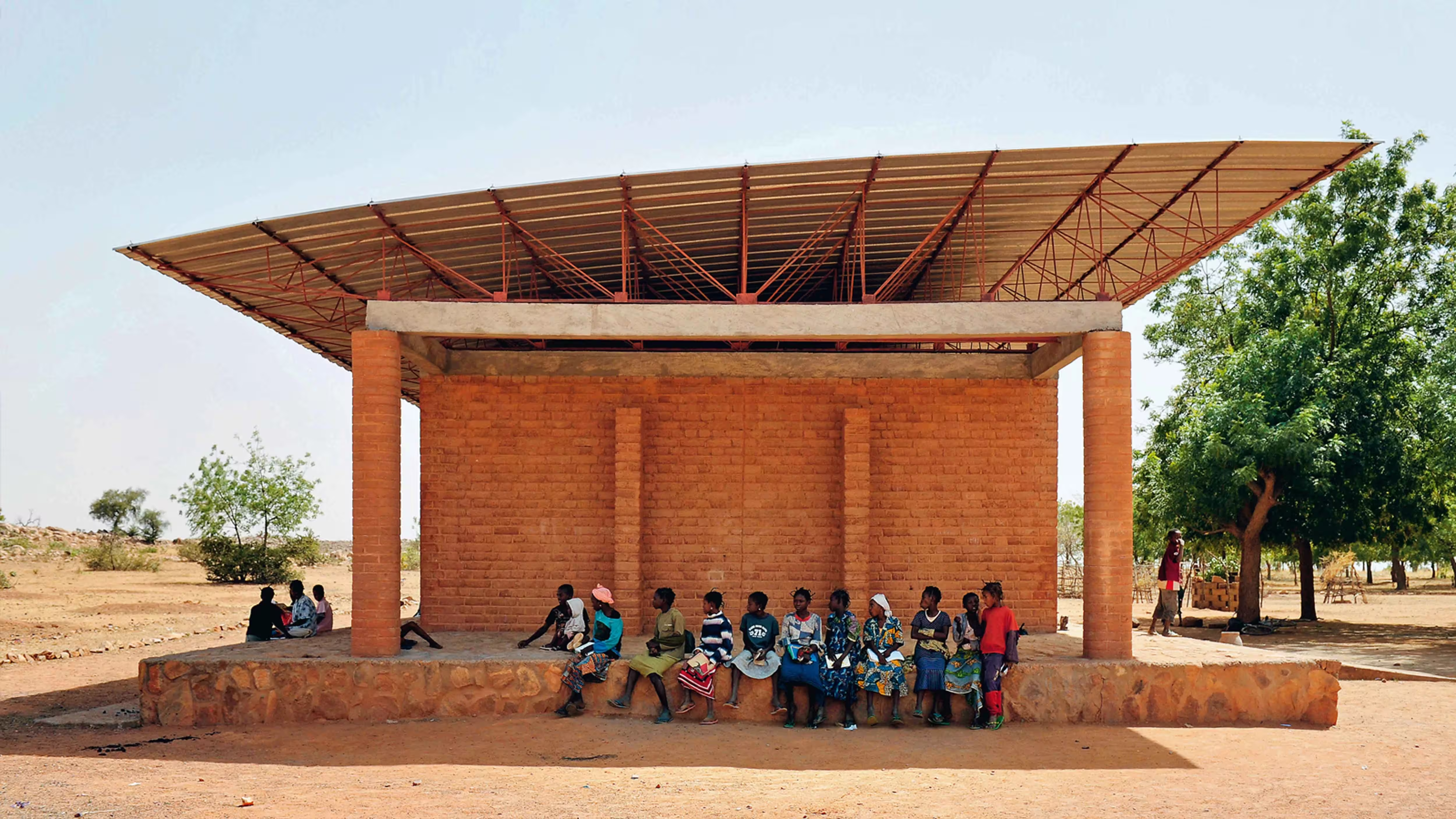
At Gando Elementary School, earthen walls combined with a separate metal roof and ventilated clay ceiling create a contrast that emphasizes comfort over showiness. The joints reveal the shadow, airflow, and pride of an architecture that makes honest use of its resources.
Common pitfalls and how to avoid them
Moisture at material interfaces is a silent form of failure that rots wood, stains stone, and corrodes metals, so design for drainage, drying, and vapor control at every joint. Different movements between different materials can cause cracks and leaks on surfaces unless the joint anticipates thermal and hygrometric changes. When metals are joined, galvanic couples can sacrifice the more anodic component within weeks, so isolate, select compatible alloys, and manage electrolytes. Detail junctions as carefully as facades, because the contact line is where performance and meaning are confirmed or betrayed.
Discover Different Types of Material Joining
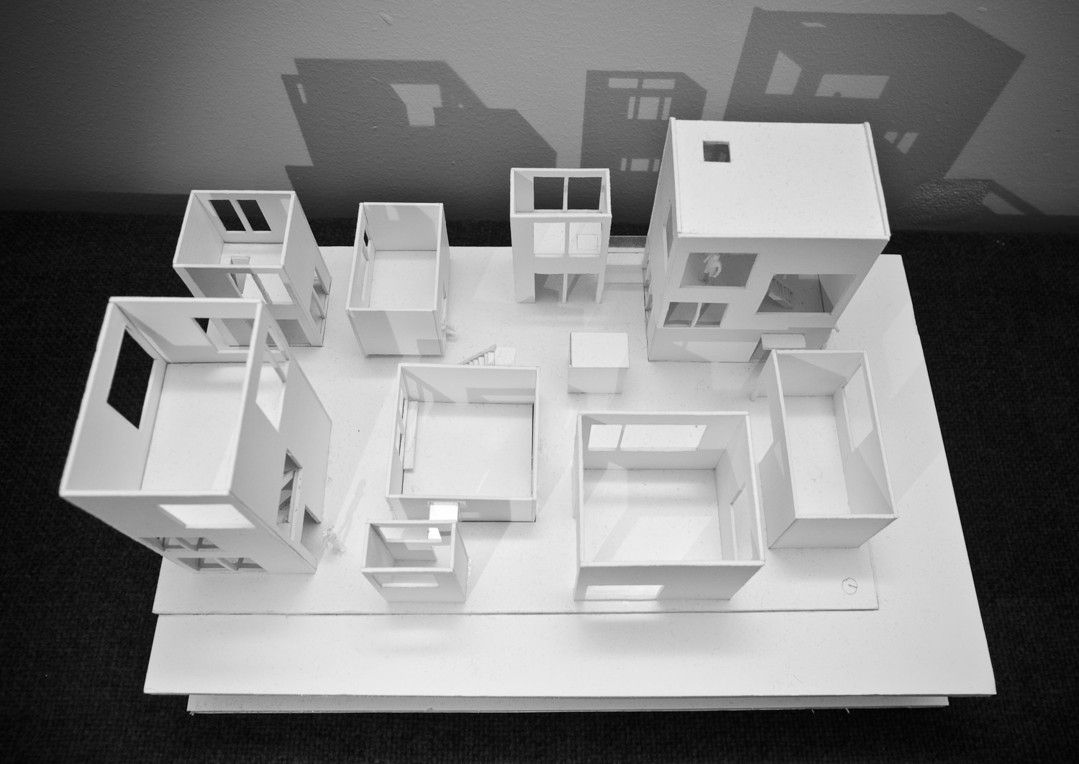
Good buildings highlight differences so that the senses can read their weight, warmth, and time at a glance. What matters is not novelty, but legibility; the coming together of each material explains how the space is made and why it belongs. In practice, four repeating pairings most clearly teach how material engages with material.
Natural materials and industrial materials (e.g., wood and steel)
Combining organic and engineered products reveals its purpose: Teak wood embedded in wood-molded concrete at the Salk Institute softens the laboratory’s rigidity and allows the joints to reflect craftsmanship and care. In Burkina Faso, the earthen wall beneath the raised metal roof uses contrast to transform the climate into comfort and proves that a “low-tech” wall and a “high-tech” canopy can perform together. These contrasts also make ethics visible, as the combination of resources, maintenance, and repair is immediately apparent. This dialogue teaches users to trust both craftsmanship and machinery within a single space.

Transparent and opaque elements (e.g., glass and brick)
Compared to glass, stone, or brick, it determines what is revealed and what is concealed. The ultra-transparent glass of the Louvre Pyramid, set within the classical courtyard, continues to be the courtyard’s star attraction. The roof of the British Museum’s Great Court transforms an old void into a bright plaza; its canopy, made of glass and steel, provides a light counterpoint to the heavy stonework. Here, transparency is not merely a view but a public tool that reorganizes circulation, light, and public life around a visible sky. Opacity becomes a foil that fixes history, while clarity invites contemporary use.
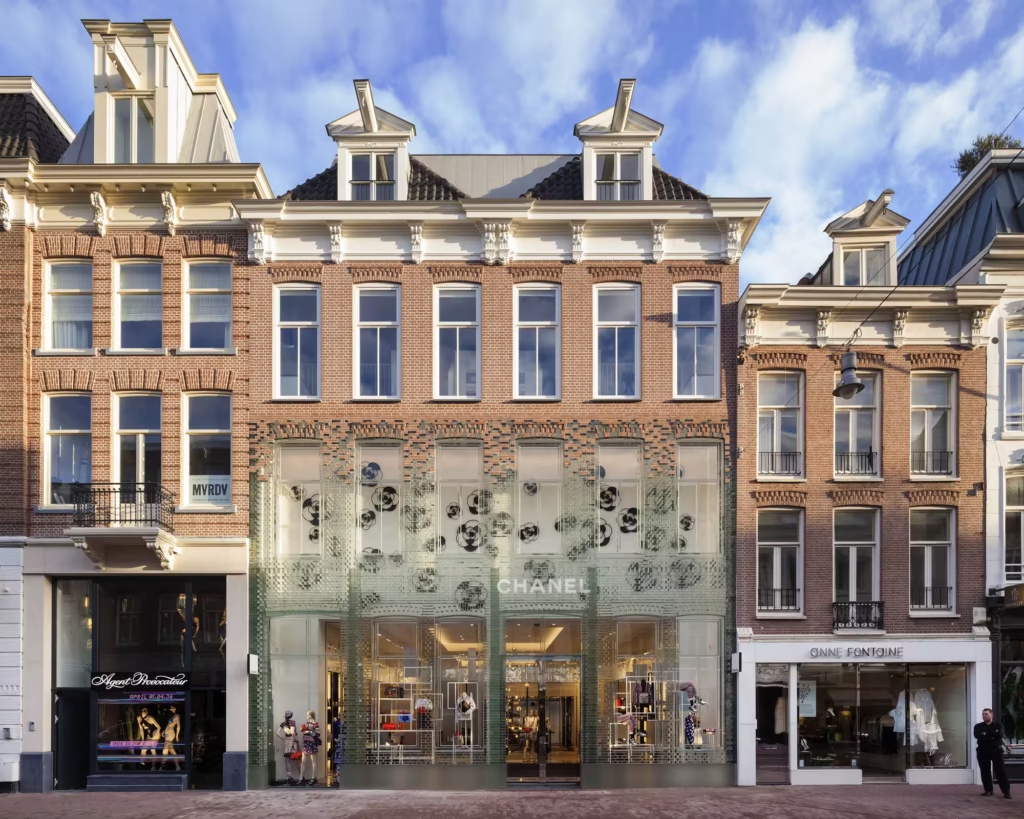
Crystal Houses MVRDV Amsterdam
New intervention with old material (e.g., historical brick with modern concrete)
When the new touches the old with sensitivity, time becomes a structural element. In Zumthor’s Kolumba, the porous gray brick shell, by embedding Roman and Gothic fragments into a single, breathing mass, allows air and light to reveal the remnants of life. At Tate Modern, the perforated brick cage reinterprets the texture of the power station, making the addition appear more like a relative than a costume. These careful additions prevent pastiche and make restoration the central idea of the architecture.
High-tech surfaces and raw textures (e.g., polished metal and exposed aggregate)
Brilliant precision sharpens both the smooth and the rough: Lloyd’s Building wraps its external skeleton services in stainless steel, leaving the concrete and structure clearly visible, turning technology into a facade. In Napa, Dominus Winery’s stone-filled gabions are almost geological in nature; their rough porosity contrasts with clear frames where light and heat are modulated by the texture. This pairing works because reflectivity and texture simultaneously manage mood and performance, transforming the cladding into both a climate tool and a narrative device. When read at the point of convergence, grandeur and courage become partners rather than rivals.
Architecture and Its Effects and Consequences on Society
Material contrast trains people to read buildings not only with their eyes but also with their bodies. Texture, weight, temperature, and smell transform rooms into experiences that are felt before they are judged. Phenomenology argues that this sensory realism grounds ethics and craftsmanship in everyday use. Contrast becomes cultural when it explains how forces move through seams, how objects age, and why space matters.
Emotional and sensory experience through material contrast
Different materials alter heart rate, attention, and calmness, making the joint both a physiological and visual tool. Research shows that wooden surfaces can lower blood pressure and activate the parasympathetic response compared to harder, colder materials. This does not imply a single palette, but proves that material selection can regulate stress, focus, and comfort in schools, homes, and clinics. When adjusted, architecture becomes human-centered, such as through contrast, lighting, or acoustics.
Placing material side by side as narrative and memory in the structure
When new works meet old structures, the details become a statement about time. Conservation principles require additions to be both harmonious and clearly belonging to their own era, so that history is not imitated but becomes legible. The point of union is proof that culture continues and that restoration is design. People trust places that reveal their layers without distorting the records.
Sustainability, reuse, and material layering strategies
When components are disassembled, cataloged, and made suitable for reuse, side-by-side placement supports circular applications. Design for disassembly, recovery, and adaptable layers keeps value in circulation and reduces tangible impacts. Guidelines from the AIA, UKGBC, and Ellen MacArthur Foundation outline practical steps, from reversible connections to material passports and reuse markets. Therefore, careful stitching is both a poetic line and an economic strategy.
Future trends: digital manufacturing, hybrid materials, and emerging juxtapositions
Robotic and computational design produces precise, reversible, and material-efficient connections. Hybrid systems such as steel frames and solid wood floors combine strength with low carbon emissions while maintaining the legibility of assemblies. Examples such as the DFAB House and the dry-assembled Striatus bridge demonstrate that digital fabrication can create smart, disassemblable, and expressive new connections. Tomorrow’s contrasts will lie between what is mined and grown, printed and woven, and the best work will keep these differences legible.
Discover more from Dök Architecture
Subscribe to get the latest posts sent to your email.