
The Fundamentals of Material Matching in Architecture
Material matching is an art that enables materials to communicate with each other, creating a unified mood through structure, surface, and light. This is important because buildings are felt before they are analyzed, and material properties carry this first impression into memory. When materials are selected not as individual parts but as complementary elements, they create an atmosphere that people feel instantly.

Understanding intrinsic properties: texture, color, reflectivity
Texture controls how a surface interacts with the body and light, shaping depth, texture, and the quietness of the room. Color determines the emotional tone and spatial illusion; it is a calibrated tool in architectural polychromy rather than decoration. Reflectivity determines how daylight is distributed, how bright a space feels, and how efficient it is. These characteristics are important because they transform surfaces into experiences, aligning perception with purpose.
The role of roughness and smoothness in surface interaction
Smooth materials produce sharp, mirror-like images that enhance brightness and edges, while rough materials diffuse light into a softer area. Reflections intensify at visible angles, making brightness more pronounced and potentially obscuring details. Research shows that increased brightness can flatten perceived texture, while micro-roughness restores readability and reduces glare. This balance is important because it adjusts contrast, comfort, and the clarity of form.
Material hierarchy: primary, secondary, accent
A clear hierarchy ensures that the building is immediately understandable at a glance: primary materials convey mass and identity, secondary materials define connections and transitions, while accents stand out. Planning and design guidelines routinely separate primary cladding from secondary or accent elements to maintain the consistency of facades. It is important to think in hierarchies, as they focus attention and prevent visual noise, allowing one material to take center stage while others support it.
How function affects material selection and combination
The function determines summary information for materials: fire safety, durability, thermal performance, maintenance and regulations, shaping what can be mixed with what. Evidence shows that exterior cladding material decisions can significantly alter energy costs, so aesthetics must be considered alongside performance. Following high-profile failures, professional guidance emphasizes the architect’s responsibility to ensure that selections remain appropriate and safe throughout the project lifecycle. This is crucial because beauty is fragile without suitability, and performance can be forgotten without character.
Classic Material Combinations and Logic
Wood + Glass: warmth meets transparency
Wood brings a tactile calm that reduces stress and gives rooms a lived-in feel, while glass provides daylight and views that keep spaces lively and open. This duo creates a balance between intimacy and openness: light reaches deep into the plan, and the wood’s grain glows and softens hard edges. Examples such as Kengo Kuma’s Glass/Wood House demonstrate how transparent volumes can be humanized when glass is framed by warm, low-reflective wood.

Metal + Wicker + Glass: industrial sophistication and transparency
The woven fabric placed on the glass creates a porous second layer that filters sunlight, reduces glare, preserves the external view, and can reduce cooling loads when adjusted according to climate and window ratios. Designers use this method to add depth and softness to industrial structures. At SANAA’s New Museum, layered aluminum mesh transforms a simple mass into a sparkling, legible object. OMA’s extension work continues the logic of combining transparency by integrating the metal mesh with embedded laminated glass. The performance balance is real: excessive shading can reduce cooling but increase lighting energy, so geometry and openness are crucial.


Stone + Wood + Metal: grounding, temperature, structure
This trio is a concrete example of local wisdom: stone anchors the foundation and resists moisture and fire; wood adds warmth and speed to living spaces; metal roofs provide protection against snow and weather conditions with their durable seams. In Alpine traditions, stone is typically used for stability on the lower floors, while lighter wood is used on the upper floors for openness and craftsmanship, then covered with slate or metal for longevity. The result reads as earth, hearth, and craft in a single elevation.

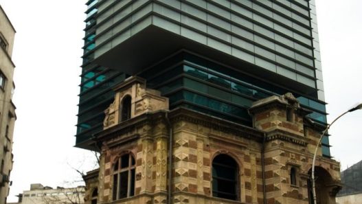
Concrete + Glass + Steel: modern minimalism and contrast
Steel frames create slender and delicate structures; glass opens up the view and lets light in; concrete provides mass that balances temperature and reduces noise. This combination forms the basis of iconic structures, from Mies’s houses and towers to countless contemporary buildings, where transparent facades meet a quiet, high-inertia core. Research on thermal mass and daylight reveals why this combination endures: concrete stores heat throughout the day, while glass optimizes light and views, particularly when ventilation strategies are considered.

Emerging Material Mixes & Insertions Between Tradition and Innovation
Bio-based composites with high-tech surfaces: e.g., mycelium panels + metal mesh
Mycelium panels turn agricultural waste into light, insulating building skins with low embodied energy and a calm, felt acoustics. When a fine metal mesh is added as a ventilated veil, it protects the bio-skin, filters sun, and keeps transparency and airflow, so the assembly reads solid yet breathable. This pairing matters because it fuses circular material logic with durable performance and solar control in one layered surface.

Semi-transparent wood + glass elements: separating heat and light into layers
Transparent wood provides greater strength and better heat resistance than monolithic glass, while diffusing daylight like paper, allowing rooms to be illuminated without glare. When combined with glass, it creates a transition from visibility to privacy, enabling architects to adjust the clarity, solar gain, and atmosphere of the facade. This is important in that it expands the palette for bright, energy-efficient facades by combining the softness of wood with the optical access of glass.
Recycled plastics or chain mail geometries were combined with traditional stone or wood.
Recycled plastic blocks create an ethical contrast to stone or wood by transforming waste streams into mass and color, demonstrating management capability without losing weight. Chain mail weaves on walls or wood add a flexible, protective coating that shades, ventilates, and deepens the facade relief while leaving the base material visible. This is important because it combines ecological restoration and tactile craftsmanship, transforming the exterior into both a message and a microclimate.
If you want to learn more about this topic, read this great article.
https://www.designboom.com/technology/kaynemaile-architectural-mesh-05-23-2017


Smart surfaces integrated with traditional coatings (self-healing concrete, sensor-embedded metal)
Self-healing concrete extends service life and reduces maintenance by sealing micro-cracks when moisture is present, ensuring surfaces remain intact and structures stay dry. Sensor-embedded steel and facade components enable buildings to report their status and adjust their operation rather than wait for failure by sending back real-time stress and climate data. This is important because surface intelligence reduces risk, cost, and carbon while keeping architectural expression simple and refined.
Surface Treatments, Textures, and Roughness in Mixtures
Glossy and matte surfaces: How does roughness alter perception?
Polished surfaces appear bright and sharp due to the dominance of specular reflections, while matte surfaces diffuse light and soften the image. Visual studies show that as specular roughness increases, perceived brightness decreases, and orientation relative to light further alters how smooth or rough a surface appears. In practice, brightness is measured with brightness meters at standard angles, so the same paint may appear different under different tests and viewing conditions. These differences are important because they alter how edges, color, and spatial depth are reflected to the eye.
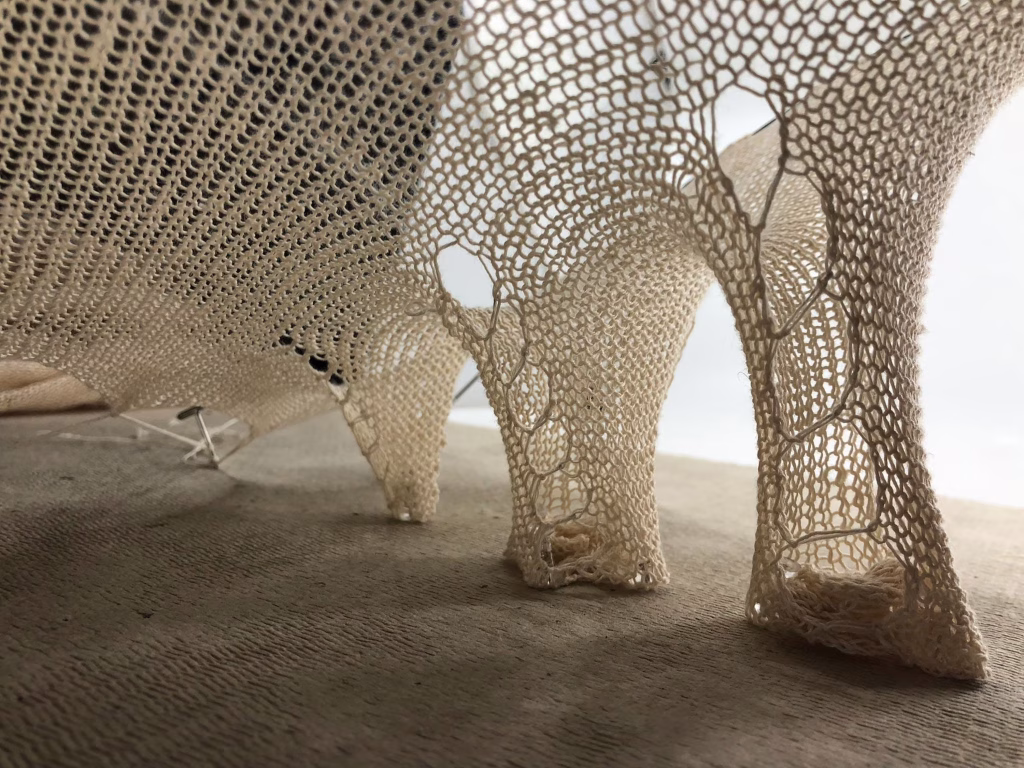
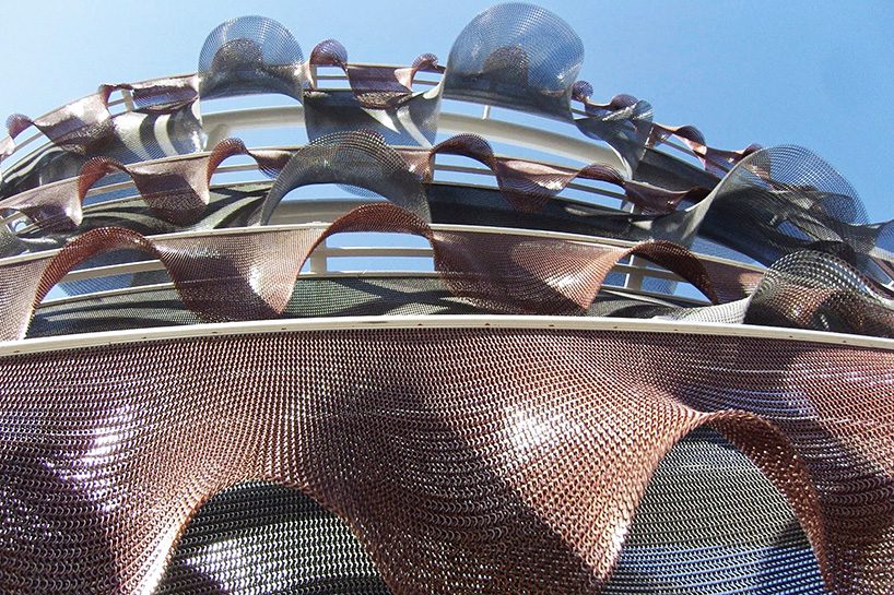
Elements that alter the fabric: weave, holes, and transparency
Perforated screens and grilles serve as an adjustable grille on the facade, adding depth to flat glass while filtering sunlight, views, and air. Research shows that hole size, spacing, thickness, and screen offset alter daylight levels, glare, and cooling loads, meaning openness is not just a percentage but also a geometry. Built examples like SANAA’s New Museum demonstrate how a metal skin can soften a mass and make a box appear light. The result is a fabric that serves as both a climate tool and a visual atmosphere.
Boundary conditions and transitions: where surfaces meet
Edges are the places that determine how materials relate to each other; therefore, joints must resolve structure, weather conditions, tolerances, and shadow in a single stroke. Louis Kahn’s statement that “the joint is the beginning of decoration” points to a simple truth: the joint is already an act of design, not something that comes to mind later. Good transitions make hierarchy understandable and allow surfaces to age gracefully rather than wear out at their edges.
Tissue scale: comparison of macro tissue with micro coating on large elements
Micro surfaces alter brightness and texture at arm’s length, while macro textures extend beyond a room or street and remain legible from a distance. Research distinguishes between micro texture and macro texture, as each scale alters reflection, slip, and light scattering in different ways. Therefore, the same concrete appears smooth when viewed up close, yet exhibits a serene appearance from a distance. Cast-in-place concrete is a clear example of the macro scale: wood grain creates shadows that warm the monolithic material and make its character legible at the scale of the building. Choosing the right scale ensures that the texture works both perceptually and performatively.
Practical Strategies for Architects and Designers
Dominant material and supporting palette selection
First, designate a material as the “voice” of the building. Then, assign secondary and accent materials to clarify joints, thresholds, and focal points. Many design guides formalize this logic into primary, secondary, and accent categories. This helps maintain legibility and clarity from a distance. Lock this palette in the early concept stages so it can be used without deviation in drawings, technical specifications, and procurement processes. Evaluate the selection not as decoration, but as coordination for the entire building. Materials have functional requirements and complex installation needs.
Balancing contrast and harmony: preventing chaos
Use contrast sparingly. Allow for texture or color variation where architectural focus is required, and keep highlights minimal to enable the eye to quickly perceive the order. Campus and municipal guidelines typically restrict the use of highlights and require consistency across all facades to prevent visual noise. Remember that “mixing” can fail physically and visually, especially when different metals come into contact and form galvanic couples. Plan separations, compatible fasteners, and drainage to prevent corrosion. A calm composition is one where hierarchy, harmony, and weather conditions are determined together.
Taking into account lighting, viewing angles, and material behavior
Surfaces change depending on the viewing angle: reflection is angular, so a surface that appears matte when viewed from the front may appear shiny when viewed from the side; design with BRDF in mind, even if you don’t explicitly model it. Daylight guidance relates appearance to comfort and reminds us that facade choices affect glare, task visibility, and spatial perception throughout the day. Use brightness ratios and tested glare methods to keep bright or reflective elements away from critical sightlines. In short, material plus light equals perception, so make palette decisions alongside daylight studies, not after them.
Sustainability, durability, and material life cycle in composite material design
Select and combine materials within a comprehensive life cycle framework: use ISO 14040 for principles, EN 15978 for building-level assessment, and EN 15804 EPDs for product data. Define service life targets and specifications using ISO 15686, so that joints, coatings, and fasteners last as long as the story your pallet tells. Increase circular value by documenting components and recoverable layers with material passports and designing for maintenance and disassembly. The most responsible mix is one that performs today and remains useful tomorrow.
Discover more from Dök Architecture
Subscribe to get the latest posts sent to your email.