


In a world obsessed with frictionless user experiences, from one-click shopping to smart homes, architecture also values perfection. Glass curtain walls meet polished floors without a single trace of additional material; motion sensors and soft-closing doors ensure nothing obstructs our movement. Yet as our buildings strive to eliminate every bump and pause, we must ask: What do we lose when space becomes too easy? This article proposes an alternative virtue: friction. Not friction as mere inconvenience or design flaw, but friction as a quality that can enrich the spatial experience—a resistance that engages the body and mind, slowing us down to truly experience the space. In the age of minimalist perfection, rethinking friction is a timely rebellion. Just as some in technology advocate “good friction” to combat superficial scrolling, architects and thinkers are rediscovering that a bit of roughness, complexity, or pause in the built environment is not a flaw but a feature.
1. What does “friction” mean in a space?
Worn edges, lived textures: Friction leaves traces in memory.
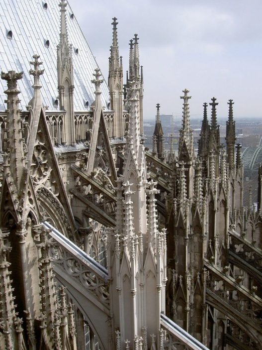
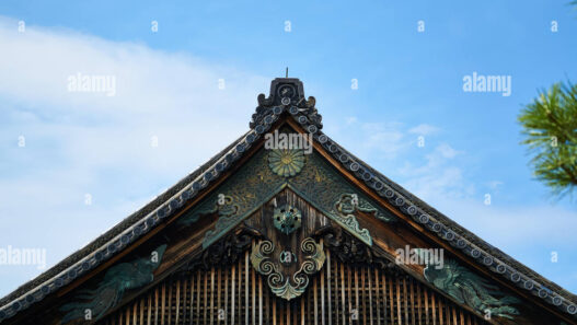
Imagine climbing a stone staircase in an old cathedral; each step has been worn smooth by centuries of footsteps. The resistance beneath your feet—those soft undulations—tells you that countless people have stepped here before you, slowing your pace as you plant your feet firmly on the ground. Looking at the steps, worn into concave shapes by thousands of feet, is to feel time become tangible. As an architectural observer noted, the famous “sea of steps” at Wells Cathedral owes its poetic power precisely to these indentations: “they make you think of people walking up and down.” This is, in the truest sense, spatial friction—the wear and tear of human presence on material—and it demonstrates how friction can serve as a carrier of memory and meaning.
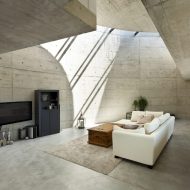
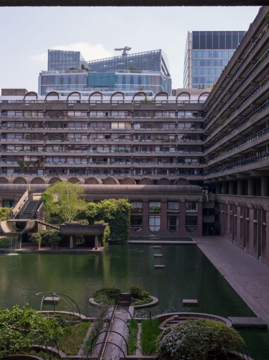
In a broader sense, a “friction-filled” space is one that asserts itself to our senses and movements rather than receding into the background. This could be a winding cobblestone path that forces you to slow down and pay attention to your steps (while noticing the aroma of a nearby bakery) or a heavy wooden door that conveys its weight and texture as you enter a room. In phenomenological terms, it is a quality that “slows down space, making it feel thick rather than thin.” Architect Juhani Pallasmaa, a proponent of multisensory design, argues that modern architecture has become too visual and slippery—a “disconnected” world of smooth surfaces—while authentic architecture should embrace and envelop the body with rich materials and tactile forms. In this sense, friction is not about obstructing movement for the sake of harshness; it is about designing environments that activate our touch, our muscles, our peripheral vision, so that moving through a building becomes an experience of being rather than a passive act of transition. The polished, climate-controlled corridors of an airport make it easy to rush from door to door, but one remembers nothing about the space. In contrast, the narrow spiral staircases of an old library or the stepped threshold of a temple that requires bending or removing shoes—these small resistances trigger awareness and even a sense of ritual. As philosopher Maurice Merleau-Ponty pointed out, our perception of space is based on the body; a friction-filled space pushes the body back, as if to say, “I am here—and you are here too.” In architectural terms, this may be the difference between ease and interaction. A completely frictionless space offers convenience—a smooth, efficient transition that demands nothing from us. A friction-filled space, on the other hand, offers interaction—it asks us to slow down, pay attention to our surroundings, perhaps change our posture or our path, and thus enter into a dialogue with our environment.
Most importantly, redefining friction as a positive quality means freeing it from its usual connotations of discomfort. Friction does not have to mean discomfort; it can mean encounter. Consider a series of stepping stones along a garden pond that require you to carefully gauge each step—a gentle challenge that accustoms you to balance and vision. Or consider the textured surface of a compacted earth wall that invites you to unconsciously run your fingers over it as you walk, providing subtle tactile feedback. These moments of pause and interaction are an antidote to what Pallasmaa calls the “ocular centrality” of contemporary architecture, which prioritizes sight at the expense of touch and kinesthesia. A flawless glass box may look perfect, but it leaves the body cold; a subtly “resistant” space—such as a corridor with a rough slate floor that clicks under your heels—communicates with you through sound and texture. It establishes a character. In short, a textured space is one that trades a bit of efficiency for a great deal of atmosphere and awareness. It is architecture that you not only observe with your eyes but also feel in the pit of your stomach or the soles of your feet. As we progress, we will see how this value is lost and how it can be regained.
2. How did perfection become the default value in contemporary architecture?
If friction represents richness and interaction, why has contemporary architecture begun to idolize seamlessness—the smooth, aligned, uninterrupted? The roots of this assumed value extend from early 20th-century modernism to 21st-century technological aesthetics. High Modernist architects like Mies van der Rohe and Le Corbusier sought an ideal pure form by eliminating ornament and disorder, preaching that “less is more.” The results were often flat planes, right angles, and surfaces so seamless that buildings appeared almost machined. There was also a moral dimension to this: ornament was “sinful” (to quote Loos), and the honest expression of industrial materials demanded a clean perfection. As construction technology advanced, this vision of perfection became more realistic—consider the mid-century skyscrapers where glass and metal panels meet in sleek modular grids, erasing the bold joints and texture of traditional masonry in favor of glass curtain walls. By the end of the 20th century, seamlessness had become a luxury aesthetic: polished marble floors extending uninterrupted from the lobby to the elevator, or custom drywall painted a flawless white to hide all screws and joints. Such details exude wealth because they imply an invisible army of labor that enables disparate building materials to move with absolute precision. Indeed, the myth of perfection persists by concealing the fact that buildings crack, age, and are exposed to the elements as they are meant to. As architects Mohsen Mostafavi and David Leatherbarrow point out, the flawless white surfaces of modern architecture do not remain flawless—natural forces inevitably leave their mark, shattering the illusion of timeless purity. Maintaining its flawless appearance and restoring it to its original state requires immense effort (and cost) to sand away the patina of use and time. In this sense, seamless architecture often shifts its friction to others: the maintenance worker polishing fingerprints off glass, or the engineer designing ventilation holes that become increasingly invisible to avoid marring a clean ceiling. The result may be visually smooth and silent, but only by hiding the layers of labor and technical complexity behind the scenes.
At the beginning of the millennium, technology culture reinforced the cult of perfection. Apple’s approach to design is a prime example of this. When you walk into an Apple Store, you enter a world of eerie smoothness—a “clean, orderly, minimalist design… the same everywhere in the world,” free from any visual friction. Every Apple Store is made up of the same components: “They are minimalist. They emphasize natural materials such as wood and stone, and are easy to move around because they are clean and open.” The architecture reflects the frictionless ease of Apple’s devices and extends the “swipe-and-go” mindset into the physical space. Other brands and architects have followed suit, drawing inspiration from this high-tech minimalism. Floating glass railings, suspended staircases, seamless resin floors—all have become defining features of a contemporary “sophisticated” space, whether it’s a boutique hotel or a Silicon Valley campus. It suggests aesthetics, efficiency, and control: every line is resolved, every junction hidden. It is the spatial equivalent of a flawless, perfectly composed photograph. However, some critics have noted that this endless refinement can produce an unsettling sterility. Rem Koolhaas addressed this in his provocative article “Junkspace,” describing the contemporary built environment as “at once overly mature and under-nourished, a vast security blanket enveloping the world… like being condemned to a jacuzzi with millions of your best friends” . In other words, our flawless spaces can feel both overly indulgent and suffocating at the same time—a bright “comfort” that numbs the senses. Koolhaas argues that the ubiquity of air conditioning, automatic doors, and shopping mall-like interiors has created a world without places, a frictionless world: a “blurred empire of blurriness” where nothing surprises or challenges us anymore.
Perfection has also become synonymous with progress and high performance. Consider how digital user interface design treats any kind of “friction” (such as an extra click or loading time) as something that needs to be eliminated for a better user experience. Architecture has adopted a similar mindset: the ideal smart building senses your arrival, opens the door for you, adjusts the lights and temperature to keep you in a comfortable bubble—you glide from your car to your desk to your couch without even noticing the transitions. This is convenient, yes, but it can also bring us to the brink of what philosopher Paul Virilio warned about as the “diminishing gap”—the loss of pause and reflection as technology accelerates every interaction. When every door is automatic, we forget the small but meaningful act of opening a door. When every corridor is a featureless tube guiding us to our destination, we lose the small deviations or encounters that occur in a more complex corridor. Convenience is prioritized alongside speed and productivity. However, convenience can lead to disconnection. In a flawless boutique or airport, one might ask: are we truly experiencing the architecture, or are we simply consuming it as another efficient service?
None of this means that perfection doesn’t produce beautiful results or that we should long for breezy buildings and cumbersome details. On the contrary, it serves as a reminder of the side effects of the dominance of a single value—smooth perfection—in our design culture. One side effect is a kind of sensory erasure: “Smooth, silent, sterile—is this spatial sophistication or sensory erasure?” asks the critical caption of a photograph of a monolithic, minimalist gallery interior. By eliminating all “noise” and friction, we also eliminate the textures of human presence. The joints, cracks, wear marks, and decorations that once told us a building’s story (how it was built, how it was used) are designed away, leaving behind a neutral, featureless space. The cost of this perfection is not only financial and ecological (high-level flawless detailing often involves materials that are difficult to recycle or replace), but also cultural: it can erase local character and craftsmanship. A flawless glass skyscraper in Dubai doesn’t look much different from one in London or Shenzhen. What makes it impressive—efficiency and global polish—also makes it somewhat generic. As Koolhaas noted, we are faced with cities that offer a smooth surface for trade, interchangeable and lacking in features that anchor memory.
So, how can we reintroduce friction as a design value without compromising on comfort or quality? The following sections examine the strategies of architects and designers who deliberately bring back material and spatial resistance—and create a positive impact. These studies demonstrate that a bit of roughness, when carefully designed, can make a space more inviting, more social, and even more sustainable in the long run.
3. What happens when we reintroduce material and spatial resistance?
The response to the seamless presence of contemporary architecture everywhere has been the revival of designs that embrace discontinuity, rawness, and layered experience. Some architects, rather than hiding a building’s joints and textures, celebrate them—making the joints an aesthetic and narrative component of the design. This design approach treats friction not as a failure in achieving perfection, but as an invitation to engage with the material reality of a space. We can see this in the work of architects such as Peter Zumthor and Lacaton & Vassal, who prioritize honest materials, striking details, and spatial journeys over shiny surfaces or simple open plans.

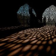
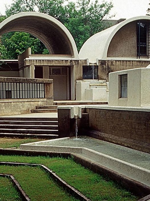
Peter Zumthor’s famous Therme Vals spa in Switzerland (1996) is often cited as a masterclass in sensory, material architecture – essentially a temple to designed friction. Far from a pristine white box, the baths are built as a partially mountain-embedded stone labyrinth. Zumthor layered approximately 60,000 locally sourced quartzite slabs to create walls that appear and feel as though the building has been literally carved out of the mountain. The joints between the floor tiles are intentionally visible as thin shadow lines, providing a tectonic reading of how the structure was assembled. Walking through this bathhouse is a slow and exploratory experience: Zumthor’s team describes it as “an informal order underlying the structure… a carefully modeled circulation path that guides bathers to predetermined points but allows them to discover other areas on their own.” The corridors do not reveal everything at once; they curve and intersect in a way that “creates a rhythm that trembles with peace”. Walking around this space means exploring. It’s like walking in a forest. Everyone there is looking for their own path.” In other words, friction is deliberately built into the spatial layout—you have to navigate, turn corners, encounter thresholds of light and dark. The material palette reinforces this: rough stone underfoot that feels cool to the touch; echoing sounds of water; occasional rough concrete surfaces. The architecture indulges the senses, but not with monotony, rather with a rich tapestry of tactile and atmospheric stimuli. For example, the joints and layers in the stone walls capture light and, as time passes, trace the patterns of shadows, allowing one to become aware of how the day has passed (a subtle counterpoint to the forgetfulness of a windowless interior). “A fascination with the mystical qualities of a world made of stone… darkness and light, the reflections of light in water or steam-filled air, the feel of warm stone and bare skin, the ritual of bathing—these concepts guided the architect in shaping the space.” Such poetic resistance to homogeneity results in an architecture that does not compete with the human body, but rather **”flattens the human form and gives it space… gives it room to be.” Therme Vals suggests that when the choreography of friction is masterfully executed, a building can slow us down and enhance our awareness, providing an experience often described as meditative or rejuvenating.
Another strategy for reintroducing “friction,” an approach mastered by French architects Anne Lacaton and Jean-Philippe Vassal, is to add new interventions to old buildings. In stark contrast to the tabula rasa approach of many modern developments, Lacaton & Vassal have built a career around adding and transforming existing buildings in ways that highlight the dialogue (and sometimes tension) between old and new. Their philosophy, summed up in the maxim “Never demolish. Never subtract… Always add, transform, and use, with and for the residents,” deliberately embraces the imperfections of what is already there. For example, in the famous renovation of the Tour Bois-le-Prêtre social housing block in Paris (with Frédéric Druot, 2011), they did not sterilize the building. Instead, they preserved the concrete skeleton and even the traces of residents’ lives during construction, adding large new balconies and winter gardens to the facade. The result is both physically and socially layered: you see the old 1960s structure and the new steel-and-glass additions side by side, creating an honest clash of eras that greatly improves the residents’ quality of life. In a later project in Bordeaux (Grand Parc, 2017), they expanded three aging apartment towers by trimming greenhouse-like extensions and again refused to demolish the existing “undesirable” blocks.
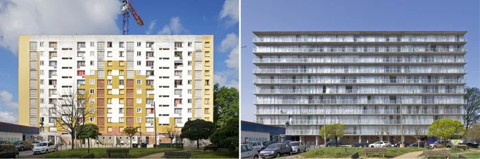
Lacaton emphasized that most of what already exists is valuable: “The existing qualities of a site can be the driving force behind a new project… Transformation is as ambitious as building a new structure.” By not softening the history embedded in these buildings—working with cracks, wear, and oddities—they create richly textured results. Even unfinished surfaces or exposed joints are left visible as part of the architecture’s story. For example, in the renovation of the Palais de Tokyo contemporary art museum (Paris, 2002), Lacaton & Vassal left large areas of the interior in raw concrete and stripped paint, thinking that artists and visitors would bring their own layers of life to the space. At the time, critics were shocked by this “crude” aesthetic, but it proved extremely successful: the building feels like a living palimpsest, where every event leaves a trace rather than being immediately cleaned away. This is friction as patina and authenticity. As Mostafavi and Leatherbarrow write in On Weathering, “as construction ends, the effects of natural forces—weathering—build and refine the finished product over time.” Lacaton & Vassal’s work embraces this concept: a building is never truly finished; it is always in dialogue with time and use. Rather than acting otherwise, the structures they add typically adapt to change—they are designed with a looseness. Movable polycarbonate panels, unplanned extra space, simple materials that residents can drill into or paint—all of these create a productive friction between design and occupation, inviting users to appropriate the architecture.
In terms of detailing, the return of friction can mean highlighting the joints and connections that a seamless design tries to conceal. Some contemporary architects take pleasure in expressing how materials come together—a steel bracket or a wooden joinery detail, deliberately highlighted like a bone almost proudly exposed. This harkens back to high-tech architecture that exposes structural connections (e.g., Norman Foster or Renzo Piano in the 1970s), but with a difference in sensitivity: today’s impressive joints are more about craftsmanship and tactility than high-tech showmanship. For example, the late Japanese architect Kengo Kuma often designed by considering tactile friction, weaving wooden planks or stacking stone to create porous, textured surfaces—so you can see and feel each part rather than a monolithic whole. Such approaches reject empty, smooth facades, instead creating facades where you can see the parts that come together. The building reveals itself to the observer, saying, “This is how I was put together.” There is an intellectual satisfaction in this (architects who value detail love it), but it is also a simple pleasure for building occupants: running your hand along a wall and feeling the subtle variations in each brick, or seeing the sunlight cast shadows through a latticework is pleasant. It humanizes the space. Architect and theorist Marco Frascari once wrote about the importance of “tectonic details”—the moments when a structure becomes legible and poetic. These are intentional friction points where the user’s eye or hand can catch, pause, and appreciate the physicality of the environment.

In summary, the reintroduction of material and spatial resistance leads to an architecture that has a much richer dialogue between surfaces, programs, and users. The building ceases to be a smooth product offered to passive users and becomes more of an open conversation. Different textures overlap—imagine an old brick wall adjacent to a new steel frame, where the contrast itself creates aesthetic interest. Different programs or periods are layered on top of each other—like a public square where historic pavements are preserved in patches alongside modern additions, guiding people through the layered history of the space. And residents are not pampered, but rather engaged—invited to open heavy shutters, rearrange modular furniture, or simply wander along a non-linear path and discover a favorite corner. None of this is inefficient or outdated; on the contrary, it can inspire care. People tend to approach a friction-filled space with more care and curiosity because the space communicates with them. As Zumthor wrote, architecture is about creating a conversation between the building and the user—through the feel of materials, the play of light, the arrangement of rooms. When friction is well designed, this conversation becomes lively and memorable. Now we turn to the social dimension: can friction not only satisfy individuals but also foster a sense of belonging for communities?
4. Can friction be designed to encourage belonging rather than exclusion?
Public spaces are where design policies are most visible. A plaza can be designed as a frictionless channel for consumption—think of a shopping mall atrium with shiny floors and ubiquitous signage that leaves little choice about how to navigate, skillfully directing you from the entrance to the food court and then out the door. Alternatively, a public space can be designed with intentional complexity and “loose” elements that encourage people to linger, take ownership, and make the space their own. In other words, friction can encourage belonging by challenging the passive consumption model of space and inviting active participation. As one commentator on urban design trends has noted, not every user is a customer, and “not every path should be direct.” Sometimes, the most beloved urban spaces are those that, even at the expense of convenience, allow for a bit of serendipity and personal agency.
Consider a modest bench. A bench fixed to the ground provides a place to sit, but it also determines your direction and range. William H. Whyte, the great observer of city squares, found that people strongly prefer movable chairs—a classic example of adding “friction” (in the form of choice and effort) to improve social use. Whyte “movable chairs expand choice: moving toward or away from the sun, making room for groups [or] moving away from them.” The ability to make a choice is as important as the ability to act on it. If you know you can move if you want to, you feel more comfortable staying where you are.” This insight is profound: by introducing a small element of work (you may have to drag your chair a few meters) and uncertainty (people can rearrange their seating whenever they want), the space becomes much more harmonious and attractive. What appears to be inefficiency—chairs scattered everywhere—is actually evidence of a participatory public space. People have shaped the micro-environment to suit their needs (two friends moving chairs closer together to chat, or someone pulling a chair up to a planter to get a better view of people) and in doing so, they feel a sense of ownership. The famous steps of Rome’s Piazza di Spagna or the ghats of Varanasi work in a similar way: they are not just circulation routes, but also improvised social arenas, because their wide, irregular steps invite people to sit, linger, and engage in spontaneous encounters. A staircase with 18 cm risers, perfectly calibrated with “No Sitting” signs—a flawless circulation machine—would kill this vitality. Here, friction (the uneven, multi-purpose terrain) is synonymous with freedom.
Urban planners such as Jane Jacobs and Jan Gehl have long defended the virtues of complexity and disorder in urban life. Jacobs celebrated the “sidewalk ballet” of scattered, mixed-use streets where people from different backgrounds intersect—something that is only possible when spaces are not overly compartmentalized or overly designed for a single flow. In contemporary discourse, Richard Sennett takes up this theme, arguing for urban spaces that encourage “interaction with difference, the acceptance of discontinuity and chance.” Sennett believes that a healthy city is one that directs people outward, toward encounter and negotiation, rather than trapping them in a frictionless bubble. Public spaces with a bit of unpredictability—overlapping activities, moving parts, even contentious edges—can expose us to others and the unexpected, providing, in his words, “all the benefits of modern city life.” From a design perspective, this could mean a park without a single axis or program, but with many corners and crossings that different groups can use in parallel and occasionally intersect. Or a civic plaza where not everything is symmetrical and balanced—perhaps with a fun rock formation or artwork on one side that people can climb on, while another corner is densely planted to create a semi-hidden retreat. These elements make the space less predictable and more explorable. They also require a little more negotiation: you may have to stray from a straight line, adapt to the presence of other users, or even talk to a stranger (“Can I move this chair?”). All these small frictions are actually the building blocks of social harmony. As noted in a landscape study, designers such as Sennett, de Certeau, Hajer, and Reijndorp call for “a public space where individuals experience the dense reality of the city through personal interaction with others, rather than sterilized, pre-written scenarios.”
A vivid case study demonstrating that friction encourages ownership is Alejandro Aravena’s participatory housing projects in Chile, particularly his “Half a House” phased housing strategy. In places like Quinta Monroy (Iquique) and Villa Verde (Constitución), Aravena’s Elemental firm deliberately delivered unfinished homes—essentially well-constructed half-houses with the structure and utilities in place, but with spaces left empty for residents to fill and expand over time.
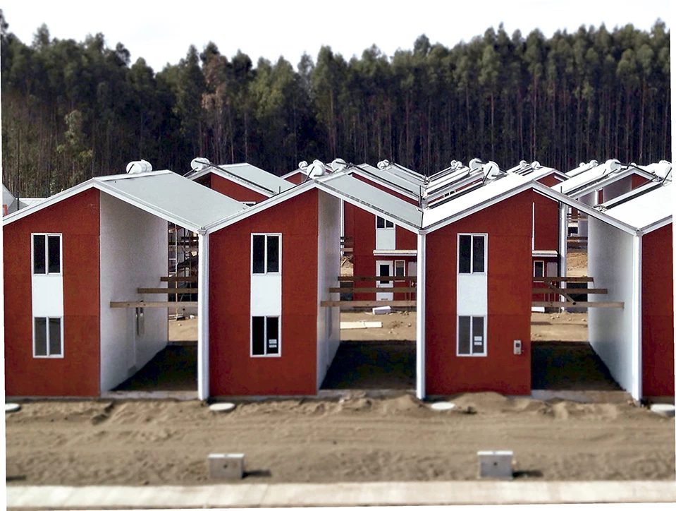
At first glance, this situation seems to place a heavy burden on low-income families: architects are giving them homework instead of turnkey homes. However, this approach has turned end users into co-creators of their environment, and the result has been extremely positive in terms of community building. Neighborhood residents added rooms to their homes, painted them, and personalized them; as a result, they doubled the size of their homes in line with their needs and possibilities. Over time, the neighborhoods took on a diverse, lived-in character, the opposite of a sterile public housing project. One of Elemental’s architects stated that even if budget had not been an issue, they would have built the homes the same way, as it channeled resources into the public realm and used “scarcity as a tool” to encourage community initiative. What appears to be a lack (scarcity) is actually a catalyst for social capital. The friction here—leaving part of the work to the residents—creates a strong sense of ownership and pride. As noted in an ArchDaily article about the project, “contrary to what our instincts tell us… building a half-finished house may be the best way to bring a community together.” In other words, by not removing all obstacles, the designers created a space for citizens to act together, collaborate, and gradually improve their environment. This contrasts sharply with the top-down social housing of the past, where residents, who felt they had no say over the finished blocks and cookie-cutter units, were often alienated.
Even in informal settlements (favelas, kampungs, etc.), which are generally perceived as chaotic, it is possible to observe how spatial friction contributes to social cohesion. The narrow, winding streets of a favela slow everyone down to walking speed and often force face-to-face interaction; the absence of formal infrastructure means that residents must negotiate the shared use of spaces (at certain times, a porch becomes a shop, a courtyard a football field). While no one defends the hardships of informality, urban researchers have pointed to the community vitality and strong social networks that these environments foster through a kind of collective improvisation. Designers are learning from this by incorporating “informal” design moves into official projects: for example, housing complexes with semi-public courtyards where tenants can place their own gardens or benches (even if they look a bit messy, they are theirs) or public squares that encourage vendors and street traders to set up in appropriate corners rather than keeping everything very orderly. Architect Alejandro Aravena’s phased urbanism beyond housing is an example of this: After the 2010 earthquake in Chile’s Constitución city, Elemental didn’t just build housing; it also designed a participatory master plan that helped the community identify safe areas and new public spaces along the river. They installed simple wooden decks and movable furniture along the water—nothing permanent, just platforms that local residents could adapt for markets or performances. This unpretentious approach also brought some friction; it relied on the community to continue shaping the spaces. The result is a waterfront park that the local community feels belongs to them, not to the state or a private developer.
However, it is important to remember that conflict in public spaces can be two-sided. If done insensitively, it can discourage or exclude some users. Consider, for example, hostile architectural elements such as anti-homeless bench designs (those with extra armrests or angled seats to prevent lying down) – this is friction by design, but it is used negatively to exclude certain people from “staying” in an area. We must distinguish good friction from such punitive designs. Good friction is about invitation and negotiation, not exclusion. A complex playground with adventurous structures invites children of all ages to test themselves; a multi-level public garden with ramps, steps, and terraces invites people to choose their own paths and perhaps encounter each other. In contrast, a spiked window sill or an overly policed “plaza” that cannot tolerate a bit of skateboarding or a stray protester uses friction to protect the space for a narrow group (usually paying customers). Our argument is clearly in favor of the former: friction as a tool to democratize and revitalize public space.
Many urban interventions have adopted this approach. The concept of “urban living rooms”—public spaces furnished with movable tables, bookshelves, and free exercise equipment—brings with it a pleasant friction. People can move chairs into a circle for a spontaneous game of chess, or drag a planter to create a semi-private corner for reading. These small actions, made possible by design elements that are not fixed in place or rigidly programmed, translate into a sense that this place is ours. As noted in an ArchDaily article, artists and designers who view the city as a “space of friction and imagination” challenge the idea that public space is a finished product; instead seeing it as “not a resolved form, but an eventful and open process”. This open process is friction—a positive kind that makes the space responsive to its users.
In summary, yes, friction can be designed to encourage belonging. By creating opportunities for people to interact, adapt, and even struggle a little with the space, architects can move away from overly controlled environments that treat people as mere consumers. It may seem riskier—a friction-filled plaza may appear more chaotic or occasionally require mediation between competing uses—but the payoff is a more robust public life. People value places with stories of interaction: the corner where they always meet a friend, the steps where they sat and argued at a rally, the wall they helped paint during a street festival. None of these things happen in a shopping mall-like void patrolled by security and music. These things happen in places with texture, layers, and yes, a bit of friction. As urban theorist Michel de Certeau put it, the tactical reuses and unexpected appropriations of the city—the path that deviates from the official plan, the unauthorized bulletin board on a lamppost—enable citizens to truly “write” the spaces they inhabit. Friction is the sand that makes this writing possible.
5. How do we balance friction and function in the age of accessibility?
Advocating friction in design comes with an important caveat: not all friction is good, especially when it comes to accessibility and inclusivity. What is an encouraging “pause” for one user can be an insurmountable barrier for another. A slow ramp that offers a meditative ascent for a wheelchair user may frustrate a pedestrian in a hurry; conversely, a captivating staircase that encourages others to linger can be a real dead end for someone who cannot climb steps. Therefore, the challenge facing architects today is to create environments that provide meaningful friction without resorting to exclusion or inaccessibility. Is there such a thing as “good friction” that coexists with universal design? The answer lies in rethinking friction not as an arbitrary obstacle, but as a form of interaction and choice. Ideally, we are designing spaces that provide functional accessibility for everyone while offering friction-filled experiences on demand.
First, let’s agree on when friction is “bad.” If a public library entrance has only a large staircase and no ramp or elevator, that’s a design flaw by today’s standards—it excludes wheelchair users, parents with strollers, and anyone with mobility issues. Similarly, an overly complex floor plan with poor signage can be a nightmare for someone with cognitive impairments or even just feeling disoriented. Building codes and guidelines such as the ADA (Americans with Disabilities Act) and Universal Design principles exist to prevent these scenarios. These principles push architects toward functionally flawless solutions—for example, recessed thresholds, adequate lighting, tactile warnings at platform edges, and simple, clear wayfinding. These are the indisputable foundations of equitable design. However, embracing them does not mean that every space must be characterless. In fact, inclusive design is evolving beyond technical compliance toward a more holistic sensory inclusivity. Neurodiversity and sensory processing experts now recommend that environments respond to a range of sensory needs—which sometimes means adding more stimuli in a controlled way rather than painting everything white in the name of simplicity. For example, some autistic individuals or those with sensory processing disorders may become overwhelmed by chaotic noise and visual clutter; for them, a well-designed environment includes as well as quiet, enclosed corners (rest areas) alongside stimulating activity areas. In such cases, friction can be offered as an option: a corridor could have two parallel paths—one simple and brightly lit for quick navigation, the other dimmer with textured walls and sound-absorbing panels for a quieter, tactile journey. Each user can choose the path that suits their comfort level, and more importantly, both paths ultimately lead to the same inclusive destination.

The key concept here is multisensory design, which views accessibility not simply as removing barriers, but as providing multiple ways to experience a space. For example, in a museum designed with visually impaired or low-vision visitors in mind, there might be tactile floor strips (these small bumps or grooves) to assist with navigation—literally a “there’s a change in the floor” or “stop, there’s something ahead” sensation underfoot. A texture that is barely noticeable to a sighted person can be a critical signal for a blind person. This friction is not an obstacle but rather a facilitating feature. Consider auditory and olfactory cues in a similar way: the faint sound of water may indicate that you are near an enclosed courtyard; a change in acoustics (from echoey to muffled) may tell you that you are moving from a public space to a more intimate area. These layered sensory elements make a space richer for everyone, but they are particularly helpful for those who rely less on one sense (such as sight) and more on others. An insight into inclusive design practice is this: “We address sensory challenges that influence how people interact with spaces—and are often overlooked—going beyond accessibility requirements to create truly inclusive spaces.” For users with neurodiversity, adding controlled friction can be beneficial: adjusting acoustics to reduce overwhelming noise or adding tactile elements that stimulate the sense of touch have been shown to be ways to increase comfort and focus. In a classroom for autistic children, this could mean providing textured wall panels that they can touch (satisfying sensory seeking behavior) and dimmable lights to prevent harsh glare. In an office building, it could mean having a variety of work environments ranging from an open, noisy lobby (highly stimulating) to a soundproofed, cocoon-like room (low-stimulus retreat). The friction lies in the transitions and options: giving people the power to change their environment.
Physical accessibility often requires softening things—ramps instead of stairs, wide doors, flat surfaces. But even these can be celebrated rather than hidden. For example, some architects are designing ramps that are not hidden in back alleys but are instead grand main thoroughfares, sometimes winding naturally through a lobby or a view. A ramp can thus become a walkway—a gentle slope that creates a longer, more developed journey (and, of course, benefits everyone, including those in wheelchairs) and a kind of spatial friction. The renovation of the Shanghai Natural History Museum (Perkins+Will, 2015) is a beautiful example of this; here, a continuously sloped walkway gently spirals upward around a central atrium, allowing visitors to progress at their own pace and enjoy viewing points along the way.
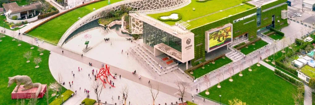
You don’t really notice that this is an accessibility feature; it feels like an elegant, slow way to experience the exhibits. In such designs, those who want a faster route (such as an elevator) can still have one, but many people prefer the ramp because it is an enjoyable way to move—the friction is not just a hindrance, but an interaction. Another striking example is the multi-sensory wayfinding in transportation hubs. In the new transit terminal in Breda, the Netherlands, not only ramps and elevators are used, but also various floor materials to distinguish between areas (ribbed tiles for platform edges, smooth tiles for walking paths) and even audio cues to guide visually impaired passengers. These elements add texture and complexity to the environment, but instead of hindering users, they are assistive. This reminds us that continuity is not always safer or more navigable—sometimes a uniform environment can confuse those who rely on non-visual cues. Small friction points (such as a change in floor texture) can signal important functional information.
There is also a social dimension to balancing friction and function: choice and respectability. An area that offers only a frictionless route can ironically reduce everyone to the same experience, whereas an area that offers both easy and challenging options respects individual preferences. Consider a public park with both a direct asphalt path and a winding, stepped stone path through the forest. The latter is clearly a friction-filled experience (your shoes might get muddy or you might need to watch your step) and not everyone will use it—but its presence adds richness for those who do, without preventing anyone from enjoying the park via the smoother path. Having both an open staircase and an elevator in an office building encourages those who can and want to use the stairs (perhaps for exercise or casual encounters between floors) while also ensuring equal access for those who cannot use them. In fact, many progressive designs are making stairs more appealing—wide, well-lit landings that double as social hubs—to encourage movement and interaction (a healthy amount of friction to break down siloed floors), alongside accessible and efficient elevators for heavy loads.
A potential concern is that celebrating friction could be used to excuse it. What matters is always the design intent: friction should not be a flaw but a feature—something intentionally placed for experiential gain and never the only way to do something critical. It should invite interaction, not force it. For example, an architecture school might include an “intervention” such as a rough experimental staircase in its lobby to encourage students to think about materials (a fun challenge to walk on, perhaps with different riser heights as an explanation) — but there would also be a normal staircase or ramp nearby that complies with code. The goal is not to make life difficult; it is to create awareness. The same principle applies to everyday architecture. Many museums now create “sensory corridors” or installations that any visitor can choose to enter for a richer experience — perhaps a dark tunnel with an interesting acoustic design or a tactile sculpture gallery — but these are additional to the main circulation and enhance it for those who wish to explore. This also grants people with different abilities the ability to move: friction becomes a matter of choice and discovery, which is empowering in itself.
Another framework worth mentioning is “not a checklist, but an inclusive design mindset”. When architects approach projects with an inclusive mindset, they often naturally bring friction and function together. They ask: Can this necessary feature (e.g., a handrail) serve multiple purposes? Perhaps the handrail could be textured or interactive, serving both as guidance and an educational element. Could a waiting area be more than just rows of chairs—perhaps some movable cubes or rocking chairs to allow people to fidget or arrange themselves comfortably? Designers brainstorm these ideas, adding layers of experience on top of the core function. Most importantly, designers discover that while these solutions are initially designed with an inclusive purpose in mind, they ultimately benefit everyone. A classic example: ramps on sidewalks were originally designed for wheelchair users, but as they became more widespread, parents with strollers, workers with handcarts, travelers with suitcases, and even the average jogger have found them extremely useful. A slight “friction” in the continuity of a sidewalk (the ramp cuts across the sidewalk line) has turned into a huge net positive. Similarly, textured and visual fire alarm systems (flashing lights + sound) help the deaf and also catch the attention of people wearing headphones. Therefore, it can be said that the goal is to create the right type of friction—the kind that increases awareness and inclusivity at the same time.
In neuro-inclusive design, there is often talk of “designing for unpredictability” – accepting that not all users will respond in the same way, and therefore flexibility is key. For some, an intense pattern on the floor may be pleasant; for others, it may be disorienting. One approach is to avoid excessive patterns (maintaining a relatively calm base environment) while providing stimulating zones where those seeking it can indulge themselves. For example, a hospital might have predominantly simple, calming corridors, but on one side there is a multisensory room with interactive lights, sounds, and textures for patients (or staff) who benefit from this therapeutic stimulation. This room is designed to be completely frictionless—functionally, nothing is “efficient,” it is entirely about sensory interaction—yet it coexists with an efficient core. In doing so, it actually addresses a functional need: mental health and emotional well-being. In an age where we recognize neurodiversity, these design choices prevent unintentional exclusion (such as an autistic patient feeling overwhelmed in a chaotic waiting area with no escape) and instead offer options for everyone.
“Conflict without exclusion – an architecture of choice and participation.” This phrase sums up the balanced approach. It implies that every user can find a comfortable path through the space, but that those who want or are able to do so have opportunities for deeper engagement along the way. For someone with limited mobility, “interaction” might mean being able to comfortably access a tactile exhibition or receive an audio explanation—not an obstacle course. For someone with mobility, “interaction” might mean climbing a scenic staircase that encourages encounters with colleagues. Design should serve both equally. The ethos of Universal Design is an environment that works for everyone, but this does not mean a single monotonous path—it could mean a network of paths that are all safe and accessible but have different characters. In a way, this aligns with the idea of “Design for everyone but allow for individuality”.
It is encouraging to see that some accessibility features are now being designed in an attractive way, effectively removing the stigma of ramps, elevators, Braille signs, etc. as cumbersome additions. For example, tactile paving (raised tiles at pedestrian crossings) can be made with integrated patterns that complement natural stone or landscape design. They continue to provide the necessary foot friction for the visually impaired, but they do not scream utilitarianism; sighted pedestrians hardly notice them and sometimes even find the texture interesting. In architecture schools, students are taught to consider these details not as afterthoughts but as integral parts of the design. The result is spaces that are both interesting and navigable. A multi-sensory, inclusive approach naturally mixes smooth and rough, loud and quiet, bright and dim. It rejects the smoothness that conforms to a single body. In doing so, it actually validates our argument: while a uniform and problem-free environment can ironically leave many people feeling inadequate, an environment with controlled friction and diversity embraces a wider audience.
Finally, we should mention dignity and challenge. In therapeutic design, there is a concept called “the dignity of risk”—allowing people, even if they are disabled or elderly, to face challenges if they wish, rather than wrapping them in cotton wool. For example, in a home for the elderly, having a small garden with raised planters that residents can tend to (which involves bending over, perhaps getting a little dirty, and navigating an uneven path) can be much more enriching than a perfectly flat enclosed courtyard where they sit passively. Of course, it must be safe (there should be no life-threatening tripping hazards), but to a certain extent, challenging and, yes, effort can increase health and happiness. The same applies to accessible play areas for children with all abilities: designers are no longer assuming flat surfaces but are incorporating wheelchair-accessible ramps leading to elevated play areas, sensory play panels at various heights, and gentle slopes or flexible surfaces that allow children using mobility devices to still participate in the fun. The idea here is to offer those who are often pushed aside “for their own safety” the option of mild risk and exploration. This is a humane balance between friction and function: allowing people to participate fully as they choose while ensuring that no one is left out through the safety net of inclusive design.
In summary, balancing friction and function in the age of accessibility means designing for duality: spaces that are fundamentally inclusive and functional, yet layered with opportunities for sensory and spatial interaction. This means applying friction as a subtle texture rather than a barrier in the user experience. When done right, inclusive architecture often becomes richer architecture. As one advocate of inclusive design puts it, we must “think beyond the ‘typical’ user and collaborate to include other perspectives” — and these perspectives might say, for example, that a floor pattern helps them find their way around or that a different scent helps them remember a place. Therefore, the accessible city of the future may be a city that is not less but more sensory and diverse. Ironically, designing for true accessibility may bring back some qualities that seamless aesthetics have eliminated (textured surfaces, obvious cues, a slower pace, etc.). Accessibility is not the enemy of atmosphere; it is about offering multiple paths. These paths can include both ramps and stairs, quiet rooms and lively plazas, allowing users to choose their own adventures. Thus, architecture is not a monotonous melody of perfection, but a richer composition played with different rhythms.
Friction as Memory, Fault, and Material Truth
When we rethink friction in architecture, a richer, more human built environment emerges—one that carries its history, engages its inhabitants, and reveals its essence. In an age of ultra-fluid user experiences, friction is worth reconsidering as a spatial virtue. It slows us down enough to allow spaces to leave an impression on our memory. Worn thresholds, the patina on stair railings, friction marks where people habitually pause—these are not dirt to be wiped away, but the memory traces of living architecture. They remind us that others have been here before us and that we, too, have left our mark. Friction also gives users a degree of agency: the chance to rearrange chairs, take the scenic route, adapt an unfinished house, or linger in unspoken places. In doing so, people cease to be mere occupants of a space and become active participants in shaping it. Finally, friction represents material reality—an honesty about how buildings are made and how they age. Rather than a deceptive veneer of perfection, architecture that celebrates joints, textures, and wear and tear tells the truth that buildings are part of the natural world and the passage of time. This is like the difference between a plastic plant and a real plant with a few brown leaves; one may appear flawless, but the other carries life.
Throughout this article, we have argued that designing for discontinuity does not mean causing discomfort or ignoring the needs of modern life. This means carefully reintroducing the texture of architecture—its tactility, complexity, and yes, sometimes its difficulty—to create spaces that feel alive and meaningful. We saw how Zumthor used friction to increase sensory awareness in Therme Vals, how Lacaton & Vassal used friction to layer history and empower residents, how Aravena used it to build community, and how public space design can channel it into social interaction and democratic use. We also addressed the balance needed to ensure that friction is not excluded by offering options and integrating it with inclusive design principles. The sum of these discoveries is a call to architects and designers to move beyond the false idol of absolute smoothness.
In the face of contemporary challenges such as climate change, social fragmentation, and digital alienation, friction architecture may even offer a solution. Buildings that age well (accepting wear and tear and transforming it into poetry) are more sustainable than those that require endless repairs. Spaces that encourage people to encounter one another (metaphorically, and even literally in a bustling market street) can strengthen social bonds in an age of isolation. Designs that allow us to feel our bodies and engage all our senses counteract the disembodiment of our screen-filled lives. In short, friction can ground us again. There is a certain poetry and freedom in imperfection. The Japanese concept of wabi-sabi values the patina of age—a crack in a tea cup is repaired with gold and becomes a beautiful scar. Architecture can embrace such poetry: a wall touched by generations, floorboards creaking with a certain melody in a beloved old home. These are sources of comfort and identity, not flaws.
It is worth remembering a simple human truth: the experiences that stick with us often involve a challenge. A peaceful walk up a rocky hill leaves a deeper impression than a smooth ride on an escalator; slowly restoring an old house teaches us more than buying a brand-new apartment. Similarly, the built environments we value—historic city centers, interesting museums, lively plazas—all have their uneven sidewalks and quirky layouts. Even if we curse them from time to time (when we trip over that damn cobblestone), we remember them fondly. We adapt to them, and in doing so, they shape us. Architecture that offers friction essentially invites us to complete the task, to fill in the gaps with our own movement, perception, and imagination. Rather than a finished image to be consumed, it is a lived story that we enter into. And isn’t that what architecture should be: not a sterile box, but a stage for the drama of life?
As we design the future, let’s carry forward the lesson that a little roughness and resistance can be a gift. Let’s create buildings and cities that, like a beloved tool or musical instrument, gain character with use—not despite it. In doing so, let’s ensure that our spaces are not just visually smooth backdrops for Instagram, but deeply engaging environments that shape better memories, stronger communities, and more resilient identities.
Discover more from Dök Architecture
Subscribe to get the latest posts sent to your email.