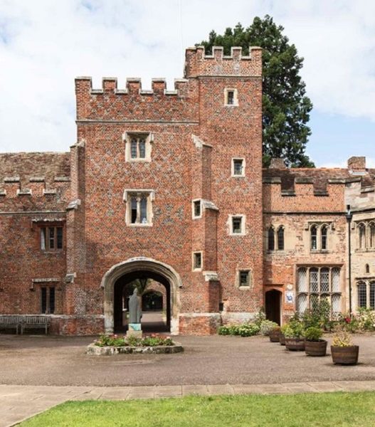


Material Shortages During Wartime and the Introduction of Concrete
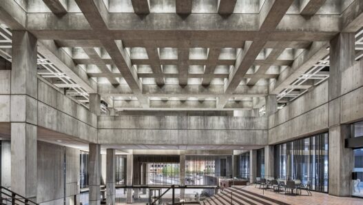
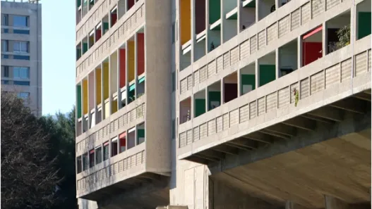
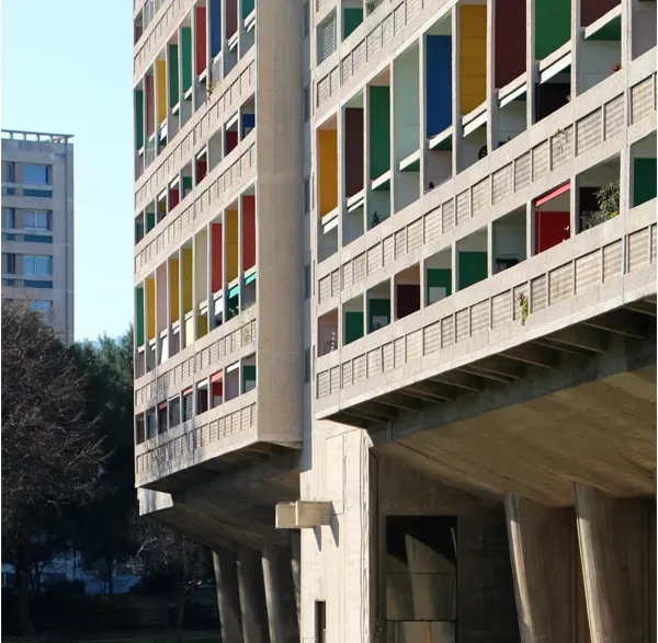
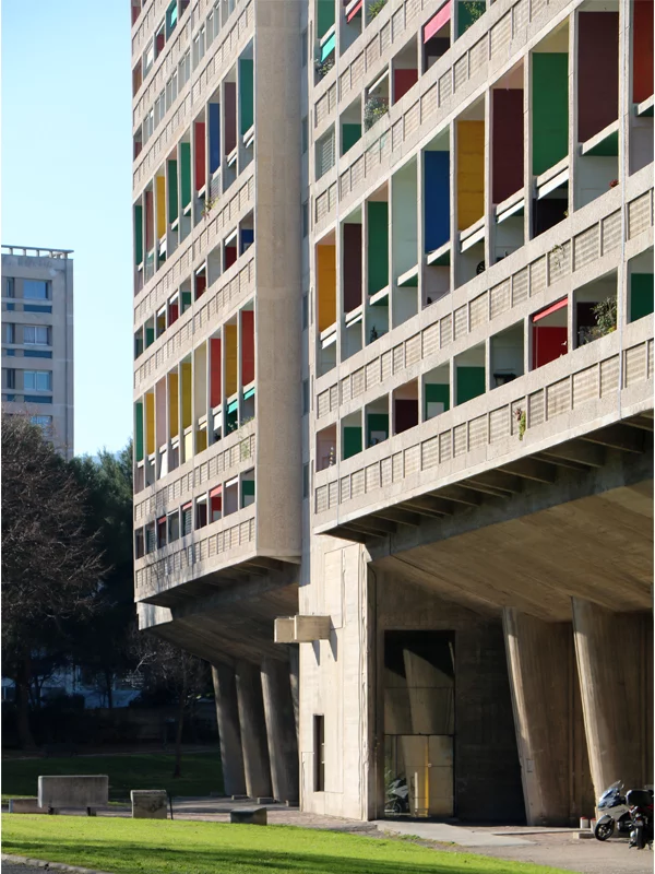
In the ruins of post-war Europe, architects did not choose concrete because it looked “harsh.” They used it because it was available, cheap, and could be poured quickly on a very large scale. Steel and quality timber were scarce or tightly controlled, so raw, cast-in-place concrete (béton brut) became a practical solution to the housing shortage. France’s most famous example, Le Corbusier’s Unité d’Habitation building in Marseille, switched from the planned steel skeleton to concrete after it became apparent that steel was too expensive in the post-war period; the result was a single block housing hundreds of families, shops, a school, and a roof terrace, representing city life in a single block.
In the UK, years of restrictive and licensing practices shaped the construction industry and steered designers toward systems that could provide maximum shelter at minimum cost and with minimal cladding. This economic approach—characterized by “bare structures, exposed installations, and simple materials”—laid the groundwork for a new aesthetic language that would later be called “Brutalism” (and frequently criticized).
The Misinterpretation of Le Corbusier’s Minimalism
The term “brutalism” did not emerge as a threat; it began with words. Critics associated this movement with Le Corbusier’s expression “béton brut” (“raw concrete”) and the Swedish word “nybrutalism” (new brutalism), which reached young architects in London. During this process, the public heard the word “brutal” and perceived it as “hostile.” However, Corbusier’s own béton brut, as in Unité, was often enlivened by colors, deep eaves, and social programs, and this had taken root in everyday life rather than being simplicity in itself.
This shift was significant. A material strategy intended to be open and efficient was redefined as a harsh, cold, and inhumane attitude through headlines and street talk. The gap between the architect’s “raw” understanding and the public’s “merciless” understanding widened day by day with worn-out facades and neglected squares, and a linguistic oddity turned into a permanent misunderstanding of intent.
Decoration and Reactions to Modernist Dogma
Brutalism was more than just a love of concrete; it was a moral stance on the reality of materials and the legibility of structure. The Smithsons and their followers argued that buildings should show how they stand, use materials “as found,” and avoid false finishes. This ethos, stripped of decorative screens and delicate cladding, was a reaction against both traditional ornamentation and a kind of formulaic, stylish International Style.
Look at Hunstanton School or Le Corbusier’s Unité and see how this belief was put into practice: the displayed structure, visible services, open circulation. This movement was not against beauty; it was against fraud. In cities with an urgent need for schools, housing, theaters, and government buildings, this clarity was perceived as honesty and, for a time, as hope.
The Role of Miscommunication in Design Intent
Within a few years, “New Brutalism” split into two parts: an ethic and an image. Critic Reyner Banham attempted to capture both, arguing that new works should be memorable as an image, clearly display their structure, and value materials in their natural state. However, as these criteria became widespread, the public and many clients focused on the image aspect—large, raw, photogenic forms—while overlooking the social ethics that the Smithsons called “ethics, not style.” The result was a feedback loop: the more the camera loved the look, the easier it was to lose sight of the purpose.
This chasm is also evident in the perception of “streets in the sky.” At Robin Hood Gardens, high-access platforms were built to encourage neighborly relations; however, decades of underinvestment and political obstacles turned these platforms into symbols of decline instead. When demolition time came, the Victoria & Albert Museum salvaged a full-scale piece for the Venice Biennale. This was a work born of misinterpreted intentions.
Public Reaction and Cult Aesthetic Heritage
In the late 1970s and 1980s, harsh winters, delayed maintenance work, and windy squares coincided with a changing political climate. Brutalism became the subject of ridicule as examples of “ugly” modernism, as seen in Boston City Hall and countless English mansions. This backlash fueled demolition campaigns; at the same time, it sharpened the preservation movement, which argued that these buildings recorded a social ambition worth remembering.
The story doesn’t end here. Photography, academic studies, and public campaigns like SOS Brutalism, along with a series of high-profile listings, have reframed many concrete giants as heritage sites. Once under threat, Preston Bus Terminal is now listed as a Grade II historic building; film and media have also contributed to this rescue effort, with books, tours, and packed screenings showcasing the public’s renewed affection. Whether you love it or hate it, Brutalism has become a cult aesthetic precisely because its “flaws” are so pronounced: its raw quality, scale, and authenticity. These characteristics made it easy to critique and unforgettable.
When Form Betrays Function: The Walkie-Talkie Skyscraper Example
The Melting Car Incident: Design and the Environment
In a bright week of 2013, 20 Fenchurch Street in London proved that a building can act like a magnifying glass. Sunlight hit the concave, high-glass south facade and reflected onto a hot spot in Eastcheap—hot enough to blister paint, deform the plastic trim of a parked Jaguar, and even fry an egg on a pan left on the sidewalk. While the press dubbed the incident “Walkie-Scorchie,” architect Rafael Viñoly acknowledged the reflections but noted that he “didn’t realize it would get that hot,” adding that the planned south-facing shutters had been removed due to cost-cutting measures.
The solution came in two stages. First, a temporary street-side curtain was installed; then a permanent renovation was carried out: brise-soleil “rows of aluminum fins added to the south facade of the tower” to disperse and block the reflected rays between the third and thirty-fourth floors. This was a classic “afterthought” in environmental design, and by adding it to a completed landmark, the street below was able to return to its normal life.
The Dangers of Parametric Facade Curvature
Digitally rendered curves may be irresistible, but a concave, shiny surface, whether intended or not, is a solar energy device. This is clearly stated in the City of London’s own guidelines: when reflective elements are arranged concavely (in plan, section, or both), sunlight is focused rather than scattered, resulting in solar energy convergence. Materials that exhibit “specular” behavior, like mirrors, enhance this effect, while matte or diffuse surfaces create the opposite effect. In other words, geometry plus reflectivity equals risk.
Researchers recreated the Walkie-Talkie’s hot spot using ray tracing models and proposed quantitative limits for safe exposure, thereby translating the tabloid landscape into technical criteria. The municipality’s recommendation sets threshold values for light intensity and exposure time and suggests early-stage testing and shading if concavity is unavoidable; elsewhere, facade engineers have published methods to predict and reduce “death ray” reflections before they leave the drawing board. The result is a new design reflex: to consider concave glass not only aesthetically but also optically.
Urban Wind Tunnels and Heat Reflection Hazards
Temperature wasn’t the only surprise in the microclimate. After construction was completed, workers around 20 Fenchurch Street reported wind gusts at street level that didn’t match pre-construction assessments. This situation served as a reminder that tall, top-heavy structures can accelerate downward air currents and redirect winds in unpredictable ways. The city responded by lowering its “comfortable” threshold and requesting more rigorous testing of how the towers affect pedestrians and cyclists.
These policy changes are now supported by technical rules. The City of London Wind Microclimate Guidelines require wind tunnel and CFD studies to be conducted in 36 directions, typically by independent teams, and comfort and safety targets linked to actual usage, from entrances to bike lanes, to be established. This is more than a checklist; it is a shift in design culture: measuring the microclimate, then shaping the building and ground plan to make streets safer and more usable.
Public Criticism Led to Changes in Regulations
The literal melting of a car beneath a new landmark structure captured the public’s attention as decisively as the facade’s concentration of sunlight. This pressure helped accelerate the official guidelines: Beyond the Walkie-Talkie’s own brise-soleil renovation, the City published Planning Advisory Notes addressing both sunlight concentration and glare, enabling teams to test geometries and materials early and prevent or mitigate concave, reflective traps or neutralize them with shading before issues reached the street.
The wind was also subject to a similar review. As complaints mounted and journalists reported on windy corners, the City tightened expectations and legalized better practices, explicitly defining pedestrians and cyclists as end users whose comfort and safety must be proven at the planning stage. This policy took shape in the public eye, with the Walkie-Talkie repeatedly cited as a cautionary example.
Undesirable Effects on Environmental Design Codes
What began as a local embarrassment has now gained international attention. London’s new wind regulations and thermal comfort framework, which combine wind, sun, temperature, and humidity into a single lens for the street experience, are now being referenced by practitioners far beyond the Square Mile. News reports at the time indicated that other cities were also adopting similar approaches to ensure the safety of cyclists and make open spaces more comfortable. This incident helped transform the concept of “ground-level comfort” from something that was desirable into an indisputable performance target.
There is also a quieter code change within the application. Walkie-Scorchie and its predecessors, such as Viñoly’s Vdara project in Las Vegas, routinely set light intensity limits, replace bright glass with glass that has a lower reflection rate, and add shading to the geometry from day one. Parametric scripts, meanwhile, flag concave hot spots before moving into the production phase. This is a new style born from an error: not a look, but a mindset that treats the city’s atmosphere and light as real design materials.
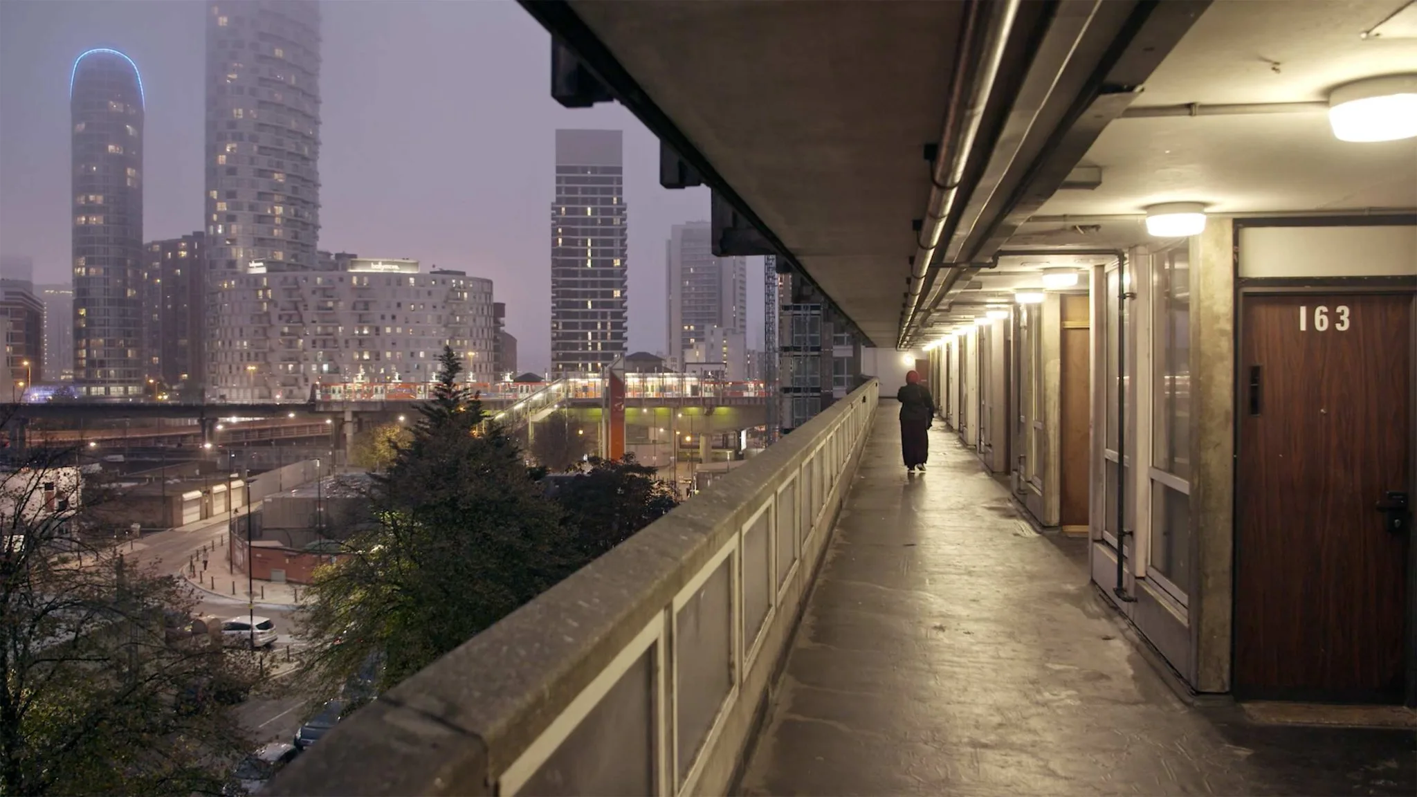
The Unliveable Legacy of Modernist Housing Blocks
Idealism Beyond Human Scale in Early Projects
Modernism sought to improve the scattered and crowded city through light, air, and order. The rules outlined in the Athens Charter treated the city like a machine with four distinct functions: living, working, recreation, and movement. Each function was assigned its own zone. This logic gave rise to the famous “towers in the park”—blocks rising above open spaces, sparse streets, and daily life elevated above the ground. It seemed logical on paper, but it often eliminated the small social friction that makes streets feel safe and lively. By dividing the city into single-purpose parts, planners also fragmented people’s routines.
Jane Jacobs had noticed this long ago. She argued that true urban security came from “watchful eyes on the streets,” where neighbors, shop owners, and passersby kept an informal watch on each other. When apartment blocks rose on vacant lots or were set back from corner shops and stairways, these daily guardians disappeared. The lesson to be learned was not that density is bad, but that the form of density matters: fine-grained, mixed, and legible at the human scale.
Pruitt-Igoe and the Death of the Utopian Vision
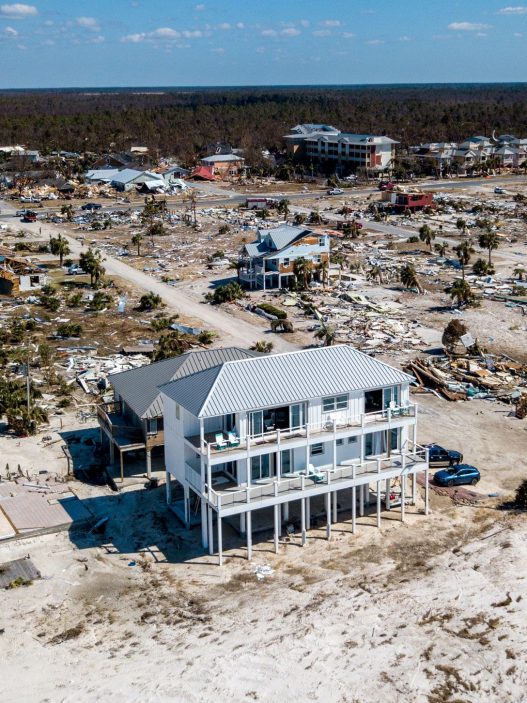
Pruitt-Igoe in St. Louis was the place that best symbolized the modernist housing crisis. Opened in the mid-1950s with approximately 3,000 apartments, the complex emptied at an astonishing rate; by the early 1970s, much of the complex was vacant or vandalized. In 1972, the demolition work was broadcast on national television, and architecture critic Charles Jencks later described this scene as the “death” of modern architecture. This image stuck in people’s minds and became proof for many that the entire experiment had failed.
However, the full story is more complex. Design choices mattered—”skip-stop elevators and long, open gallery corridors made supervision difficult, and cost-cutting eliminated ground-floor living”—but economics, racism, and policy failures also mattered. St. Louis was losing business and people, maintenance budgets were inadequate, and discrimination determined who would move in and who would move out. Historians and the documentary “The Pruitt-Igoe Myth” have shown that it was not just the architecture, but a combination of factors that led to the project’s failure. In other words, the problem was not just height or concrete. It was the mismatch between an abstract plan and the actual social and financial conditions on the ground.
Ignoring Cultural and Social Contexts
After the war, in many settlements, a uniform plan crushed local lifestyles. Households that depended on street trade, extended family care, or socializing in stairwells suddenly found themselves in deep-plan apartment buildings accessible only through nameless corridors. Ground floors without active edges felt empty; without mixed uses, travel increased; without neighbors at eye level, informal social control weakened. Jacobs’ common sense test—”does this place encourage daily observations, quick errands, and chance encounters?”—often failed.
Oscar Newman’s security theories, such as the “defensible space,” attempted to fill these gaps by advocating for open spaces, sightlines, and semi-private thresholds where residents would feel responsible. However, even these ideas worked best when combined with good management, stable financing, and public trust. Design can help or hinder, but it cannot function in a vacuum; social programs and management are as important as facades and floor slabs.
The Rise of Design Led by Participants and the Community
A counter-movement emerged from these failures: involving residents in the process from the outset and leaving room for change. Dutch theorist John Habraken proposed “Supports,” which separate a durable base structure from flexible infill material that households can shape over time. Instead of freezing an ideal plan from day one, the building becomes a platform for life to unfold. This idea sowed the seeds for the broader “open building” approach used today in housing and clinics.
John F. C. Turner went even further, arguing that what housing does for people is more important than how it looks. His work with self-help settlements showed that empowering families and directing subsidies toward land, services, and secure tenure yielded more livable results than finishing every room for them. Contemporary projects like Elemental’s Quinta Monroy in Chile apply these ideas on a large scale: building structurally “halfway decent” homes, then supporting residents in safely completing and expanding their homes over time. Longitudinal studies have shown that this phased model can stabilize communities while also improving equity.
Lessons for Contemporary Public Housing Models
The clearest lesson is that good social housing is not a single building, but a system. Vienna demonstrates how design, financing, and long-term management can be interconnected. The city directly owns approximately 220,000 municipal apartments and, working with limited-profit housing associations governed by national laws, keeps rents tied to actual costs rather than investors’ returns. Due to the large and permanent supply, most Viennese live in municipal or limited-profit housing, and quality remains high across generations.
Other models emphasize the same point in different ways. Singapore’s HDB combines mass supply with strong maintenance regimes and social policies, providing housing for approximately 80% of established households while maintaining high property and real estate maintenance. Regardless of rental or ownership, the model is consistent: stable public or mission-driven providers, predictable financing, mixed-use at the street level, and design frameworks flexible enough to meet changing family needs. If the mistake of the post-war era was imposing perfect forms on flawed realities, the new rule is more modest: start with people, build for adaptation, and support this with institutions that will still be around fifty years from now.
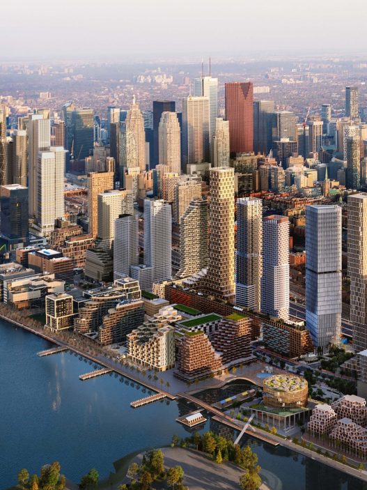
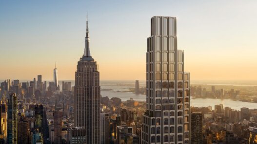
4. Glass Skyscrapers and the Energy Efficiency Crisis
Misinterpreting Transparency as Sustainability
For a generation, “more glass” seemed like the quick fix for being environmentally friendly: let in the daylight, dim the lights, and watch the meters slow down. In practice, however, the situation is more complex. Daylight can certainly reduce the need for electric lighting, but if the sun’s heat and glare are not controlled, the cooling load increases and blinds are lowered, so the savings you hoped for disappear. The Lawrence Berkeley National Laboratory has long warned that poorly managed daylight increases both discomfort and cooling energy, and that real savings depend not only on transparency but also on coordinated facades, shading, and controls.
The modern love affair with glass also benefited from technology. International Style promoted a clean, glassy aesthetic, but it took mid-century climate control and engineering technology to make completely glass-covered, airtight towers livable. As design culture combined visual lightness with environmental virtue, many buildings prioritized comfort through air conditioning rather than shaping facades for sun and climate.
Aesthetic Obsession with “International Style”
The 1932 exhibition at MoMA was named International Style and established a taste for volume, orderliness, and the absence of ornamentation. From New York to Chicago, this became an institutional look: taut curtain walls, clean grids, and clarity extending from the lobby to the sky. This clarity was visual, not thermal. The icons of that era, whose airtight facades relied on mechanical climate control to remain comfortable, helped normalize offices made entirely of glass as symbols of progress. The ideals of this style persisted; energy habits, however, became badly outdated.
Flashing, Overheating, and Cooling Paradoxes
Physical factors matter. As the window-to-wall ratio increases, studies consistently show that cooling demand rises, glare risk increases, and lighting savings must compete with solar energy gains. Extensive research in US offices has revealed that higher glazing ratios are associated with higher total energy use, while modeling and field studies show that bright areas can still be thermally costly without external shading or selective optics. Guidelines emerging from practice now limit glazing area based on orientation. For example, LETI in the UK recommends modest WWRs, particularly on east and west facades where controlling low-angle sun is most challenging.
Daylight standards have also shifted from the “more is better” approach to the “right light without glare” approach. LEED v4’s daylight credit uses the sDA and ASE metrics; if an area is overly exposed, you must demonstrate how glare is controlled before earning points. The Whole Building Design Guide and LBNL echo the same trade-off: daylighting saves energy when combined with shading, optics, and controls that prevent overheating.
LEED and BREEAM’s Challenge to Rethink
Rating systems have improved performance and pushed boundaries. Literally. By linking the energy prerequisite to ASHRAE 90.1-2010 and the stricter 90.1-2016 framework under v4.1, LEED v4 has moved design teams away from high WWR “glass boxes” that cannot be modeled well without aggressive shading and high-performance glazing. The daylight credit explicitly penalizes rooms with excessive sunlight unless glare issues are resolved. BREEAM combines the visual comfort requirement, which demands reliable glare control, with robust dynamic simulation and energy credits linked to reduced operational demand. The combined effect is as much cultural as it is technical: facade design must prove its comfort and efficiency on paper before construction.
Cities have adopted stricter measures. London’s energy guidelines now require projects to declare their glazing percentages in energy assessments, and New York’s Local Law 97 sets emission limits for large buildings and makes it financially risky to operate leaky, excessively glazed buildings unless they undergo significant renovation. The policy has become a design principle: first reduce demand, then meet the remainder cleanly.
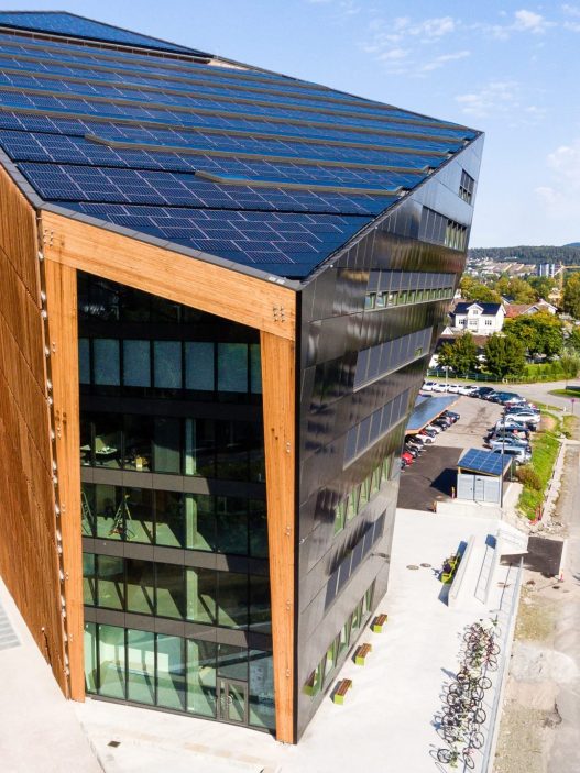
The Invention of Double Shell and Passive Shading
Instead of abandoning glass, many teams redesigned it. Double-walled facades create a ventilated cavity constructed in box window, corridor, or shaft box types. Within this cavity, external sunshades can be located in a protected area, solar energy can be captured, and fresh air can be heated before entering the room. Pioneering European towers brought this idea to tall buildings: Foster + Partners’ Commerzbank building in Frankfurt and Sauerbruch Hutton’s KfW Westarkade building use layered facades, sky gardens, and pressure-balanced voids to provide daylight and natural ventilation for much of the year while also reducing cooling loads. These are not merely aesthetic tricks but thermodynamic devices integrated into the building’s exterior.
Passive shading completes this transformation. Studies show that external shading is more effective than internal blinds because it stops heat before it reaches the glass, reducing both solar heat gain and glare. Contemporary projects scale this logic with responsive systems: Abu Dhabi’s Al Bahar Towers use a dynamic mashrabiya that tracks the sun, significantly reducing solar gain and cooling needs while preserving views and daylight. Whether through fixed projections, vertical blades, or kinetic screens, the lesson remains the same: prioritize form and shading first, then fine-tune with selective glass and smart controls.
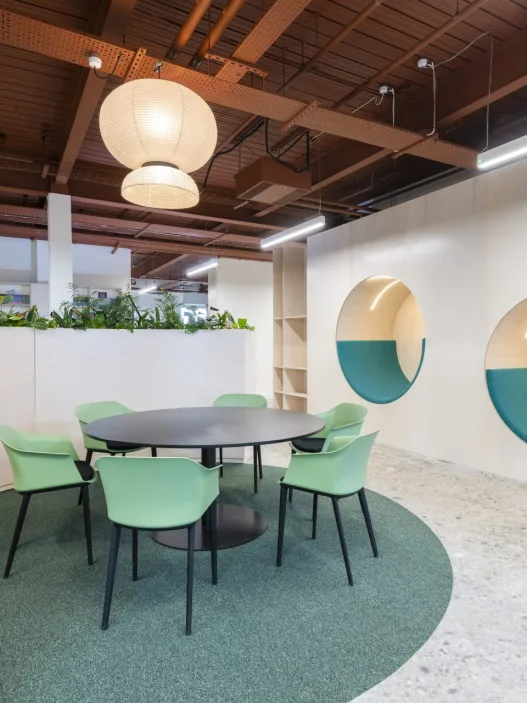
The Open Plan Revolution and Its Psychological Effects
The Origins of Flexibility and Cooperation Ideals
Open-plan offices emerged from a sincere desire to make work more human. In the 1950s, the Quickborner Team in Germany proposed the “office landscape” (Bürolandschaft), featuring fluid groupings instead of rigid rows, to encourage communication and flatten hierarchies. Their ideas spread internationally, and for a moment, offices began to resemble a social organism rather than a factory.
Ten years later, Robert Propst of Herman Miller sought to introduce new open-plan tools capable of adapting to changing tasks. The Action Office system promised movable components, sit-stand surfaces, and the ability for teams to reconfigure their environment as work evolved. Propst’s vision was not about cramming people together, but about autonomy and adaptability; he later lamented that cost-cutting measures had transformed this idea into monotonous “cube farms.” Yet the seed remained the same: openness as a platform for collaboration and choice.
Unexpected Effects on Noise and Focus
When the partitions were removed, sound and social cues flooded in. Post-implementation studies show that employees working in open-plan offices report lower satisfaction with privacy and acoustics compared to those working in closed rooms, but the gains in “ease of interaction” are below expectations. In return, consistent results emerge, such as increased exposure to conversation and movement, greater distraction, and a perceived decline in productivity.
Experimental and field studies link these issues to measurable tension. Simulated office studies associate typical open-plan office conversation noise with cognitive load and stress responses, while real-world observations during office “demolitions” revealed that face-to-face interaction actually decreased after teams transitioned to more open layouts. People preferred digital messages over conversations to maintain their focus. Open-plan promised serendipitous encounters; the human nervous system demanded boundaries.
The Pandemic Exposed the Weaknesses of Open Plans
COVID-19 has redefined openness as a risk management issue. Engineering institutions have acknowledged the importance of airborne transmission and emphasized the need to improve ventilation systems, implement filtration, and make operational changes. These recommendations challenged dense layouts with shared air and few physical barriers, where desks are placed close together. The message was clear: Air is an architectural material and must be shaped as much as light.
At the same time, global workplace surveys reported that many knowledge workers received more support for working from home with focus compared to their pre-pandemic offices. This reinforced the argument that the “average open plan” is not conducive to deep work. As organizations transition to hybrid work programs, offices must now justify themselves as purposeful gathering places rather than default participation locations. This shift has exposed the acoustic and privacy deficiencies of large, undifferentiated floors.
Acoustic Zoning and the Return of Visual Privacy
Designers responded by reconstructing the edges within the open plan. Standards now provide a common language for performance: ISO 3382-3 defines the method for measuring speech propagation and intelligibility in open spaces, while ISO 22955 sets user-focused targets for activity-based spaces. Thus, “quiet” areas remain truly quiet, and conversations in collaborative spaces are tolerated without spilling into areas requiring focus. Instead of a single large room, contemporary offices are transforming into a calibrated series of soundscapes.
Well-being frameworks are also moving in the same direction. The WELL Building Standard’s sound characteristics formalize acoustic privacy, and its guidelines on sound masking point to activation levels that make nearby conversations less intelligible without making the space feel overly quiet. Industry handbooks reinforce this with pragmatic criteria. For example, the British Council for Offices guide refers to NR targets for open-plan and cubicle offices, directing projects toward standard amenities such as quiet rooms, phone booths, libraries, and screened workstations.
Design for Balance: Openness with Boundaries
The next office reestablishes the thresholds our minds require while preserving useful openness elements (informal access, visual connection, reconfigurability). In practice, this means framing neighborhoods around tasks and then proving their performance with metrics: Designing for speech disruption and privacy distances according to ISO 3382-3, adjusting background noise with calibrated masking where appropriate, and mixing low-stimulus “deep work” rooms with high-social project areas, so people can move to the environment their task requires. The goal is not the freedom to be interrupted, but the freedom to choose.
Hybrid work has also raised the bar for why we meet face-to-face. Spaces that deserve commuting combine clear acoustics with clear sightlines and modest visual privacy, so collaboration becomes energizing rather than performative. Research on activity-based offices shows that when users can find and claim environments suited to their tasks, perceived productivity and well-being increase; when they cannot, the old pitfalls of open-plan layouts are repeated on a large scale. Therefore, achieving balance is both a psychological and operational issue: align policy and reservations with design, and ensure the plan encourages interaction while also preserving focus.
Accepting Mistakes as a Catalyst for Innovation
Architectural Error as a Design Accelerator
If architecture is a slow dialogue with reality, then error is the moment that dialogue responds. Every field that builds at full scale learns this truth: missteps reveal hidden variables faster than consistent success. Engineering scholar Henry Petroski argues that failure is not a shame to be buried, but a motor of knowledge, because every collapse or deficiency reveals the limits of what we do not yet understand and propels the next design forward. Architecture, which shares engineering’s risks but also incorporates culture and habits, progresses in the same way: by rigorously analyzing what went wrong.
Design theory provides the methodology for this reading. Donald Schön’s idea of the “reflective practitioner” frames practice as a continuous cycle: action, perception of results, reflection, adjustment. In this cycle, the designer learns directly from the material and social “feedback” of the situation. Studios and workplaces become laboratories; reflective practice transforms mistakes from wounds to be hidden into structured experiments.
How Do Failures Change Public Perception and Policy?
Visible errors don’t just change buildings; they change the rules. The “Walkie-Talkie” glare incident in London prompted the City of London to publish an official guideline on the convergence of sunlight. This guidance warned against concave, reflective facades and documented renovation strategies such as external brise-soleil that eliminate the problem. What began as a local embarrassment has now become a codified recommendation guiding early-stage modeling and approval processes.
Energy policy also follows the same model at the urban scale. As mechanically energy-intensive glass towers proliferate, cities have moved from voluntary labels to binding restrictions. New York’s Local Law 97 set emission limits for large buildings, forcing owners to reduce operational carbon or face fines; at the project level, LEED v4 tied daylight credits to excessive exposure standards (ASE), so that “more light” no longer overshadowed glare and cooling penalties. A visible performance failure class sharpened public will and technical tools for demanding better envelopes and lower carbon.
From Regret to Revival: Styles That Have Become Icons
History is generous to the misunderstood. The Eiffel Tower, vilified by Parisian artists during its construction as a monstrous factory chimney, has today become a symbol of France. This situation reminds us that shock and skepticism sometimes precede affection. The same process is unfolding, albeit more slowly, with late modern concrete. Once slated for demolition, the Preston Bus Terminal, following a careful renovation, gained Grade II listed status and later won the World Monuments Fund/Knoll Prize for Modernism, proving that yesterday’s “mistake” can become tomorrow’s heritage. Here, preservation is not nostalgia; it is the argument that bold experiments deserve careful re-evaluation.
Reassessment reshapes both pleasure and technique. Platforms like SOS Brutalism catalog and champion concrete structures worldwide, reframing their roughness as evidence of social purpose and material honesty. As public narratives soften, technical renovations—such as “thermal improvements, careful repairs, and new access options”—move these buildings forward without erasing their character. Craft-supported cultural forgiveness transforms regret into renewal.
Architects’ Responsibility to Learn from Mistakes
Admitting mistakes is as much an ethical duty as it is a technical one. If buildings affect public safety, mental health, and the climate, lessons cannot remain hidden. Standards translate ideas into measurable goals: ISO 3382-3 in offices defines how to verify speech privacy and intelligibility in open-plan spaces; on facades, rating systems and local guidelines encourage teams to test solar gain, glare, and emissions before the first mock-up is built. The goal here is not to restrict creativity, but to provide robust feedback loops that keep people safe and comfortable.
Design culture matures when practitioners develop not only their signatures but also their reflective habits. Schön’s model requires teams to treat each stage (briefing, modeling, fieldwork, post-use) as a place for listening and refining. Petroski’s reminder is harsher: We learn less from our successes than from the honest autopsy of our failures. Together, they demonstrate a curious, transparent, and responsible professional stance.
Celebrating Imperfections in the Built Form
Imperfection is not an aesthetic crutch; it is a design strategy for a changing world. When we appreciate patina, repair marks, or a well-executed renovation, we affirm that buildings can evolve without shame. Policies that reward repeated improvements—such as “decades of tightened emission limits, plans that prioritize better acoustics and daylighting, and comfort standards”—ensure that this evolution remains visible and valued rather than invisible.
A deeper invitation, however, is cultural in nature. Cities are collective prototypes. Some experiences will surprise us, some will hurt us, and some will become icons we cannot live without. If we see mistakes as catalysts, “examined, shared, and put back into practice,” then new forms will be both bolder and gentler. This is the secret to keeping an area that has been built over centuries young.
Discover more from Dök Architecture
Subscribe to get the latest posts sent to your email.