


Minimalist luxury is not simply about having less. It is a quest for precision: the right form, the right material, the right light, arranged so that nothing distracts from the experience. In this sense, luxury is not about ostentation or logos, but the quiet confidence of proportion, craftsmanship, and durability. John Pawson’s writings and work helped codify this stance by demonstrating how reduction can enhance the perception of light, texture, and scale.
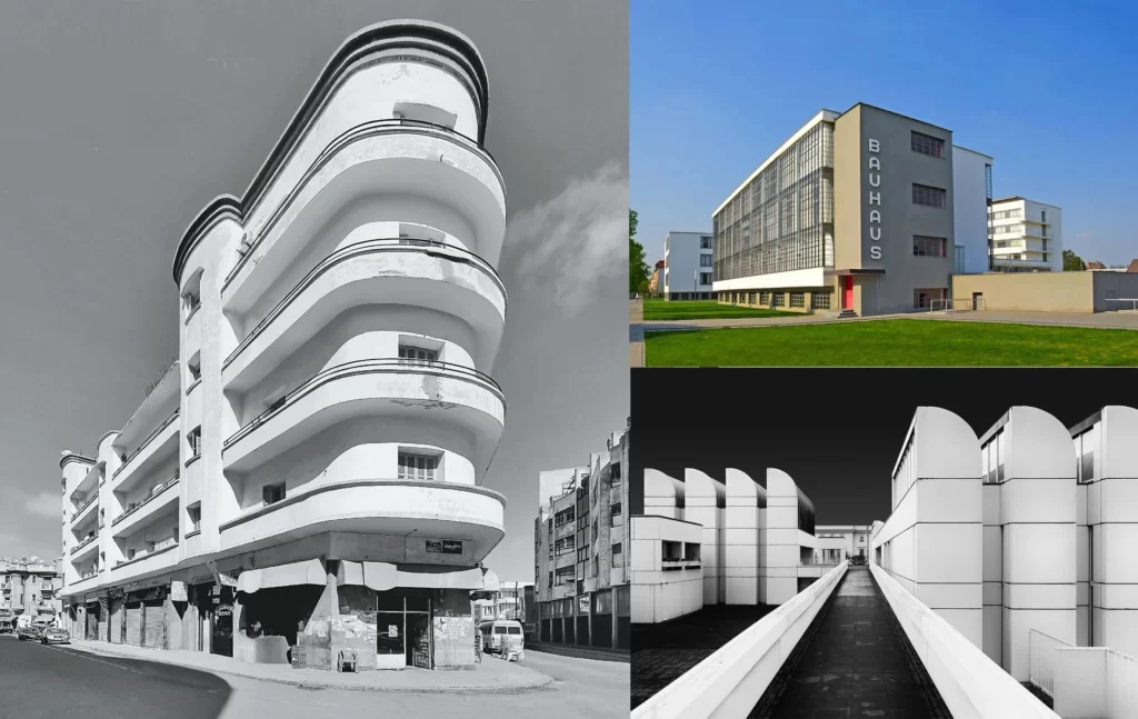
Historically, minimalism draws from multiple sources simultaneously. As an art movement, it crystallized in the 1960s with extreme formal simplicity, while in architecture, its roots extend back to early modern movements such as De Stijl and Bauhaus. Both movements emphasize clarity, geometry, and functionality. These ideas later intertwined with Japanese aesthetics, which actively considers restraint and emptiness as design elements.

Today’s market sees a broad shift towards “quiet luxury,” where minimalist luxury, quality, durability, and refinement are prioritized in interiors and branded environments. This can be seen everywhere, from luxury accommodation facilities to meticulously simplified retail spaces.
The Philosophy and Context of Minimalist Luxury
Minimalism is a method used to reach the essence. Bauhaus harmonized beauty with purpose, and later minimalism in art took simplicity to an objective extreme. Architecture embraced both movements, making structures understandable through simplification and allowing materials to speak for themselves without ornamentation.
In practice, this philosophy emphasizes light, proportion, and material reality. Pawson’s “Minimum” defines simplicity as the disciplined pursuit of a few key elements, while Japanese traditions introduce concepts such as ma and shibumi, where emptiness and subtle elegance become productive elements of the space.


The origins of minimalism in architecture
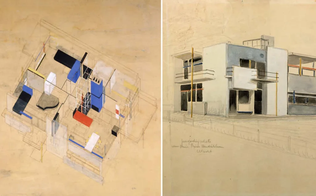
The architectural origins of minimalism date back to the early 20th century. De Stijl limited form to planes and fundamental relationships. Rietveld’s Schröder House is the best example of this, with its radical composition of movable partitions and right angles. Bauhaus argued that art and industry should be combined, that form should follow function, and that ornamentation should yield to clarity.

Minimalism emerged in the art of the 1960s as a simple style composed of repetitive, realistic forms, reinforcing the trend toward simplification and objectivity in architecture. This Western movement converged with the Japanese aesthetic of restraint, transience, and silence, which had been embraced for a long time, and was later transformed by architects such as Tadao Ando into concrete, light, and shadow.
To adopt the principle that “less is more” as a guide
Mies van der Rohe popularized the slogan “less is more” to express a compositional ethic in which each element must justify its existence. In his work, this slogan created structural clarity and material sensitivity, demonstrating that simplification could intensify rather than diminish elegance. The accompanying proverb, “God is in the details,” describes the meticulous application required by this approach.
This statement also drew criticism. Robert Venturi responded by saying, “Less is boring,” and defended complexity and contradiction in appropriate situations. This debate clarifies the role of minimalism: Minimalism is a conscious choice among design strategies, not a moral absolute.
The place of minimalism in the evolution of luxury design
Over the past twenty years, luxury has evolved from an overtly displayed concept to a carefully crafted restraint. In interiors, this manifests itself through calm color palettes, flawless carpentry, and investments in tactile materials that improve with age. Publications and market reports define “quiet luxury”—a concept that emphasizes timelessness over innovation—as one that has moved from fashion into the home.
Case studies demonstrate how simplification creates a superior experience. Apple’s flagship stores emphasize glass engineering and spatial clarity, enabling technology to evoke a weightless and serene feeling. Aman’s resorts create a contemplative tranquility that evokes a rare and special feeling by using measured geometry and natural materials. Both exemplify how simplicity, when executed at a very high level, becomes a form of luxury.
Distinguishing minimalism from simplicity
Minimalism and simplicity are not synonymous. Simplicity is generally associated with restriction, either for its own sake or due to cost, whereas architectural minimalism is a deliberate act of positive organization achieved through meticulous craftsmanship. Pawson emphasizes that true minimalism is not about self-denial or emptiness, but rather the “truth” of what remains, made comprehensible through light, proportion, and material quality.
This distinction is important in the luxury sector. Minimalist luxury can offer a rich experience because it allocates resources to things that are enduring: stones that feel good to the touch, flawless details, and daylight that spreads harmoniously throughout the day. When done well, the result feels generous and enduring, not sparse or cheap.
Importance, Texture, and Color Palette
Minimalist luxury treats materials as the leading actors. The palette is deliberately kept narrow, allowing stone, glass, metal, and wood to speak for themselves. The effect relies not on decoration, but on the sensitivity, proportion, and light that emphasize the presence of each surface. Peter Zumthor defines this as creating an atmosphere where materials carry not only functionality but also memory and mood. Juhani Pallasmaa similarly centers on tactility, reminding us that architecture is not only seen with the eyes but also felt with the hands and body.
A limited color palette is not a limitation, but rather a lens. By reducing color and complexity, texture, pores, reflection, and weight become more clearly discernible. For this reason, minimalist interiors often convey a calm yet intense feeling: by eliminating noise, they bring the character of the material, light, and shadow to the forefront.
Material selection – stone, glass, metal, wood
Stone carries mass and time. In minimalist environments, limestones, marbles, and granites are valued for their integrity, ability to be cleanly cut, and capacity to take on different surfaces for floors, walls, or stairs. The Natural Stone Institute’s design guidelines and the Stone Federation’s guidance emphasize that, whether the goal is a quiet polished surface or a more textured exterior, the choice cannot be separated from performance and surface.
Glass creates a counterbalance to the weight of the stone. Low-iron compositions eliminate the greenish tint glass normally possesses and provide a neutral, clear edge that supports minimalists’ desire for visual precision. These substrates can be laminated, coated, or processed for privacy without losing light transmission, making them ideal for delicate, serene envelopes and partitions.

Metal adds discipline and craftsmanship to joints, edges, and surfaces. Brushed stainless steel is resistant to fingerprints and softens reflections, while bronze and copper add a warmth that deepens with patina. Technical sources on architectural copper detail how patina changes depending on direction and climate, ensuring that the material’s aging is part of its desired character.
Wood is known as the material that best reflects the sense of touch. American hardwood species such as oak, ash, and maple offer different colors and grain patterns for floors, cabinets, and panels when treated with oils or clear finishes that reveal their grain without adding gloss. The American Hardwood Export Council’s species guides clearly outline these differences and their suitability for furniture and interior design.
Surface treatments, coatings, and restrictions
In minimalist luxury, the finish is not cosmetic. It adjusts light, slip, acoustics, and tactility. Stone clearly demonstrates this range: polished surfaces enhance reflectivity and veining, honed surfaces reduce glare and invite touch, while flamed or hammered textures increase grip and visual depth on exterior cladding or stairs. Technical guides catalog these finishes to help architects align appearance with performance.
Glass coatings regulate privacy and brightness without adding decoration. Full-surface acid etching disperses glare and softens silhouettes while maintaining high visible light transmittance. Metals are similarly adjusted: linear brushing on stainless steel masks minor abrasions in high-contact areas, while intentional patina on copper or bronze imparts a vibrant hue that develops over time. Restriction means stopping when the surface begins to carry the room on its own.
Single-color and subtle tonal variations
A monochromatic design is a discipline of focus. Working within a single color tone and its tonal values unifies the form, sharpens the profiles, and allows daylight to be the primary color. In minimalist interiors, this is often perceived as calm and order. This effect is explained in color theory references that examine how limited color palettes reduce visual noise and emphasize proportions and details.
Subtle tonal variations within a narrow range prevent flatness. Value changes on stone, wood, textiles, and plaster enrich the space without disrupting its tranquility. Research on interior colors and psychological functions shows that color choices shape comfort and cognition, and supports the notion that subtle tonal variations can maintain interest while preserving consistency. Neutral systems such as NCS and RAL help standardize these variations in architectural coatings and surfaces.
Integrating tactility without ornamentation
Tactility is the quiet luxury of minimalism. The texture of polished stone beneath your feet, light softly diffusing across acid-etched glass, the allure of a bronze handle beginning to darken, oiled wood warming your hand. While Pallasmaa argues that this kind of sensory interaction forms the basis of architectural character, Zumthor defines it as the essence of atmosphere. In both views, richness is achieved not through applied decoration, but through touch.
Craft transforms constraint into presence. Consider the obsessive smoothness of Tadao Ando’s concrete; here, the formwork, binding pattern, and curing precision create a surface that requires nothing to be added to feel complete. Or consider Kengo Kuma’s defense of materials that age and bear the marks of time. These approaches exemplify a minimalist luxury that prioritizes construction over ornamentation, allowing surfaces to gain meaning through exposure to the elements, patina, and wear from use.
Spatial Composition and Form
Minimalist luxury treats composition as the quiet discipline of order. Plans are legible, structures are clearly defined, and space is organized to allow light and material to fulfill their expressive function. The goal is not emptiness, but clarity; a clarity where geometry, load-bearing paths, and circulation harmonize, creating an inevitable sense of calm. Mies van der Rohe’s work, with its spaces based on purity, precise proportions, and open structure, continues to be a reference point for this approach.
This clarity extends from the plan to the section. Voids, double heights, and controlled openings create a slow choreography of movement and perception. The concepts of literal and phenomenal transparency help explain how space can be layered to reveal depth without visual noise, transforming simplicity into spatial richness.
Pure geometry and structural clarity
Minimalist composition begins with geometry that is simple enough to be understood at a glance yet precise enough to reward closer inspection. Grids and rectangles are not clichés here, but measuring tools that enable the structure to carry the architecture. The Farnsworth House demonstrates how an elevated, disciplined steel frame can enhance the presence of glass, landscape, and proportion while supporting overall resource conservation.
Clarity is not merely an aesthetic element. When columns, beams, and planes are precisely positioned, rooms achieve a harmonious appearance and circulation becomes intuitive. Mies’s pavilion studies demonstrate how walls and planes shape space without resorting to ornamentation. This approach continues to inspire contemporary minimalism.
Open plans, spatial relationships, voids
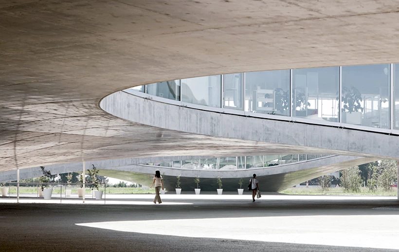
The modern open plan emerged from a structural change. Le Corbusier’s Dom-Ino system and Five Points freed the plan and facade from load-bearing walls, enabling new relationships between rooms, voids, and movement. This technical reorganization underpins much of today’s minimalist planning, where free plans and open voids support tranquil interiors based on proportion rather than decoration.

Open spaces gain character through measured variations in height and mass. SANAA’s Rolex Learning Center demonstrates that a single continuous floor slab, lightly contoured and perforated with courtyards, can form an ecosystem of interconnected zones without partitions. Voids, recesses, and skylit pockets create a continuous yet differentiated space, proving that minimal form can still accommodate complexity.

Light, shadow, and spatial layering
Light is a structural material in minimalist design. Tadao Ando’s Church of Light demonstrates this with its interior space defined by a single section of daylight. An examination of this work shows that shadow is not a deficiency but a positive tool that sharpens edges, reveals texture, and slows perception. This aligns with the Japanese aesthetic argument regarding the value of darkness and semi-darkness.
Layering transforms reduction into depth. Colin Rowe’s distinction between real transparency and phenomenal transparency explains why a simplified plan can still feel spatially dense. Overlapping planes, veiled views, and offset axes allow the eye to read several registers at once, creating a serene complexity that rewards time spent in the space.
Thresholds, transitions, and continuity
Minimalist environments depend on how one space transitions into another. Thresholds are designed as moments of calibration rather than display, and are often accentuated by changes in light, ceiling height, or materials. Aldo van Eyck’s concept of the “interim” gives these transitions a language and defines them as places that simultaneously contain both sides and unite the whole.
Continuity is reinforced by a clear hierarchy. Louis Kahn’s concept of service areas and service corridors separates primary rooms from utility rooms, making movements understandable and keeping surfaces calm. In large, uninterrupted plans like the Rolex Learning Center, soft topography and courtyards allow for navigation without doors or signs, uniting sequences into a seamless, coherent whole.
Integration with Nature and Context
Minimalist luxury first becomes appealing when you read the space. The goal is not to place an object in the landscape, but to transform the building, land, and climate into a single experience. Kengo Kuma defines this as removing boundaries so that architecture can harmonize with nature rather than dominate it. In practice, this means adjusting openings, paths, and materials to maximize the expressive power of the space itself.
Japanese examples clearly frame this approach. Engawa is an environmental room that establishes a continuous dialogue between the interior and the garden, while the shakkei technique incorporates distant landscapes—such as mountains, forests, or the horizon—into the composition. These ideas do not add ornamentation. They refine our perspective and movements, transforming landscapes and thresholds into the center of architecture.
Views, internal-external dialogue, and framing
When landscapes are arranged, they become architectural. Engawa, sliding planes, and deep projections create a shallow, livable edge that frames the garden like parchment, and shakkei extends this frame to include borrowed scenery beyond the property boundary. The effect is the gradual unfolding of views rather than a single panorama, encouraging attention to the changing light, vegetation, and weather throughout the day.
Framing is not merely lateral. Roof cuts and high openings can shape how we perceive the sky and time. Tadao Ando’s Chichu Art Museum uses light wells, courtyards, and delicate openings to make daylight the main exhibit. The building is largely buried, yet calibrated voids choreographically arrange sight and shadow, proving that a restrained form can enhance contact with nature.
Landscape architecture partner
When the landscape is more than just a backdrop, circulation and planting come together to create an experience. In the Cultural Village of Portland Japanese Garden, Kuma defines this community as a connecting point that mediates between the city, the hillside, and craftsmanship by placing modest wooden buildings around a plaza that opens onto existing gardens. The architecture frames and filters the landscape, while the garden provides scale, tranquility, and seasonal change.
Interior spaces can also serve a landscaping function. SANAA’s Rolex Learning Center is defined as an interior topography consisting of gentle slopes and courtyards that organize movement and sightlines, typically without walls. The result is a spatially rich, minimalist structure where voids and courtyards incorporate the sky and vegetation into the plan.
Passive strategies: daylighting, cross ventilation
In a minimalist project, passive performance is achieved with very few, very precise decisions. Daylight, views, and daylight work best when treated as separate tasks with the same openness. The Whole Building Design Guide recommends a high ceiling height to bring light deep into the plan. A daylight panel is located at the top, while a view panel with different visible transmittance ranges is located at the bottom. This division improves glare control while maintaining clarity.
Cross ventilation depends on the effect of wind and lift force in well-placed openings. While CIBSE’s AM10 document summarizes how to select concepts, determine opening sizes, and manage internal obstructions, AIVC’s fundamentals and Hazim Awbi’s teaching materials summarize the physical characteristics of single-sided and double-sided ventilation and when hybrid systems are appropriate. Minimalist envelopes benefit from this precision because fewer elements must do more work.
Positioning minimalism within a cultural and climatic context
Minimalist form should never be independent of context. Kenneth Frampton’s critical regionalism approach advocates for architecture that reconciles universal techniques with the characteristics of topography, climate, and culture. Christian Norberg-Schulz’s genius loci approach adds a phenomenological perspective, seeking to make the work readable as the spirit of a place. These two approaches ground reduction not in abstract neutrality but in local meanings.
Climate provides concrete guidelines. In hot and dry regions, courtyards, shaded galleries, and high-mass facades can balance daytime temperature fluctuations, but research reminds us that proportions and orientation matter, and that poorly designed courtyards in hot and humid environments can actually increase solar heat gain. Traditional wind catchers in Iran demonstrate how airflow capture and cooling can be architecturally integrated, and this concept continues to inspire natural ventilation design today. Orientation and shading strategies remain fundamental principles across all climates.
A minimalist palette and plan gain depth when these forces are recorded. Projections adjusted according to the sun’s angles, openings aligned with prevailing winds, and plants that cool the air before it enters are not mere decoration. These are the tools that enable a quiet building to become both luxurious and appropriate to its surroundings, allowing nature and culture to converse through restraint.
Iconic Case Studies and Lessons for Architects
Minimalist luxury is most easily understood in homes that express the entire project with just a few elements. The following works are not merely simple. Each one transforms a small group of pieces into a complete spatial argument where structure, light, and material are sufficient to define luxury.
Minimalist projects in luxury residential architecture
Mies van der Rohe’s Farnsworth House in Plano clearly demonstrates that simplicity is luxury. A single steel frame supports a glass pavilion above the Fox River’s floodplain, leaving a single open room whose floor and roof are perceived as pure planes. Official history notes the extraordinary coordination behind this simple appearance and how the project came to be recognized as an interior architectural work that would later hold an important place in Mies’s career.
Philip Johnson’s Glass House is the American version of this. A transparent, single-room pavilion that treats the view as the actual wall of the interior. With no partition walls inside and four doors in the middle, this structure blurs the boundary between the enclosed space and the view in an unusual way, making openness and proportion the house’s most important luxury.
John Pawson’s Life House in Wales transforms minimalism into a monastic retreat. The composition is set on a hillside, with dark-colored bricks inspired by the surrounding heathland used on the exterior, and lighter-colored bricks on the interior. The aim is to create tranquility through mass, orientation, and a very limited color palette, rather than through ostentation.
Alberto Campo Baeza’s work in Cádiz, titled Casa del Infinito, reduces the house to a basic horizontal plane made of Roman travertine overlooking the Atlantic. The residence is located beneath and within this platform, while the roof becomes a bare base that frames the horizon. It is a radical luxury in terms of scale, stone, and light.
Peter Zumthor’s Secular Retreat in Devon represents the other end of minimalism, namely intensity. Hand-hammered concrete walls and a wide, low roof create a dignified and serene atmosphere, framing expansive views with thick edges to make light and shadow tangibly felt.
Studio MK27’s Redux House project in Brazil returns to the glass pavilion as a contemporary typology. Two delicate concrete slabs connect the program and openings, slightly elevating the floor from the ground and creating a serene, suspended figure above the local landscape.
Key design movements for deconstruction
Base and plane. Casa del Infinito demonstrates how a single horizontal surface can organize the entire world of a home. The roof is not a cover, but a livable terrace, and the rest of the house recedes, allowing the platform and horizon to take center stage. The lesson to be learned here is that a minimal figure can offer a rich experience when its scale and position are correct.
Architecture as structure. Farnsworth House and Redux House demonstrate how the clarity of the frame takes precedence over decoration. When the floor and roof are legible as thin, uninterrupted elements and the columns are placed with discipline, the proportions and joints become a source of refinement. Luxury emerges not only from the applied finishes, but also from alignment and tolerances.
Mass and silence. Secular Retreat uses thickness to perceive light as a material. Compressed concrete walls slow down sound and movement, allowing daylight or distant views to gain more weight. This is minimalism through substance rather than transparency.
Context as a palette. Life House reflects the black of the surrounding bushes and the pale tones inside, while staying true to local colors and textures. This approach proves that minimalism does not have to be abstract. Minimalism can be locally adapted and thus emotionally specific.
The landscape is like a room. Johnson’s Glass House and MK27’s pavilion project are based on landscape curation. Since there are few interior elements, the garden, slope, and sky should be arranged like interior spaces. The doors in the center of each glass wall and the long panel edges become the frames of this arrangement.
Common challenges and compromises
Comfort and purity. Homes with large glass surfaces carry risks of glare, increased heat, and loss of privacy. The Glass House embraces this exposure as a concept, yet it also highlights the constant compromise between the openness demanded by minimalist facades and comfort. Choices regarding orientation, shading, and glass properties become not just technical decisions, but architectural decisions.
Field risk and maintenance. Farnsworth’s history of severe flooding and the delicate maintenance of its unaltered materials demonstrate the cost side of minimal clarity. Official records and conservation literature indicate not only the project’s profound impact but also real challenges such as long-term viability, cost overruns, and environmental fragility.
Craftsmanship tolerance. The work of Pawson and Zumthor has set a high standard in terms of execution. Millimeter-precise gaps, seamless planes, and honest joints mean that any error is immediately apparent. The profiles of clients and curators emphasize that this approach typically requires exceptional material selection, specialized detailing, and patient coordination.
Program and privacy. When partitions are removed, functions must coexist within a single volume. Johnson’s pavilion demonstrates the poetic aspect of this choice while also revealing its limitations in everyday life. Many contemporary minimalist homes regain levels of privacy without sacrificing clarity by balancing openness with screened courtyards or thickened thresholds.
How can we carry minimalist luxury into future projects?
Start with an idea so powerful it can almost stand on its own. The most compelling houses of this lineage push a gesture to its limit: a raised frame on a meadow, a single travertine slab over the sea, a compressed concrete area that regulates light. If the concept, plan, section, structure, and landscape are organized in a single stroke, the remaining decisions can remain simple without feeling weak.
On-site reduction. Life House and Koshino House remind us that minimalism gains depth when it records its location. Orientation, level changes, and local material tones create a timeless originality. Reduction is perceived not as a general void, but as clarity about a specific hill, climate, or forest.
Landscape and light should be co-authors. The Glass House, the terrace of Casa del Infinito, and the floating sign of MK27 rely on the elements around them to complete the composition. Think of the sky openings, doors, and edges as instruments. If they harmonize, a limited palette can present the seasons, shadows, and landscapes with a full orchestration.
Finally, embrace the discipline of the construction process. Minimalist luxury is challenging because it reveals every joint and proportion. The lesson to be learned from these projects is that the time spent on structure, joints, and tolerances is not a background effort. This is the work that creates tranquility.